How to handle Hover and Focus States in Tailwind CSS ?
Last Updated :
16 Feb, 2024
Handling hover and focus states in Tailwind CSS involves using utility classes that specifically target these states. The hover: prefix is used for hover states, and the focus: prefix is used for focus states.
Syntax
// For Hover state
<button class="bg-blue-500 hover:bg-blue-700">
  Click me
</button>

// For focus state
<button class="bg-blue-500 focus:outline-none focus:border-blue-700">
Click me
</button>
Hover State
In the hover state, Styling is applied when the mouse hovers over an element, using hover: prefix in utility classes.
Example: The example illustrates the hovering states in Tailwind CSS.
HTML
<!DOCTYPE html>
<html lang="en">
<head>
<meta charset="UTF-8">
<meta http-equiv="X-UA-Compatible" content="IE=edge">
<meta name="viewport"
content="width=device-width, initial-scale=1.0">
<title>Welcome to GFG</title>
<link rel="stylesheet" href="style.css">
<link href="/dist/output.css" rel="stylesheet">
</head>
<body>
<div class="flex justify-center
items-center min-h-screen">
<div>
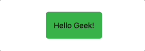
<button class="bg-green-600 p-4
rounded-md hover:bg-green-700">
Hello Geek!
</button>
</div>
</div>
</body>
</html>
|
Output:
focus State
In the focus state, Styling is applied when an element is focused, using focus: prefix in utility classes.
Example: The example illustrates the focusing states in Tailwind CSS.
HTML
<!DOCTYPE html>
<html lang="en">
<head>
<meta charset="UTF-8">
<meta http-equiv="X-UA-Compatible" content="IE=edge">
<meta name="viewport"
content="width=device-width, initial-scale=1.0">
<title>Welcome to GFG</title>
<link rel="stylesheet" href="style.css">
</head>
<body>
<div class="flex justify-center
items-center min-h-screen">
<div>
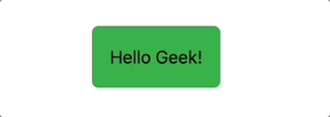
<button class="bg-green-600 p-4
rounded-md focus:bg-green-700">
Hello Geek!
</button>
</div>
</div>
</body>
</html>
|
Output:
The table below illustrates the hover and focus states alongside their corresponding descriptions.
| Prefix |
Description |
hover |
Applied as a prefix to define styles for the hover state of an element, allowing customization upon mouseover. |
focus |
Used as a prefix to specify styles for the focus state, typically on interactive elements like buttons or inputs. |
Key Features:
- Interactive Design: Tailwind provides a simple and effective way to add interactive styles, enhancing the visual feedback for users during hover or focus interactions.
- Responsive Design: The hover and focus classes can be used with responsive variants (
sm:, md:, lg:, xl:) to create adaptive designs for various screen sizes.
- Focus Styling: Tailwind offers focus-related classes (
focus:outline-none, focus:border-blue-700, etc.) for styling elements when they are in focus, improving accessibility and user experience.
Share your thoughts in the comments
Please Login to comment...