How to create a drop shadow effect using CSS ?
Last Updated :
18 Sep, 2023
In this article, we are going to learn how to create a drop shadow effect using CSS. drop-shadow() is an inbuilt function used to create a blurred shadow in a given offset and color. A drop shadow effect adds depth and visual interest to elements on a web page by creating a shadow behind them. This effect can be achieved using various CSS properties, By adjusting the values of these properties, you can control the size, color, blur, and position of the shadow, giving your elements a more prominent and three-dimensional appearance.
There are several approaches that can be used to create a drop shadow effect using CSS
- Using the box-shadow property
- Using Pseudo-elements
- using filter property with drop-shadow function
- using inset box-shadow
We will explore all the above methods along with their basic implementation with the help of examples.
The box-shadow the property allows you to add a drop shadow effect to an element. It takes in multiple values that define the properties of the shadow.
Syntax:
selector {
  box-shadow: [horizontal offset] [vertical offset] [blur radius] [spread radius] [color];
}
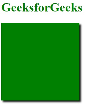
Example: In this example, we are using the above-explained property.
HTML
<!DOCTYPE html>
<html>
<head>
<title>Drop Shadow Effect using CSS</title>
<style>
.box {
width: 200px;
height: 200px;
background-color: green;
box-shadow: 4px 4px 4px rgba(0, 0, 0, 0.9);
}
</style>
</head>
<body>
<h1 style="color: green;">
GeeksforGeeks
</h1>
<div class="box"></div>
</body>
</html>
|
Output:
In this approach we are using::after pseudo-element, we may create an overlaying pseudo-element with a background color to simulate a shadow behind the primary element.
Syntax:
.element {
    position: relative;
}
.element::after {
    content: "";
    position: absolute;
    /* Define shadow styles, e.g.,
    background-color, offset, blur, etc. */
}
Example: Drop Shadow Effect using Pseudo-elements.
HTML
<!DOCTYPE html>
<html>
<head>
<title>Drop Shadow - ::after Pseudo-element </title>
<style>
body {
display: flex;
justify-content: center;
align-items: center;
height: 100vh;
margin: 0;
}
.container {
position: relative;
}
.box-with-shadow {
width: 200px;
height: 200px;
background-color: green;
border-radius: 8px;
}
.box-with-shadow::after {
content: "";
position: absolute;
top: 8px;
left: 8px;
width: 100%;
height: 100%;
background-color: rgba(0, 0, 0, 0.4);
z-index: -1;
border-radius: 8px;
}
</style>
</head>
<body>
<div class="container">
<div class="box-with-shadow">
Drop Shadow using ::after
</div>
</div>
</body>
</html>
|
Output:
.png)
Approach 3: using filter property with drop-shadow function
The drop shadow effect using the filter property and drop-shadow function applies a shadow to an element using CSS filter, enhancing visual appearance.
Syntax:
.element {
    /* Other styles for the element */
    filter: drop-shadow([offset-x] [offset-y] [blur-radius] [color]);
}
Example: In this example, we are using filter property with the drop-shadow function.
HTML
<!DOCTYPE html>
<html>
<head>
<title>Drop Shadow -using Filter property</title>
<style>
body {
display: flex;
justify-content: center;
align-items: center;
height: 100vh;
margin: 0;
}
.drop-shadow {
width: 200px;
height: 200px;
background-color: green;
border-radius: 4px;
filter: drop-shadow(4px 4px 8px rgba(0, 0, 0, 0.8));
}
</style>
</head>
<body>
<div class="drop-shadow">
</div>
</body>
</html>
|
Output:
.png)
Approach 4: using inset box-shadow
In this approach we are using the CSS box-shadow property and the inset keyword, the inset box-shadow provides a shadow effect inside the element to give it a recessed appearance.
Syntax
.element {
    /* Other styles for the element */
    box-shadow: inset [offset-x] [offset-y] [blur-radius] [spread-radius] [color];
}
Example: In this example, we are using the inset box-shadow property.
HTML
<!DOCTYPE html>
<html>
<head>
<title>Drop Shadow - Inset Box Shadow </title>
<style>
body {
display: flex;
justify-content: center;
align-items: center;
height: 100vh;
margin: 0;
}
.inset-box-shadow {
width: 400px;
height: 300px;
background-color: white;
border-radius: 6px;
box-shadow: inset 4px 4px 8px rgba(0, 0, 0, 0.8);
}
</style>
</head>
<body>
<div class="inset-box-shadow">
Drop Shadow using inset box-shadow
</div>
</body>
</html>
|
Output:
.png)
Share your thoughts in the comments
Please Login to comment...