How to create a Split Button Dropdown using CSS ?
Last Updated :
12 Jan, 2024
In this article, we will learn how to design a split button dropdown using CSS. Split buttons combine a main button with a dropdown, useful for adding interactive features to your website. This guide helps you improve your web design skills by showing you how to make a split button in easy steps.
Using CSS Properties & Pseudo-class
This approach uses CSS properties and pseudo-classes to create a split button dropdown, enhancing user interaction and design by combining style elements and interactive features within a single-button interface.
Approach
- Make a structure of the web page using <h1>, <h3>, <div>, <span> and <button> elements. Link the external stylesheet to the HTML file.
- The element with the class name
.box is styled to be a relatively positioned inline block. This styling creates a container for both the split button and the dropdown list.
- The dropdown list is initially hidden by setting the property
display: none; and positioned absolutely below the split button it becomes visible only when the box is being hovered.
- Styling the
<h1> element with the color property set to green. Additionally, the <h3> element is styled with properties such as color (blueviolet), font-size (25px), and text-align (center).
Example: The code example shows how to create a split button dropdown using CSS pseudo-elements
HTML
<!DOCTYPE html>
<html lang="en">
<head>
<meta charset="UTF-8">
<meta name="viewport"
content="width=device-width,
initial-scale=1.0">
<title>Split Button Dropdown</title>
<link rel="stylesheet"
href="style.css">
<link rel="stylesheet"
href=
</head>
<body>
<div class="box1">
<div class="innerbox">
<h1>GeeksforGeeks</h1>
<h3>A split buttondropdown using CSS</h3>
<div class="box">
<button class="mybtn">
Split Button
<span>
<i class="fa fa-solid fa-caret-down"></i>
</span>
</button>
<div class="dropdownlist">
<a href="#">DSA</a>
<a href="#">MERN</a>
<a href="#">MEAN</a>
<a href="#">MEVN</a>
</div>
</div>
</div>
</div>
</body>
</html>
|
CSS
.box1 {
height: 100vh;
display: flex;
justify-content: center;
align-items: center;
flex-direction: column;
}
h1 {
color: green;
text-align: center;
}
h3 {
color: blueviolet;
font-size: 25px;
text-align: center;
}
.box {
position: relative;
display: inline-block;
margin-left: 120px;
}
.mybtn {
background-color: #4CAF50;
color: rgb(243, 251, 243);
font-size: 20px;
font-weight: 700;
padding: 10px;
border: none;
border-radius: 4px;
cursor: pointer;
}
i {
margin-left: 5px;
}
.box:hover .dropdownlist {
display: block;
}
.dropdownlist {
display: none;
position: absolute;
background-color: #deedd4;
font-weight: 700;
min-width: 140px;
box-shadow: 0 16px 16px rgba(13, 12, 12, 0.2);
top: 100%;
}
.dropdownlist a {
color: rgb(26, 24, 24);
padding: 12px 16px;
text-decoration: none;
display: block;
}
.dropdownlist a:hover {
background-color: rgb(162, 220, 162);
}
|
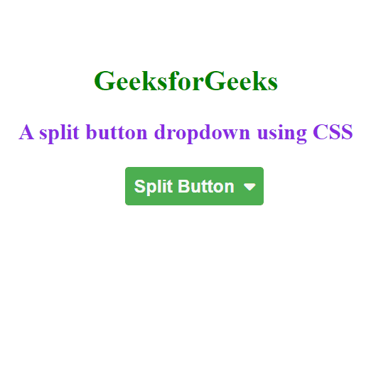
Output:
Using Flexbox Properties
In this approach we will use the CSS flex properties to create a responsive and visually appealing layout. The flex container arrangement facilitates easy alignment and positioning of the dropdown elements within the button structure.
Approach
- Make a structure of the web page using <h1>, <h3>, <div>, <span> and <button> elements. Link the external stylesheet to the HTML file.
- The
.mybtn1 class is a flex container that holds both the split button and the dropdown list. It’s set to display: flex. The overall page structure is centered vertically and horizontally using flexbox properties on the .box1 class.
- The dropdown list is initially hidden (
display: none;) and positioned absolutely below the split button. Links inside the dropdown list have styling properties for color, padding, and display.
- Styling the
<h1> element with the color property set to green. Additionally, the <h3> element is styled with properties such as color (blueviolet), font-size (25px), and text-align (center).
Example: The code example shows how to create a split button dropdown using CSS flexbox properties.
HTML
<!DOCTYPE html>
<html lang="en">
<head>
<meta charset="UTF-8">
<meta name="viewport"
content="width=device-width,
initial-scale=1.0">
<title>Split Button Dropdown</title>
<link rel="stylesheet"
href="style.css">
<link rel="stylesheet"
href=
</head>
<body>
<div class="box1">
<div class="innerbox">
<h1>GeeksforGeeks</h1>
<h3>A split button
dropdown using Flexbox
</h3>
<div class="mybtn1">
<button class="mybtn">
Split Button
<span class="dropdown-symbol">
<i class="fa fa-solid fa-caret-down"></i>
</span>
</button>
<div class="dropdownlist">
<a href="#">Course</a>
<a href="#">MERN</a>
<a href="#">MEAN</a>
<a href="#">MEVN</a>
<a href="#">DSA</a>
</div>
</div>
</div>
</div>
</body>
</html>
|
CSS
.box1 {
height: 100vh;
display: flex;
justify-content: center;
align-items: center;
flex-direction: column;
}
h1 {
color: green;
text-align: center;
}
h3 {
color: blueviolet;
font-size: 25px;
text-align: center;
}
.mybtn1 {
display: flex;
position: relative;
margin-left: 120px;
}
.mybtn {
background-color: #4CAF50;
color: rgb(243, 251, 243);
font-size: 20px;
font-weight: 700;
padding: 10px;
border: none;
border-radius: 4px;
cursor: pointer;
}
i {
margin-left: 5px;
}
.mybtn1:hover .dropdownlist {
display: flex;
flex-direction: column;
}
.dropdownlist {
display: none;
position: absolute;
background-color: #deedd4;
font-weight: 700;
min-width: 140px;
box-shadow: 0 16px 16px rgba(13, 12, 12, 0.2);
top: 100%;
margin-left: 10px;
}
.dropdownlist a {
color: black;
padding: 12px 16px;
text-decoration: none;
display: block;
}
.dropdownlist a:hover {
background-color: rgb(162, 220, 162);
}
|
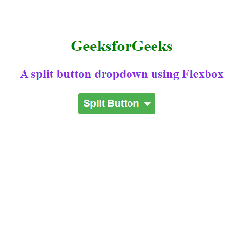
Output:
Share your thoughts in the comments
Please Login to comment...