How to create a Chevron Arrow using CSS ?
Last Updated :
08 Jan, 2024
In the article, we will see how to make a Chevron Arrow using CSS. A Chevron Arrow is an arrow, often used to indicate direction or to represent navigation elements. Creating a chevron arrow using CSS involves using CSS properties like border and transform to generate the arrow shape.
Syntax
transform: rotate(45deg);
transform: rotate(-135deg);
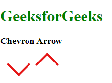
Chevron Arrow for Up and Down Arrow
- The class name
.chevron displays the element as an inline block then Sets a red border on the right and bottom. and define a fixed width and height of 30px.
- Set the transformations to rotate the
.chevron element. the id named "chevron-arrow-up" is rotated 45 degrees clockwise and the id named “chevron-arrow-down" is rotated 135 degrees counter-clockwise.
- The
transform: rotate() property is used to change the direction of the chevron, creating an arrow-like appearance.
- Give color to the heading.
Example 1: The example illustrates how to make up and down Chevron Arrow.
HTML
<!DOCTYPE html>
<html lang="en">
<head>
<meta charset="UTF-8">
<meta name="viewport"
content="width=device-width,
initial-scale=1.0">
<style>
.chevron {
display: inline-block;
border-right:
4px solid rgb(229, 21, 21);
border-bottom:
4px solid rgb(229, 21, 21);
width: 30px;
height: 30px;
}
#chevron-arrow-up {
transform: rotate(45deg);
}
#chevron-arrow-down {
transform: rotate(-135deg);
}
h1 {
color: green;
}
</style>
</head>
<body>
<h1>GeeksforGeeks</h1>
<h3> Chevron Arrow</h3>
<div style="margin-top: 20px;">
<div style="margin-left: 20px;"
id="chevron-arrow-up"
class="chevron">
</div>
<div style="margin-left: 20px;"
id="chevron-arrow-down"
class="chevron">
</div>
</div>
</body>
</html>
|
Output:
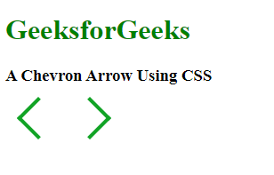
Chevron Arrow for Left and Right Arrow
- The class name
.chevron displays the element as an inline block then Sets a red green on the right and bottom. and define a fixed width and height of 30px.
- Set the transformations to rotate the
.chevron element. the id named "chevron-arrow-left" is rotated 135 degrees clockwise and the id named “chevron-arrow-right" is rotated 45 degrees counter-clockwise.
- The
transform: rotate() property is used to change the direction of the chevron, creating an arrow-like appearance.
- Give color to the heading.
Example 2: The example illustrate how to make left and right Chevron Arrow.
HTML
<!DOCTYPE html>
<html lang="en">
<head>
<meta charset="UTF-8">
<meta name="viewport"
content="width=device-width,
initial-scale=1.0">
<style>
.chevron {
display: inline-block;
border-right:
4px solid rgb(17, 163, 37);
border-bottom:
4px solid rgb(17, 163, 37);
width: 30px;
height: 30px;
}
#chevron-arrow-left {
transform: rotate(135deg);
}
#chevron-arrow-right {
transform: rotate(-45deg);
}
h1 {
color: green;
}
</style>
</head>
<body>
<h1>GeeksforGeeks</h1>
<h3>A Chevron Arrow Using CSS</h3>
<div class="box"
style="margin-top: 20px;">
<div style="margin-left: 20px;"
id="chevron-arrow-left"
class="chevron">
</div>
<div style="margin-left: 20px;"
id="chevron-arrow-right"
class="chevron">
</div>
</div>
</body>
</html>
|
Output:
Share your thoughts in the comments
Please Login to comment...