How to Center the JavaScript Alert Message Box ?
Last Updated :
18 Apr, 2024
An alert box is a dialogue box that pops up on the screen to provide information to the user. It contains a message and an OK button, which allow users to acknowledge the message and close the box. Alert boxes are commonly used in web development to display important messages, warnings, or notifications to users.
Using Custom CSS and Javascript
In this approach, we will utilize custom CSS for layout and styling, along with JavaScript for interactivity. Apply CSS flexbox and absolute positioning for centering elements, and JavaScript event handling for displaying and hiding the alert box.
- Develop the HTML structure with a container for the main content and a modal for the alert box.
- Apply CSS to centre the main content vertically and horizontally using Flexbox. Style the modal to cover the entire viewport and centre it using absolute positioning and the transform property.
- Implement JavaScript to control the display of the modal. When the button is clicked, show the modal by changing its display property to “block”. Similarly, clicking the close button hides the modal by setting its display property to “none”.
- Add event listeners to the submit button and the close button to trigger the display and hiding of the modal, respectively.
- Customize the modal content, including the alert message, heading, and close button, to match the design requirements. Adjust the styles as needed for visual appeal and accessibility.
Example: This example shows the implementation to center the JavaScript alert message box.
HTML
<!DOCTYPE html>
<html lang="en">
<head>
<meta charset="UTF-8">
<meta name="viewport"
content="width=device-width, initial-scale=1.0">
<title>Centered Alert Box</title>
<style>
.container-main {
display: flex;
justify-content: center;
align-items: center;
flex-direction: column;
margin-top: 10rem;
}
.modal {
display: none;
position: fixed;
z-index: 1;
left: 0;
top: 0;
width: 100%;
height: 100%;
background-color: rgba(0, 0, 0, 0.4);
}
.modal-content {
background-color: #28e117;
color: #fff;
position: absolute;
top: 50%;
left: 50%;
transform: translate(-50%, -50%);
padding: 20px;
width: 50%;
text-align: center;
border-radius: 5px;
box-shadow: 0 4px 8px rgba(0, 0, 0, 0.1);
}
.close {
color: #070707;
font-size: 28px;
font-weight: bold;
}
.close:hover,
.close:focus {
color: black;
cursor: pointer;
}
.modal-heading {
font-size: 24px;
margin-bottom: 20px;
}
.open-modal-btn {
background-color: #4CAF50;
border: none;
color: white;
padding: 15px 32px;
font-size: 16px;
margin: 20px;
cursor: pointer;
border-radius: 5px;
box-shadow: 0 2px 4px rgba(0, 0, 0, 0.1);
}
.open-modal-btn:hover {
background-color: #45a049;
}
</style>
</head>
<body>
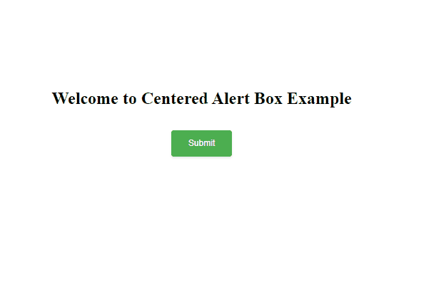
<div class="container-main">
<h1>
Welcome to Centered Alert Box Example
</h1>
<button class="open-modal-btn">
Submit
</button>
</div>
<!-- The Modal -->
<div id="myModal" class="modal">
<!-- Modal content -->
<div class="modal-content">
<span class="close">×</span>
<h2 class="modal-heading">
This is a alert message.
</h2>
<p>Your data is submitted.</p>
</div>
</div>
<script>
let open_modal_btn =
document.querySelector(".open-modal-btn");
let my_model =
document.getElementById("myModal");
let close_btn =
document.querySelector(".close");
open_modal_btn.addEventListener("click", function () {
my_model.style.display = "block";
});
close_btn.addEventListener("click", function () {
my_model.style.display = "none";
});
</script>
</body>
</html>
Output:
Using SweetAlert2 Library
SweetAlert2 offers an easy solution for creating visually appealing alert boxes with minimal effort. By linking the SweetAlert2 CSS file, developers can easily implement custom alert dialogues with various styles.
- Construct the HTML with a container for the main content and a button to trigger the alert.
- Define custom CSS to style the button and center the container using flexbox for better visual presentation.
- Import the SweetAlert2 library’s CSS and JavaScript files from a CDN to enable the creation of centered alert boxes with enhanced styling and functionality.
- Implement JavaScript to trigger the SweetAlert2 alert when the button is clicked. Customize the alert title, text, icon, and confirm button text as needed for the specific use case.
- Attach an event listener to the button to invoke the function that opens the centered alert box when clicked, providing a user-friendly interaction experience.
Example : This example shows the implementation of the above-explained approach.
HTML
<!DOCTYPE html>
<html lang="en">
<head>
<meta charset="UTF-8">
<meta name="viewport"
content="width=device-width, initial-scale=1.0">
<title>
Centered Alert Box
with SweetAlert2
</title>
<!-- Include SweetAlert2 CSS -->
<link rel="stylesheet" href=
"https://cdn.jsdelivr.net/npm/sweetalert2@10" />
<style>
button {
background-color: #4CAF50;
border: none;
color: white;
padding: 15px 32px;
text-align: center;
text-decoration: none;
display: inline-block;
font-size: 16px;
margin: 20px;
cursor: pointer;
border-radius: 5px;
box-shadow: 0 2px 4px rgba(0, 0, 0, 0.1);
}
.container {
background: #fefefe;
display: flex;
justify-content: center;
align-items: center;
flex-direction: column;
margin-top: 10rem;
}
</style>
</head>
<body>
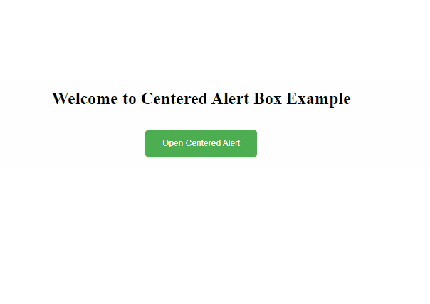
<div class="container">
<h1>
Welcome to Centered
Alert Box Example
</h1>
<button onclick="openCenteredAlert()">
Open Centered Alert
</button>
</div>
<script>
function openCenteredAlert() {
Swal.fire({
title: 'Centered Alert Message Box',
text: 'You clicked the button.',
icon: 'info',
confirmButtonText: 'Close'
});
}
</script>
<!-- Include SweetAlert2 JavaScript -->
<script src=
"https://cdn.jsdelivr.net/npm/sweetalert2@10">
</script>
</body>
</html>
Output:
Share your thoughts in the comments
Please Login to comment...