How to Change the Color of the Alert Box in JavaScript ?
Last Updated :
26 Mar, 2024
Alert boxes, often utilized in JavaScript applications, provide users with important notifications or messages. However, their default appearance may not always blend seamlessly with the overall design of your website or application.
JavaScript offers several methods to customize alert boxes as listed below.
Using display property to create custom alert
This method involves crafting a custom alert-like dialog using HTML, CSS, and JavaScript. By constructing the dialog from scratch, developers gain complete control over its appearance, including its color.
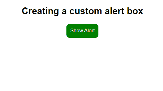
Example: The below code example will explain how you can create your custom alert dialog.
HTML
<!DOCTYPE html>
<html lang="en">
<head>
<meta charset="UTF-8">
<meta name="viewport" content=
"width=device-width, initial-scale=1.0">
<title>Custom Alert Box</title>
<link rel="stylesheet" href="style.css">
</head>
<body style="text-align: center;">
<h2>
Creating a custom alert box
</h2>
<button class="open-btn" onclick="showAlert()">
Show Alert
</button>
<div id="customAlert" class="custom-alert">
<span class="close-btn" onclick="closeAlert()">
×
</span>
<p>This is a custom alert!</p>
</div>
<script>
function showAlert() {
const alertBox =
document.getElementById('customAlert');
alertBox.style.display = 'block';
}
function closeAlert() {
const alertBox =
document.getElementById('customAlert');
alertBox.style.display = 'none';
}
</script>
</body>
</html>
body {
    font-family: Arial, sans-serif;
}

.custom-alert {
    display: none;
    position: fixed;
    top: 20%;
    left: 50%;
    transform: translate(-50%, -20%);
    background-color: #4CAF50;
    padding: 30px;
    border-radius: 5px;
    box-shadow: 0 0 10px rgba(0, 0, 0, 0.2);
}

.custom-alert p {
    margin: 0;
    color: #ffffff;
}

.open-btn{
    color: #fff;
    background: green;
    border: none;
    padding: 10px;
    border-radius: 8px;
    cursor: pointer;
}

.close-btn {
    position: absolute;
    top: 5px;
    right: 5px;
    cursor: pointer;
    font-size: 20px;
    color: #ffffff;
}
Output:
Using visibility property to create custom alert
We can use the visibility property in the same way as we used the display property to hide and show the alert box on click to the button.
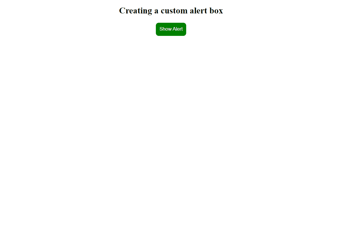
Example: The below code will explain the use of the visibility property to create custom alert.
HTML
<!DOCTYPE html>
<html lang="en">

<head>
    <meta charset="UTF-8">
    <meta name="viewport" content=
"width=device-width, initial-scale=1.0">
    <title>Advanced Custom Alert Box</title>
    <link rel="stylesheet" href="style.css">
</head>

<body style="text-align: center;">
    <h2>
        Creating a custom alert box
    </h2>
    <button class="open-btn" onclick="customAlert()">
        Show Alert
    </button>

    <div id="custom-alert" class="custom-alert">
        <div class="alert-content">
            <span id="alert-message"></span>
            <div class="button-container">
                <button id="confirm-btn"
                    onclick="confirmAction()">
                    Confirm
                </button>
                <button id="cancel-btn"
                    onclick="cancelAction()">
                    Cancel
                </button>
            </div>
        </div>
    </div>

    <script>
        function customAlert() {
            const message =
                "Are you sure you want to perform this action?";
            document.getElementById("alert-message").
                innerText = message;
            document.getElementById("custom-alert").
                style.visibility = "visible";
            document.body.
                style.backgroundColor = "rgb(49 45 45 / 45%)";
        }

        function confirmAction() {
            document.getElementById("custom-alert").
                style.visibility = "hidden";
            document.body.
                style.backgroundColor = "#fff"
        }

        function cancelAction() {
            document.getElementById("custom-alert").
                style.visibility = "hidden";
            document.body.
                style.backgroundColor = "#fff"
        }
    </script>
</body>

</html>
.custom-alert {
    visibility: hidden;
    position: fixed;
    top: 50%;
    left: 50%;
    transform: translate(-50%, -50%);
    background-color: #e8efe8;
    border: 1px solid #77bb77;
    padding: 20px;
    border-radius: 10px;
    box-shadow: 0px 0px 10px rgba(0, 0, 0, 0.1);
}

.alert-content {
    text-align: center;
}

.open-btn {
    color: #fff;
    background: green;
    border: none;
    padding: 10px;
    border-radius: 8px;
    cursor: pointer;
}

.button-container {
    margin-top: 15px;
}

#confirm-btn,
#cancel-btn {
    padding: 8px 20px;
    background-color: #4CAF50;
    border: none;
    border-radius: 5px;
    cursor: pointer;
    font-size: 16px;
    margin: 5px 10px;
    transition: background-color 0.3s;
}

#confirm-btn:hover,
#cancel-btn:hover {
    background-color: #45a049;
}

#confirm-btn:focus,
#cancel-btn:focus {
    outline: none;
}

#confirm-btn:active,
#cancel-btn:active {
    background-color: #3e8e41;
}
Output:
Share your thoughts in the comments
Please Login to comment...