How to Apply Opacity to a Color Variable in CSS ?
Last Updated :
08 Feb, 2024
To adjust opacity, we can use RGBA (Red, Green, Blue, Alpha) or HSLA (Hue, Saturation, Lightness, Alpha) values. By defining a color variable with an alpha value, we can dynamically control the transparency of elements in our stylesheets. Opacity is the attribute that controls the transparency of an element.
Using RGBA Values
RGBA values represent colors in web design, with Red, Green, and Blue components and an Alpha channel for transparency. The RGBA color model where the fourth parameter represents the alpha channel for opacity. This method is suitable for applying opacity to any color.
Syntax:
:root {
    --customColor: rgba(255, 0, 0, 0.5); /* Red color with 50% opacity */
}
.element {
    background-color: var(--customColor);
}
Example: Illustration of opacity for a colour variable in CSS by using the RGBA.
HTML
<!DOCTYPE html>
<html lang="en">
<head>
<meta charset="UTF-8">
<meta name="viewport" content="width=device-width,
initial-scale=1.0">
<title>RGBA Example</title>
<style>
:root {
--myColor: rgba(255, 0, 0, 0.5);
--myColor2: rgba(4, 0, 255, 0.5);
}
body {
margin: 0;
display: flex;
align-items: center;
justify-content: center;
height: 100vh;
background-color: #f0f0f0;
}
.colored-box {
width: 600px;
height: 400px;
background-color: red;
display: flex;
align-items: center;
justify-content: center;
}
.colored-box:hover {
background-color: var(--myColor);
}
.inside-box {
width: 200px;
height: 200px;
background-color: rgb(0, 26, 255);
}
.inside-box:hover {
background-color: var(--myColor2);
}
</style>
</head>
<body>
<div class="colored-box">
<div class="inside-box"></div>
</div>
</body>
</html>
|
Output:

Using HSLA Values
Using HSLA values involves specifying colors in the HSL (Hue, Saturation, Lightness) color model with an additional alpha channel for adjusting opacity, providing flexibility for color adjustments in the HSL color space.
Syntax:
:root {
    --customColor: hsla(0, 100%, 50%, 0.5); /* Hue: 0 (red), Saturation: 100%, Lightness: 50%, 50% opacity */
}
.element {
    background-color: var(--customColor);
}
Example: Illustration of the opacity to a color variable in CSS by using the HSLA.
HTML
<!DOCTYPE html>
<html lang="en">
<head>
<meta charset="UTF-8">
<meta name="viewport" content="width=device-width,
initial-scale=1.0">
<title>RGBA Example</title>
<style>
:root {
--myColor: hsla(120, 100%, 50%, 0.5);
--myColor2: hsla(295, 100%, 50%, 0.5);
}
body {
margin: 0;
display: flex;
align-items: center;
justify-content: center;
height: 100vh;
background-color: #f0f0f0;
}
.colored-box {
width: 600px;
height: 400px;
background-color: rgb(0, 255, 34);
display: flex;
align-items: center;
justify-content: center;
}
.colored-box:hover {
background-color: var(--myColor);
}
.inside-box {
width: 200px;
height: 200px;
background-color: rgb(255, 0, 234);
}
.inside-box:hover {
background-color: var(--myColor2);
}
</style>
</head>
<body>
<div class="colored-box">
<div class="inside-box"></div>
</div>
</body>
</html>
|
Output:
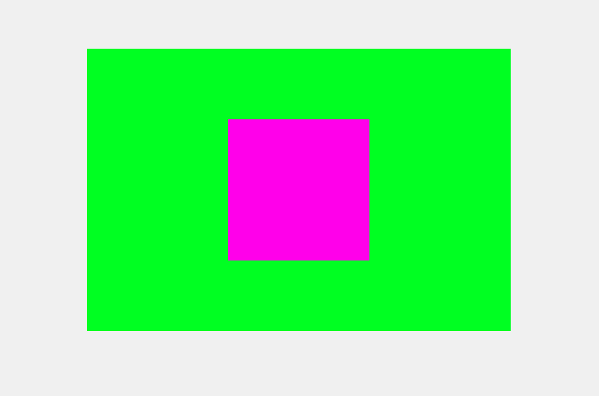
Using Opacity Property
Apply the opacity property directly to the color variable or any element with that variable. This method is straightforward but affects the entire element’s transparency.
Syntax:
:root {
    --customColor: #ff0000; /* Red color */
}
.element {
    background-color: var(--customColor);
    opacity: 0.5; /* 50% opacity applied to the entire element */
}
Example: Illustration of the opacity to a color variable in CSS by using opacity property.
HTML
<!DOCTYPE html>
<html lang="en">
<head>
<meta charset="UTF-8">
<meta name="viewport"
content="width=device-width, initial-scale=1.0">
<title>Opacity Example</title>
<style>
:root {
--myColor: #00ff22;
--myColor2: #ff00ea;
}
body {
margin: 0;
display: flex;
align-items: center;
justify-content: center;
height: 100vh;
background-color: #f0f0f0;
}
.colored-box {
width: 600px;
height: 400px;
background-color: var(--myColor);
display: flex;
align-items: center;
justify-content: center;
transition: background-color 0.3s ease;
/* Add transition for smooth color change */
}
.colored-box:hover {
background-color: var(--myColor);
opacity: 0.5;
/* Apply 50% opacity on hover */
}
.inside-box {
width: 200px;
height: 200px;
background-color: var(--myColor2);
transition: background-color 0.3s ease;
/* Add transition for smooth color change */
}
.inside-box:hover {
background-color: var(--myColor2);
opacity: 0.7;
/* Apply 70% opacity on hover */
}
</style>
</head>
<body>
<div class="colored-box">
<div class="inside-box"></div>
</div>
</body>
</html>
|
Output:

Share your thoughts in the comments
Please Login to comment...