CSS gradients offer a powerful way to create visually appealing web elements by smoothly transitioning between two or more colors. As a web developer, understanding gradients is essential for crafting attractive and engaging user interfaces.
Types of Gradients
The Gradients can be categorized into 3 types:
- Linear Gradients
- Radial Gradients
- Conic Gradients
1. Linear Gradients:
Linear Gradients includes the smooth color transitions to going up, down, left, right, and diagonally. The minimum two-color required to create a linear gradient. More than two color elements can be possible in linear gradients. The starting point and the direction are needed for the gradient effect.
Syntax:
background-image: linear-gradient(direction, color-stop1, color-stop2, ...);
The linear-gradient can be implemented in the following ways:
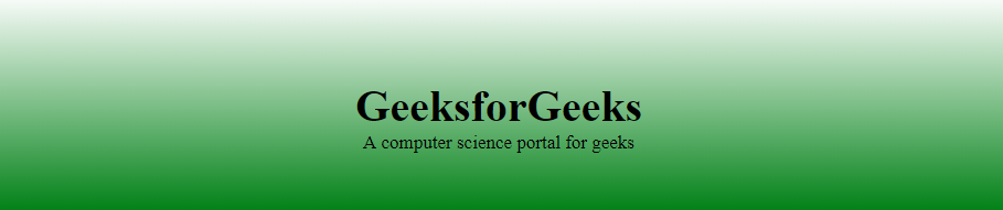
1. Top to Bottom:
In this image, the transition started with white color and ended with green color. On exchanging the color sequence, the transition will start with green and will end with white.
Example: This example illustrates the linear-gradient that starts from the top & ends at the bottom, initiating from the white color, transitioning to the green color.
HTML
<!DOCTYPE html>
<html>
<head>
    <title>CSS Gradients</title>
    <style>
    #main {
        height: 200px;
        background-color: white;
        background-image: linear-gradient(white, green);
    }

    .gfg {
        text-align: center;
        font-size: 40px;
        font-weight: bold;
        padding-top: 80px;
    }

    .geeks {
        font-size: 17px;
        text-align: center;
    }
    </style>
</head>

<body>
    <div id="main">
        <div class="gfg">GeeksforGeeks</div>
        <div class="geeks">
          A computer science portal for geeks
        </div>
    </div>
</body>
</html>
Output:
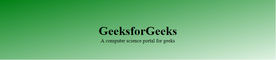
2. Left to Right:
In this image, the transition started from left to right. It starts from white transitioning to green.
Example: This example illustrates the linear-gradient that starts from the left & ends at the right.
HTML
<!DOCTYPE html>
<html>
<head>
    <title>CSS Gradients</title>
    <style>
    #main {
        height: 200px;
        background-color: white;
        background-image: linear-gradient(to right, white, green);
    }

    .gfg {
        text-align: center;
        font-size: 40px;
        font-weight: bold;
        padding-top: 80px;
    }

    .geeks {
        font-size: 17px;
        text-align: center;
    }
    </style>
</head>

<body>
    <div id="main">
        <div class="gfg">GeeksforGeeks</div>
        <div class="geeks">
          A computer science portal for geeks
        </div>
    </div>
</body>
</html>
Output:

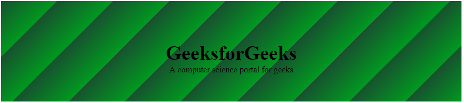
3. Diagonal:
This transition started from top-left to bottom-right. It starts with the green transition to white. For the diagonal gradient, need to specify both horizontal and vertical starting positions.
Example: This example illustrates the linear-gradient with the diagonal transition by specifying both the horizontal and vertical starting positions.
HTML
<!DOCTYPE html>
<html>
<head>
    <title>CSS Gradients</title>
    <style>
    #main {
        height: 200px;
        background-color: white;
        background-image: linear-gradient(to bottom right,
          green, rgba(183, 223, 182, 0.4));
    }

    .gfg {
        text-align: center;
        font-size: 40px;
        font-weight: bold;
        padding-top: 80px;
    }

    .geeks {
        font-size: 17px;
        text-align: center;
    }
    </style>
</head>

<body>
    <div id="main">
        <div class="gfg">GeeksforGeeks</div>
        <div class="geeks">
          A computer science portal for geeks
        </div>
    </div>
</body>
</html>
Output:
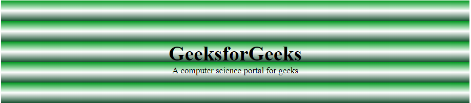
4. Repeating Linear Gradient:
CSS allows the user to implement multiple linear gradients using a single function repeating-linear-gradient(). The image here contains 3 colors in each transition with some percentage value.
Example: This example illustrates the linear-gradient with repeating transition effects by implementing the multicolors.
HTML
<!DOCTYPE html>
<html>
<head>
    <title>CSS Gradients</title>
    <style>
    #main {
        height: 200px;
        background-color: white;
        background-image: repeating-linear-gradient(#090,
                                      #fff 10%, #2a4f32 20%);
    }

    .gfg {
        text-align: center;
        font-size: 40px;
        font-weight: bold;
        padding-top: 80px;
    }

    .geeks {
        font-size: 17px;
        text-align: center;
    }
    </style>
</head>

<body>
    <div id="main">
        <div class="gfg">GeeksforGeeks</div>
        <div class="geeks">
          A computer science portal for geeks
        </div>
    </div>
</body>
</html>
Output:
5. Angles on Linear Gradients:
CSS allows the user to implement directions in Linear Gradients rather than restricting themselves to predefined directions.
Example: This example illustrates the linear-gradient by implementing the direction on linear gradients.
HTML
<!DOCTYPE html>
<html>
<head>
    <title>CSS Gradients</title>
    <style>
    #main {
        height: 200px;
        background-color: white;
        background-image: repeating-linear-gradient(-45deg, #090,
                                                    #2a4f32 10%);
    }

    .gfg {
        text-align: center;
        font-size: 40px;
        font-weight: bold;
        padding-top: 80px;
    }

    .geeks {
        font-size: 17px;
        text-align: center;
    }
    </style>
</head>

<body>
    <div id="main">
        <div class="gfg">GeeksforGeeks</div>
        <div class="geeks">
          A computer science portal for geeks
        </div>
    </div>
</body>
</html>
Output:
2. CSS Radial Gradients:
A radial gradient differs from a linear gradient. It starts at a single point and emanates outward. By default, the gradient will be elliptical shape, the size will be farthest-corner the first color starts at the center position of the element and then fades to the end color towards the edge of the element. Fade happens at an equal rate until specified.
Syntax:
background-image: radial-gradient(shape size at position, start-color, ..., last-color);
The radial-gradient can be implemented in the following ways:
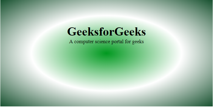
1. Radial Gradient – evenly spaced color stops:
In CSS, by default, the fade happens at an equal rate. The following figure shows the Radial Gradient with even color stops.
Color stops: Color stops inform the browsers that what color to use, at the starting point of the gradient & where to stop. By default, they are equally spaced but we can overrule it by providing the specific color stops.
Example: This example illustrates the radial-gradient having evenly spaced color stops.
HTML
<!DOCTYPE html>
<html>
<head>
    <title>CSS Gradients</title>
    <style>
    #main {
        height: 350px;
        width: 700px;
        background-color: white;
        background-image: radial-gradient(#090,
                                  #fff, #2a4f32);
    }

    .gfg {
        text-align: center;
        font-size: 40px;
        font-weight: bold;
        padding-top: 80px;
    }

    .geeks {
        font-size: 17px;
        text-align: center;
    }
    </style>
</head>

<body>
    <div id="main">
        <div class="gfg">GeeksforGeeks</div>
        <div class="geeks">
          computer science portal for geeks
        </div>
    </div>
</body>
</html>
Output:
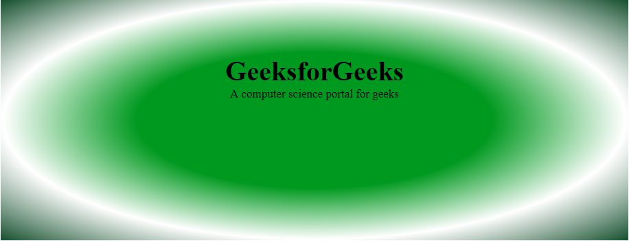
2. Radial Gradient- unevenly spaced color stops:
CSS allows the user to have variation in spacing of color stops while applying the radial-gradient feature.
Example: This example illustrates the radial-gradient having unevenly spaced color stops.
HTML
<!DOCTYPE html>
<html>
<head>
    <title>CSS Gradients</title>
    <style>
    #main {
        height: 350px;
        width: 100%;
        background-color: white;
        background-image: radial-gradient(#090
                              40%, #fff, #2a4f32);
    }

    .gfg {
        text-align: center;
        font-size: 40px;
        font-weight: bold;
        padding-top: 80px;
    }

    .geeks {
        font-size: 17px;
        text-align: center;
    }
    </style>
</head>

<body>
    <div id="main">
        <div class="gfg">GeeksforGeeks</div>
        <div class="geeks">
          A computer science portal for geeks
        </div>
    </div>
</body>
</html>
Output:
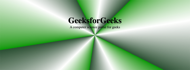
3. CSS Conic Gradients:
Unlike radial gradients, a conic gradient is defined by colors that transition in a circular pattern and rotate around a central point to complete a 360-degree rotation. By default, the central point will be positioned at the center of the container (50%, 50%). Similar to linear gradients, conic gradients can be rotated by defining an angle value.
Syntax:
background-image: conic-gradient(from angle at position, start-color, ..., last-color);
The conic-gradient can be implemented in the following ways:
1. Angles on Conic Gradients:
CSS allows the user to implement the rotation (in clockwise direction) of conic gradients.
Example: This example illustrates a conic gradient with a 45 degrees rotation, where the coordinates (x, y) of the central point are respectively 50% and 50% of the container’s dimensions.
HTML
<!DOCTYPE html>
<html>
<head>
    <title>CSS Gradients</title>
    <style>
    #main {
        height: 350px;
        width: 100%;
        background-color: white;
        background-image: conic-gradient(from 45deg at 50% 50%, #090, #fff, #2a4f32);
    }

    .gfg {
        text-align: center;
        font-size: 40px;
        font-weight: bold;
        padding-top: 80px;
    }

    .geeks {
        font-size: 17px;
        text-align: center;
    }
    </style>
</head>

<body>
    <div id="main">
        <div class="gfg">GeeksforGeeks</div>
        <div class="geeks">
          A computer science portal for geeks
        </div>
    </div>
</body>
</html>
Output:

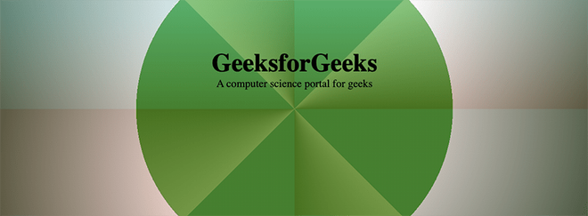
2. Repeating Conic Gradient:
CSS also allows the user to implement multiple conic gradients using the repeating-conic-gradient() function.
Example: This example illustrates the previous conic-gradient repeated fives times.
HTML
<!DOCTYPE html>
<html>
<head>
    <title>CSS Gradients</title>
    <style>
    #main {
        height: 350px;
        width: 100%;
        background-color: white;
        background-image: repeating-conic-gradient(from 45deg at 50% 50%, #009900ff 0%, #ffffffff 10%, #2a4f32ff 20%);
    }

    .gfg {
        text-align: center;
        font-size: 40px;
        font-weight: bold;
        padding-top: 80px;
    }

    .geeks {
        font-size: 17px;
        text-align: center;
    }
    </style>
</head>

<body>
    <div id="main">
        <div class="gfg">GeeksforGeeks</div>
        <div class="geeks">
          A computer science portal for geeks
        </div>
    </div>
</body>
</html>
Output:
Overlaying Gradients
You can add multiple gradients within a single background and adjust color transparency to create more advanced effects. Since designing these gradients can be tricky, using a CSS gradient editor can make the design process easier.
Example: This example illustrates three stacked gradients: a repeating conic gradient on top, followed by a linear gradient, and a radial gradient at the bottom.
HTML
<!DOCTYPE html>
<html>
<head>
    <title>CSS Gradients</title>
    <style>
    #main {
        height: 350px;
        width: 100%;
        background-color: white;
        background-image:
repeating-conic-gradient(from 0deg at 50% 50%, #008a9933 0% 12.5%, #ffffff33 12.5%, #2a445133 25%),
linear-gradient(360deg, #9936004d 0% 50%, #ffffff4d 100%),
radial-gradient(circle farthest-corner at 50% 50%, #009900ff 0% 50%, #ffffffff 50%, #2a4f32ff 100%);
    }

    .gfg {
        text-align: center;
        font-size: 40px;
        font-weight: bold;
        padding-top: 80px;
    }

    .geeks {
        font-size: 17px;
        text-align: center;
    }
    </style>
</head>

<body>
    <div id="main">
        <div class="gfg">GeeksforGeeks</div>
        <div class="geeks">
          A computer science portal for geeks
        </div>
    </div>
</body>
</html>
Output:
Supported Browser:
- Google Chrome 26.0
- Microsoft Edge 12.0
- Firefox 16.0
- Opera 12.1
- Internet Explorer 10.0
- Safari 6.1
Like Article
Suggest improvement
Share your thoughts in the comments
Please Login to comment...