How to Add a Shadow to an Element ?
Last Updated :
18 Mar, 2024
Adding shadow to the elements enhances the appearance of the UI elements. Shadow is a property that makes the element look in the 3D visuals.
Below are some of the approaches to add shadow to an element:
Using drop-shadow() filter property
In this approach, we are using the CSS filter property with the drop-shadow() function to apply a shadow effect to the specified HTML element. The drop-shadow() function takes parameters for horizontal and vertical offsets, blur radius, and color to create the shadow effect.
Syntax:
filter: drop-shadow(20px 20px 30px rgba(255, 0, 0, 0.5));
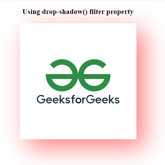
Example: The below example uses the CSS drop-shadow() filter property to add a shadow to an element.
HTML
<!DOCTYPE html>
<html>

<head>
    <title>Example 1</title>
    <style>
        body {
            text-align: center;
        }

        .imageEle-Shadow {
            width: 300px;
            height: auto;
            filter:
                drop-shadow(20px 20px 30px rgba(255, 0, 0, 0.5));
        }
    </style>
</head>

<body>
    <h3>Using drop-shadow() filter property</h3>
    <img class="imageEle-Shadow" src=
"https://media.geeksforgeeks.org/wp-content/uploads/20230816191453/gfglogo.png">
</body>

</html>
Output:
Using box-shadow Property
In this approach, we are using the CSS box-shadow property to add a shadow effect to the specified HTML elements. The box-shadow property allows for the creation of shadows with parameters such as horizontal and vertical offsets, blur radius, spread radius, and color.
Syntax:
box-shadow: -5px -5px 10px rgb(255, 0, 0);
Example: The below example uses the box-shadow property to add a shadow to an element.
HTML
<!DOCTYPE html>
<html>

<head>
    <title>Example 2</title>
    <style>
        body {
            text-align: center;
        }

        .button-shadow {
            padding: 10px 20px;
            background-color: #fffd71;
            color: rgb(0, 0, 0);
            border: none;
            cursor: pointer;
            border-radius: 5px;
            margin-bottom: 40px;
            box-shadow: 0px 0px 30px green;
        }

        .div-shadow {
            width: 100px;
            height: 100px;
            background-color: #f0f0f0;
            margin: 0 auto 20px;
            border-radius: 10px;
            box-shadow: -5px -5px 10px rgb(255, 0, 0);
        }
    </style>
</head>

<body>
    <h3>
        User Using box-shadow property
    </h3>
    <button class="button-shadow">
        Click Me
    </button>
    <div class="div-shadow">
        Box shadow applied
    </div>
</body>

</html>
Output:

Share your thoughts in the comments
Please Login to comment...