How does the SVG Viewbox & Viewport work in CSS ?
Last Updated :
04 Apr, 2024
SVG (Scalable Vector Graphics) is a format used to create graphics on the web that can scale without losing quality. Within SVG, two important concepts are the viewBox and viewPort, which play crucial roles in how SVG elements are displayed and scaled.
What is SVG ViewBox?
The viewBox attribute in SVG defines the coordinate system and the dimensions of the “viewable” area within an SVG element. It specifies the position and dimensions of the SVG content relative to the SVG canvas. For example, a viewBox of “0 0 100 100” means that the SVG content covers an area from (0, 0) to (100, 100) units.
What is SVG ViewPort?
The viewPort (or viewport) refers to the area where an SVG image is displayed on the screen or within an HTML document. It is the visible area that contains the SVG content. The width and height attributes of the SVG element determine the size of the viewport.
How Do They Work Together?
- The
viewBox defines the coordinate system and content area. - The
width and height attributes of the SVG element define the viewport size. - When the viewBox and viewport have different aspect ratios, the SVG content is scaled to fit the viewport while maintaining its proportions.
- If the aspect ratios match, the SVG content is displayed without distortion.
Example: Illustration of Inline SVG with viewbox and viewport Attributes
HTML
<!DOCTYPE html>
<html lang="en">

<head>
    <meta charset="UTF-8">
    <meta name="viewport"
          content="width=device-width, initial-scale=1.0">
    <title>Inline SVG Example</title>
    <style>
        body {
            font-family: Arial, sans-serif;
            background-color: #f7f7f7;
        }

        .container {
            width: 80%;
            margin: 0 auto;
            text-align: center;
            padding-top: 50px;
        }

        .svg-container {
            width: 100px;
            height: 100px;
            display: inline-block;
            margin-top: 20px;
        }
    </style>
</head>

<body>
    <div class="container">
        <h1>Inline SVG Example</h1>
        <div class="svg-container">
            <svg viewBox="0 0 100 100"
                 width="100" height="100"
                 preserveAspectRatio="xMidYMid meet">
                <circle cx="50" cy="50" r="40" fill="blue" />
            </svg>
        </div>
    </div>
</body>

</html>
Output:

Employing External SVG with viewbox and viewport Attributes
In this method, we put the SVG picture in a separate file and then add it to our webpage using a special tag called <object>. The viewbox helps us to define the size and shape of the picture, and the viewport attributes width and height help us to control the size of the SVG within its containing element. preserveAspectRatio ensures that the SVG maintains its aspect ratio.
Syntax:
<object type="image/svg+xml" data="path/to/svg" width="value"
               height="value" style="preserveAspectRatio: value;">
</object>
In this syntax:
type="image/svg+xml" specifies that the object contains an SVG image.data="path/to/svg" points to the external SVG file.width="value" and height="value" control the dimensions of the SVG within the object.
Example: Illustration of Employing External SVG with viewbox and viewport Attributes
HTML
<!DOCTYPE html>
<html lang="en">

<head>
    <meta charset="UTF-8">
    <meta name="viewport"
          content="width=device-width, initial-scale=1.0">
    <title>
          External SVG with viewbox
          and viewport Attributes
      </title>
    <style>
        body {
            display: flex;
            justify-content: center;
            align-items: center;
            height: 100vh;
            margin: 0;
        }

        .container {
            text-align: center;
        }

        svg {
            display: block;
            margin: 0 auto;
        }
    </style>
</head>

<body>
    <div class="container">
        <h1>
              External SVG with viewbox
              and viewport Attributes
          </h1>
        <!-- External SVG embedded with specified
             viewBox and viewport attributes -->
        <svg xmlns="http://www.w3.org/2000/svg"
             viewBox="0 0 100 100" width="300" height="200"
             style="border:1px solid black;">
            <circle cx="50" cy="50" r="40" stroke="black"
                    stroke-width="3" fill="red" />
        </svg>
    </div>
</body>

</html>
Output:

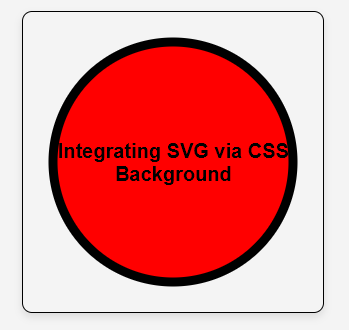
Integrating SVG via CSS Background with viewBox and viewport Attributes:
In this method we use SVG as a background image in CSS. The viewbox helps us to define the size and shape of the picture, and the viewport attributes width and height help us to control the size of the SVG within its containing element. preserveAspectRatio ensures that the SVG maintains its aspect ratio. The background-size property controls how the SVG scales within its container.
Syntax for HTML:
<div class="svg-background"></div>
Syntax for CSS:
.svg-background {
  background-image: url('path/to/svg');
  background-size: value;
}
Example: Illustration of Integrating SVG via CSS Background with viewBox and viewport Attributes
HTML
<!DOCTYPE html>
<html lang="en">

<head>
    <meta charset="UTF-8">
    <meta name="viewport"
          content="width=device-width, initial-scale=1.0">
    <title>
          Integrating SVG
          via CSS Background
      </title>
    <link rel="stylesheet"
          href="style.css">
</head>

<body>
    <div class="container">
        <div class="content">
            <h1>
                  Integrating SVG
                  via CSS Background
              </h1>
        </div>
    </div>
</body>

</html>
/* style.css */

body {
    margin: 0;
    font-family: Arial, sans-serif;
    background-color: #f4f4f4;
    display: flex;
    justify-content: center;
    align-items: center;
    height: 100vh;
}

.container {
    width: 300px;
    height: 300px;
    background-image: url(
'data:image/svg+xml;utf8,<svg xmlns="http://www.w3.org/2000/svg" viewBox="0 0 100 100"><circle cx="50" cy="50" r="40" stroke="black" stroke-width="3" fill="red" /></svg>');
    background-size: cover;
    background-repeat: no-repeat;
    border: 1px solid black;
    border-radius: 10px;
    box-shadow: 0 4px 8px rgba(0, 0, 0, 0.1);
    overflow: hidden;
    display: flex;
    justify-content: center;
    align-items: center;
}

.content {
    text-align: center;
    color: black;
}

h1 {
    font-size: 20px;
    margin-bottom: 10px;
}

p {
    font-size: 8px;
    line-height: 1;
}
Output:
Difference between SVG Viewbox & Viewport
| Aspect | SVG ViewBox | SVG ViewPort |
|---|
| Definition | Defines the coordinate system and content area within the SVG. | Defines the visible area where the SVG content is displayed. |
| Attribute | Defined within the SVG content using the viewBox attribute. | Defined by the width and height attributes of the SVG element. |
| Purpose | Specifies the position and dimensions of the SVG content relative to the SVG canvas. | Determines the size of the visible area that contains the SVG content. |
| Aspect Ratio | Can have different aspect ratios from the viewport. | Usually matches the aspect ratio of the viewport. |
| Scaling Behavior | Determines how SVG content scales and fits within the viewport. | Affects how the SVG image is displayed in terms of size and proportions. |
Share your thoughts in the comments
Please Login to comment...