How to Set Viewport Height & Width in CSS ?
Last Updated :
09 Apr, 2024
Set viewport height and width in CSS is essential for creating responsive and visually appealing web designs. We’ll explore the concepts of setting viewport height and width by using various methods like CSS Units, Viewport-Relative Units, and keyframe Media Queries.
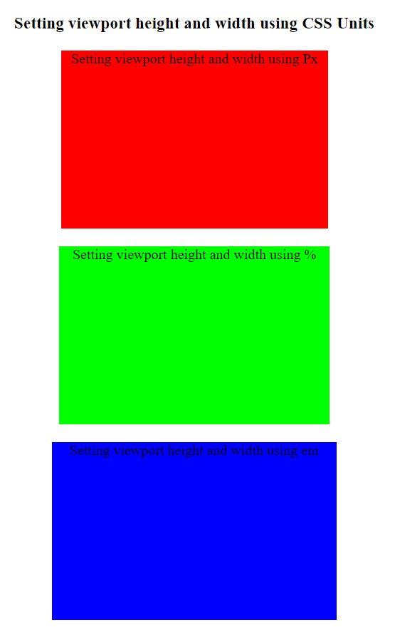
Setting viewport height and width using CSS Units
CSS units such as pixels (px), percentages (%), and ems (em) allow to specify fixed or relative dimensions for elements based on the viewport size.
Example: Setting viewport height and width using CSS Units.
HTML
<!DOCTYPE html>
<html lang="en">

<head>
    <meta charset="UTF-8">
    <meta name="viewport"
          content="width=device-width, initial-scale=1.0">
    <title>Using CSS Units</title>
    <style>
        .container {
            text-align: center;
        }

        .box {
            height: 200px;
            margin: 20px auto;
            text-align: center;
        }

        .px-div {
            background-color: #ff0000;
            width: 300px;
        }

        .percent-div {
            background-color: #00ff00;
            width: 20%;
        }

        .em-div {
            background-color: #0000ff;
            width: 20em;
        }
    </style>
</head>

<body>
    <h3 class="container">
      Setting viewport height and width using CSS Units
      </h3>
    <div class="box px-div">
      Setting viewport height and width using Px
      </div>
    <div class="box percent-div">
      Setting viewport height and width using %
      </div>
    <div class="box em-div">
      Setting viewport height and width using em
      </div>
</body>

</html>
Output:
Output
Setting viewport height and width using Viewport-Relative Units
This approach ensures that elements scale proportionally with the viewport, offering a flexible and intuitive way to create responsive layouts. Viewport-relative units, including vh (viewport height) and vw (viewport width), enable developers to define element dimensions relative to the size of the viewport.
Example: Setting viewport height and width using Viewport-Relative Units.
HTML
<!DOCTYPE html>
<html lang="en">

<head>
    <meta charset="UTF-8">
    <meta name="viewport"
          content="width=device-width, initial-scale=1.0">
    <title>Setting viewport height and width
             using Viewport-Relative Units
      </title>
    <style>
        body,
        html {
            height: 100%;
            margin: 0;
            display: flex;
            justify-content: center;
            align-items: flex-start;
        }

        .container {
            margin-top: 20px;
        }

        .box {
            width: 50vw;
            height: 50vh;
            background-color: #ff0000;
        }

        h3 {
            text-align: center;
        }
    </style>
</head>

<body>
    <div class="container">
        <h3>Setting viewport height and width
              using Viewport-Relative Units
          </h3>
        <div class="box"></div>
    </div>
</body>

</html>
Output:

Output
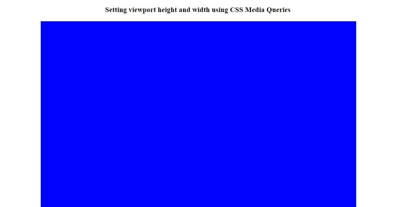
In this approach, the .box element has a default height of 500px and adjusts to 50px on screens smaller than 768px using CSS media queries, demonstrating how to set viewport height and width dynamically based on screen size.
Example: Setting viewport height and width using CSS Media Queries.
HTML
<!DOCTYPE html>
<html lang="en">

<head>
    <meta charset="UTF-8">
    <meta name="viewport"
          content="width=device-width, initial-scale=1.0">
    <title>Media Queries</title>
    <style>
        .box {
            width: 80%;
            height: 500px;
            background-color: #0000ff;
            margin-left: 10vw;
        }

        @media screen and (max-width: 768px) {
            .box {
                height: 50px;
            }
        }

        h3 {
            text-align: center;
        }
    </style>
</head>

<body>
    <h3>Setting viewport height and width
          using CSS Media Queries
      </h3>
    <div class="box"></div>
</body>

</html>
Output:
Output
Share your thoughts in the comments
Please Login to comment...