Vision is sensation and perception at the same time. The human vision system is very complex and does not act like a camera. The eyes are the doorway to our brain, that’s in perceiving information based on how it appears. A lot may be inferred about a particular thing or product via eyes. Eyes can also provide insight into how people receive information and what factors shape their behavior and judgments. There is a narrow spectrum of light between Ultraviolet and infrared visible to human eyes.
In this article, we’ll be discussing:
- Human vision system
- How eye tracking works
- A brief about eye-scanning patterns
- Types of color weakness and how to design for such cases
So to start with the Human Vision System, let’s look into how the Human eye works.
As mentioned “Eyes are NOT like cameras”, because eyes do not capture everything in a frame, unlike cameras. Eye only focuses on a particular area which is the size of our thumb. From research, it is proved that the peak or highest cone concentration is at the Central Fovea which falls at the 90-degree angle from our eye. Anything beyond that central fovea is blurry and ignored, meaning it falls under the blind spot area. Vision is very complex. It can process 30 different specific areas such as shapes, colors, and emotions. Apart from visual processing, the human brain is more sensitive to “Faces”. Anywhere we see similar people and faces on screen we feel comfortable.
On the face “Eyes” plays the most important role. More human-like eyes are pleasing to see as compared to robotic eyes. By this, you might be wondering then how the Avatars are working, so the answer is that avatars are us trying to mimic human faces. the more realistic these avatars look, the better the experience it would give.
To complete the understanding of human faces and visual processing in the brain, there is a dedicated cortex in the brain called the “Amygdala”, which is called the brain’s emotional center. The amygdala helps easy face and facial experience recognition. Suppose you’re looking at an inverted face, your brain would try its best to recognize and create a meaningful experience, such as smiling, crying, etc.
So this was more or less about the human faces and visual processing, now to understand vision, eye tracking, and scanning a little better there are a few terms that one should know such as:
- Fovea: It is sharp central vision required for reading, driving, and other activities involving the major focus on visual detail in humans.
- Margin: It refers to the frame which is seen while reading or focusing on something. Not everything inside a frame is visible.
- Focus: The area at a particular moment which is focused.
- Fringe: Under the margin(frame), everything else which is not being focused and is blurry is called the Fringe.
- Foveation: A single point of vision, which helps in eye tracking. Which tracks eye movement.
- Saccades: It’s the movement of the eyes between different fixation spots. Saccadic vision is blurry as eyes are trying to locate and focus on a particular element. Saccades give the routes through which the eyes travel on a page.
- Fixation: The internal time when eyes are kept aligned while reading. Fixation shows which are the most looked-at areas on the page.
Now that we are pretty familiar with the terms used while eye tracking, let’s look into how eye tracking is done and its use.
UX designers can get a lot of useful information from eye-tracking on how users behave and traverse on desktop and mobile devices, and how they perceive and interact with the UI. But it is more expensive than heatmaps because eye-tracking requires specialized equipment like Oculometer, which helps track eye movement. However, with the advent of software that can turn any webcam or smartphone selfie camera into an eye tracker, performing eye-tracking studies has lately become far more affordable.
Eye tracking is generally used while usability testing to check how user behavior is with a product/screen. It helps in understanding what users notice and for how long the fixation is made possible by eye tracking.
When talking about eye tracking there are 2 maps that are very confusingly used by beginners such as:
1. Heat Maps
It is a popular mapping method, which is used in eye tracking that helps in providing the measure of “What areas/elements are MOST looked at” using fixations. The heat map is a group analysis done by placing individual heat maps on top of each other. On heat maps, green color indicates fewer fixations whereas red indicates most fixations.
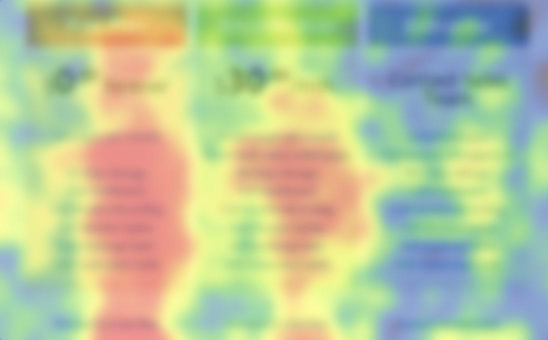
Heat maps, showing high and least-viewed areas
2. Fixation Maps
It is another type of mapping method, which provides the measure of “What areas are looked at first). Fixation maps are individual measures that give an idea about how a user has traversed through a page. Movement between areas is also shown by lines that show the saccadic motion.
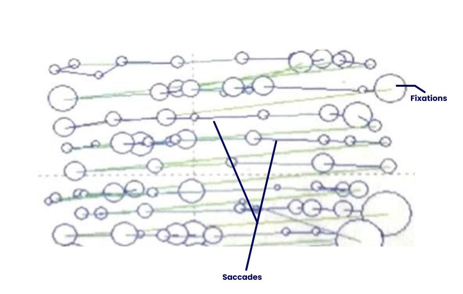
Fixation Map, showing fixations and saccades
While analyzing the eye tracking and maps there are few patterns in which users scan the information on a page. These are called scanning patterns, which help in better information perceivability. The main idea for providing better visual scanning of the information is to minimize the visual load.
Let’s look into how as a designer one can leverage the research on scanning and how to attract scanning.
How Do Attract Scanning?
People generally scan a page or screen in either F or Z shape, but it is not always necessary that this would be the only scanning pattern. It is also noticed in some cases that depending on the content of places such as faces, colors, and text people do jump scanning while traversing through a screen.
Then how can we say which shape or pattern would help us achieve the goal?
It all depends on the product context, placement of unique elements, and how organized & balanced is the layout to scan.
Tricks That influence Eye Tracking
Scanning is nothing but how the user is moving the eye to read and understand the content. Scanning helps in easy eye tracking. Through research and exploring multiple websites, it is found that people tend to scan the following thing first:
- Human Faces
- Rough or asymmetrical surfaces
- Saturated colors
- Spaced areas
- New & Unique element
People form a mental model of how frequently something is occurring, just like a CTA button. Any website that a person visits very often has a clear idea of what steps are involved to reach the target, how many touchpoints are there, and where a particular element like a button is located. But when something unique or any change occurs in that process it gets noticed easily.
For Example Google search page, generally on regular days the page remains the same but on any festival or occasion there are some illustrations and additional. So basically anything which is new or unique placed on the screen gets noticed instantly.
Brief About Color Weakness
Now let’s also know about some color weaknesses and how to design while keeping these weaknesses in mind.
Color weakness also called “Color Blindness” happens due to the absence or defect of a particular cone.
Type of weakness that exists:
- Protanopia: Occurs due to the defect or absence of red color(L cone). It is also known as “Red deficiency” and people having this type of weakness are called “Red deficient”.
- Deuteranopia: Occurs due to the defect or absence of green color(M cone). It is also known as “Green deficiency” and people having this type of weakness are called “Green deficient”.
- Tritanopia: Occurs due to the defect or absence of blue color(S cone). It is also known as “Blue deficiency” and people having this type of weakness are called “Blue deficient”.
- Rod Monochromacy: Occurs due to dysfunctional or missing cones. It is also known as “Achromatopsia”.

Types of Colour Weaknesses
To detect if a person is color blind, the “Ishihara Test” is carried out. In this test, people are shown a sheet containing colorful bubbles within which some numbers are hidden. People who have any type of weakness might not be able to see or might not be able to tell a correct number but people who do not have any weakness can clearly see the numbers.
Things to Consider While Designing For People Who Have These Color Weaknesses
This was all about the color weakness, so now also check how to design optimally for people who are having these color weaknesses. For such cases, while designing screens it is important to pay attention to visuals not only through colors but through how each element on the screen is appearing. Making necessary elements pop into these people is crucial.
Provide more than one method for people to get cues. This is called redundant coding, where not just one method but using multiple methods like shapes, colors, and use of other senses like sound and touch is given to people so that they notice UI and any changes that are happening. For example, Traffic lights have only 3 colors, but people who have color blindness might not be able to optimally sense the signal, so in such a case if along with color we use shapes to signify traffic signals would be a win-win for everyone.
Things to consider while designing for color weakness:
- Use contrasting gray scales to help visibility for people having any type of color blindness.
- Incorporate more than one method to help people get cues.
- Avoid using Blue and red as background and foreground or even text when using both colors together. This causes “Chromostereopsis” which irritates vision.
- Always design monochrome and add color to enhance
- Always check contrast, which depends upon both color and brightness
- Follow WCAG 2.0 level for optimal contrast check
Conclusion
Vision is a very important tool in UX design when balanced gives the user the best experience. Everything a user sees and scans on any screen is through the eye therefore always consider pleasing eye along with usability. So that’s all for this article, and I’ll get you more information on such concepts.
Share your thoughts in the comments
Please Login to comment...