Flutter – TextButton Widget
Last Updated :
18 Oct, 2022
TextButton is a built-in widget in Flutter which derives its design from Google’s Material Design Library. It is a simple Button without any border that listens for onPressed and onLongPress gestures. It has a style property that accepts ButtonStyle as value, using this style property developers can customize the TextButton however they want.
The constructor of TextButton Class:
const TextButton({
  Key? key,
  required void Function()? onPressed,
  void Function()? onLongPress,
  void Function(bool)? onHover,
  void Function(bool)? onFocusChange,
  ButtonStyle? style,
  FocusNode? focusNode,
  bool autofocus = false,
  Clip clipBehavior = Clip.none,
  required Widget child,
})
Properties of TextButton Widget:
- onPressed: (required) This property takes a Function that returns void. That function will be invoked whenever the TextButton is pressed.
- onLongPress: This property also takes a Function that returns void. That function will be invoked whenever the TextButton is long pressed.
- onHover: onHover property takes a void Function which takes a boolean value as its only parameter. The passed parameter is true if a pointer entered the button response area and is false when a pointer leaves the button response area.
- onFocusChange: onFocusChange property also takes a void Function which takes a boolean value as its only parameter. The passed parameter is true if the button gains focus and is false if the button loses focus.
- style: This optional property accepts ButtonStyle as an object. It is used for customizing the look of the TextButton.
- focusNode: An optional focus node to use as the focus node for TextButton.
- autofocus: Pass true if you want this widget as the initial focus when no other node in its scope is currently focused. The default value is false.
- clipBehaviour: Accept value of type Clip enum. The default value is Clip.none.
- child: (required) The child widget of TextButton Widget.
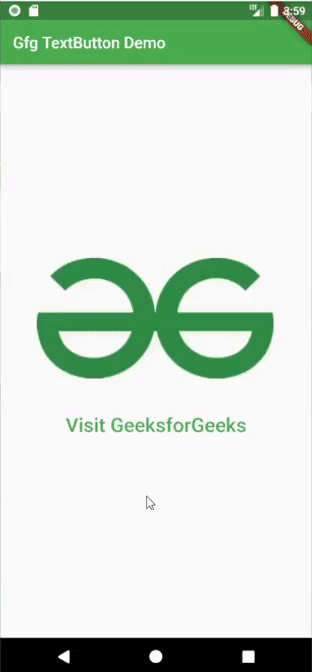
Example1: In the example below, we used TextButton’s onPressed property to launch the URL when we press the TextButton.
Dart
import 'package:flutter/material.dart';
import 'package:url_launcher/url_launcher.dart';
void main() {
runApp(const MyApp());
}
class MyApp extends StatelessWidget {
const MyApp({Key? key}) : super(key: key);
@override
Widget build(BuildContext context) {
return MaterialApp(
title: 'Gfg TextButton Demo',
theme: ThemeData(
primarySwatch: Colors.green,
),
home: const Home(),
);
}
}
class Home extends StatelessWidget {
const Home({Key? key}) : super(key: key);
@override
Widget build(BuildContext context) {
return Scaffold(
appBar: AppBar(
title: Text("Gfg TextButton Demo"),
),
body: Center(
child: Column(
mainAxisAlignment: MainAxisAlignment.center,
children: [
Padding(
padding: const EdgeInsets.only(bottom: 35),
child: Image.network(
),
TextButton(
child: Text(
"Visit GeeksforGeeks",
style: TextStyle(fontSize: 25),
),
onPressed: () async {
if (await canLaunch(_url)) {
launch(_url);
} else {
throw "Could not launch $_url";
}
},
)
],
),
),
);
}
}
|
Output:
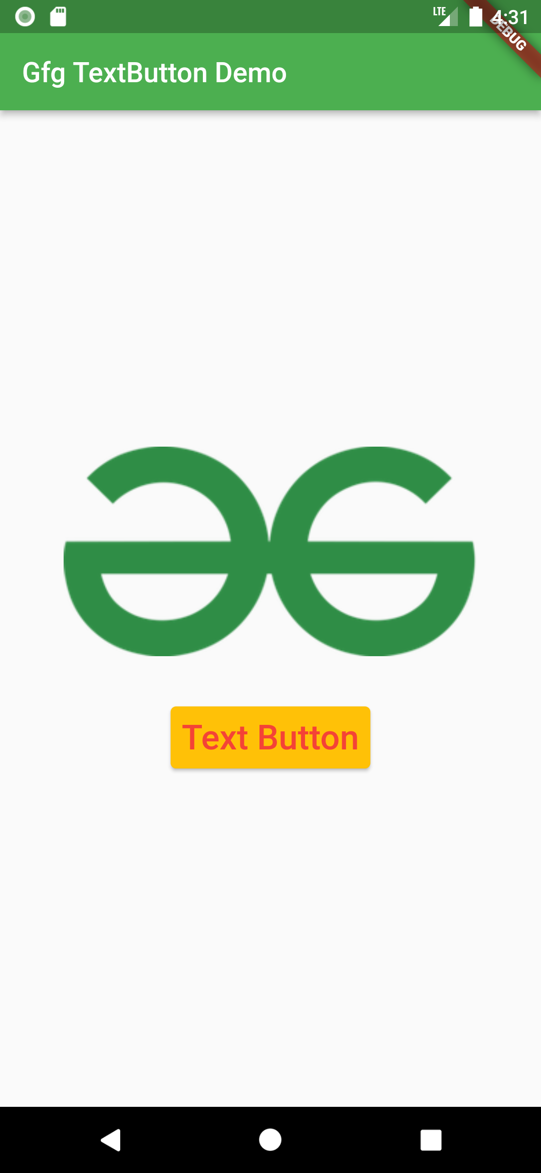
Example2: In this example, we used TextButton’s style property to change the style of the text button.
Dart
import 'package:flutter/material.dart';
import 'package:url_launcher/url_launcher.dart';
void main() {
runApp(const MyApp());
}
class MyApp extends StatelessWidget {
const MyApp({Key? key}) : super(key: key);
@override
Widget build(BuildContext context) {
return MaterialApp(
title: 'Gfg TextButton Demo',
theme: ThemeData(
primarySwatch: Colors.green,
),
home: const Home(),
);
}
}
class Home extends StatefulWidget {
const Home({Key? key}) : super(key: key);
@override
State<Home> createState() => _HomeState();
}
class _HomeState extends State<Home> {
String _buttonText = "Text Button";
@override
Widget build(BuildContext context) {
return Scaffold(
appBar: AppBar(
title: Text("Gfg TextButton Demo"),
),
body: Center(
child: Column(
mainAxisAlignment: MainAxisAlignment.center,
children: [
Padding(
padding: const EdgeInsets.only(bottom: 35),
child: Image.network(
),
TextButton(
child: Text(
_buttonText,
style: TextStyle(fontSize: 25),
),
onPressed: () {},
style: TextButton.styleFrom(
foregroundColor: Colors.red,
elevation: 2,
backgroundColor: Colors.amber),
),
],
),
),
);
}
}
|
Output:
Share your thoughts in the comments
Please Login to comment...