Design a Progress Bar with Smooth Animations using Tailwind CSS
Last Updated :
22 Mar, 2024
A progress bar is a type of component that tracks the percentage completion of a particular task and makes it visible to the users to enhance user interactivity.
Steps to create the project
Step 1: Create a directory Progress Bar with files: index.html, style.css, and script.js for HTML, CSS, and JavaScript respectively.
Step 2: Add the below CDN link for Tailwind CSS to your HTML document.
<link href="https://cdn.jsdelivr.net/npm/tailwindcss@2.2.19/dist/tailwind.min.css" rel="stylesheet">
Step 3: Add keyframes & animations in the CSS file and functionalities in script.js and rest styles through class names in the index.html file.
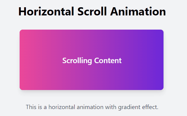
Example 1: The below code will help you to create a horizontal progress bar using Tailwind CSS.
HTML
<!DOCTYPE html>
<html lang="en">

<head>
    <meta charset="UTF-8">
    <meta name="viewport" content=
"width=device-width, initial-scale=1.0">
    <title>Horizontal Animation</title>
    <link rel="stylesheet" href=
"https://cdn.jsdelivr.net/npm/tailwindcss@2.2.19/dist/tailwind.min.css">
    <style>
        .animate-scroll {
            animation: scroll 2s infinite
              linear forwards alternate;
        }

        @keyframes scroll {
            from {
                transform: translateX(-100%);
            }

            to {
                transform: translateX(0);
            }
        }
    </style>
</head>

<body class="bg-gray-100">
    <div class="container mx-auto py-8">
        <h1 class="text-3xl font-bold
                   text-center mb-8 mt-20">
            Horizontal Scroll Animation
        </h1>
        <div class="flex justify-center
                    items-center">
            <div class="w-96 h-40 bg-gray-200
                        overflow-x-auto
                relative rounded-lg shadow-lg">
                <div class="absolute inset-0
                            bg-gradient-to-r
                    from-pink-500 to-purple-700
                            animate-scroll rounded-lg">
                </div>
                <div class="absolute inset-0
                            flex items-center justify-center
                           text-white text-xl font-semibold">
                    Scrolling Content</div>
            </div>
        </div>
        <p class="text-center mt-8
                  text-gray-600">
            This is a horizontal animation
          with gradient effect.
        </p>
    </div>

</body>

</html>
Output:
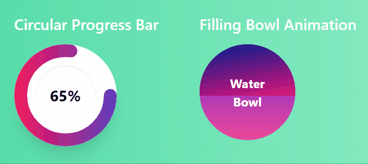
Example 2: The below code will help you to create the circular progress bar and a bowl filling animation.
HTML
<!DOCTYPE html>
<html lang="en">

<head>
    <meta charset="UTF-8">
    <meta name="viewport" content=
"width=device-width, initial-scale=1.0">
    <title>Animation Showcase</title>
    <link rel="stylesheet" href=
"https://cdn.jsdelivr.net/npm/tailwindcss@2.2.19/dist/tailwind.min.css">
    <link rel="stylesheet"
          href="style.css">
</head>

<body class="bg-gradient-to-r
             from-green-400 to-green-200
             min-h-screen flex items-center
             justify-center">
    <div class="flex justify-center gap-16">
        <!-- Circular progress bar -->
        <div class="text-center">
            <h2 class="text-2xl font-semibold
                       text-white mb-4">
                Circular Progress Bar
            </h2>
            <div id="progressContainer"
                 class="bg-white shadow-xl
                       rounded-full w-40 h-40
                       flex items-center justify-center">
                <div id="progressCircle"
                     class="bg-white rounded-full w-24 h-24 flex
                        items-center justify-center shadow-inner">
                    <div id="progressText"
                         class="text-2xl font-bold">
                        0%
                    </div>
                </div>
            </div>
            <svg xmlns="http://www.w3.org/2000/svg"
                 version="1.1" width="160px"
                height="160px" class="mt-4">
                <defs>
                    <linearGradient id="GradientColor">
                        <stop id="gradientStart"
                              offset="0%"
                              stop-color="#e91e63" />
                        <stop id="gradientEnd"
                              offset="100%"
                              stop-color="#673ab7" />
                    </linearGradient>
                </defs>
                <circle id="progressBar"
                        cx="80" cy="80"
                        r="70"
                        stroke-linecap="round" />
            </svg>
        </div>
        <!-- filling bowl animation -->
        <div class="text-center">
            <h2 class="text-2xl font-semibold
                       text-white mb-4">
                Filling Bowl Animation
            </h2>
            <div id="waterContainer"
                 class="bg-gradient-to-t
                        from-pink-500
                        to-purple-700">
                <div id="water"
                     class="h-full bg-white"></div>
                <div id="waterText">Water Bowl</div>
            </div>
        </div>
    </div>
    <script src="script.js"></script>
</body>

</html>
/* Water filling animation */
#water {
    background:
        linear-gradient(350deg, rgb(223, 19, 121), rgb(0, 30, 141));
    animation: water-fill 2s infinite forwards alternate;
}

@keyframes water-fill {
    from {
        height: 0;
    }

    to {
        height: 100%;
    }
}


/* Circular progress bar */
circle {
    fill: none;
    stroke: url('#GradientColor');
    stroke-width: 20px;
    stroke-dasharray: 520;
    stroke-dashoffset: 520;
}

svg {
    position: relative;
    top: -176px;
}

#progressContainer,
#water {
    animation-duration: 1.5s;
    animation-timing-function: ease-in-out;
}

.progress-heading,
.water-heading {
    text-shadow: 2px 2px 4px rgba(0, 0, 0, 0.2);
}

#waterContainer {
    width: 150px;
    height: 150px;
    border-radius: 50%;
    position: relative;
    overflow: hidden;
}

#waterText {
    position: absolute;
    top: 50%;
    left: 50%;
    transform: translate(-50%, -50%);
    color: white;
    font-size: 1.2rem;
    font-weight: bold;
}

#water {
    animation: water-fill 2s infinite forwards alternate;
}

@keyframes water-fill {
    from {
        height: 0;
    }

    to {
        height: 100%;
    }
}
const progressText =
    document.getElementById('progressText');
const progressBar =
    document.getElementById('progressBar');
const gradientEnd =
    document.getElementById('gradientEnd');

let progress = 0;
const updateInterval = 50;
const maxProgress = 65;

function updateProgress() {
    progress++;
    if (progress > maxProgress) {
        clearInterval(interval);
        progress = maxProgress;
    }
    progressText.textContent =
        progress + '%';
    progressBar.style.strokeDashoffset =
        520 - (520 * progress) / 100;

    const gradientProgress = progress / maxProgress;
    gradientEnd.setAttribute('offset',
        `${gradientProgress * 100}%`);
}

updateProgress();
const interval = setInterval(updateProgress, updateInterval);
Output:
Share your thoughts in the comments
Please Login to comment...