Create a Mobile Toggle Navigation Menu using HTML, CSS and JavaScript
Last Updated :
22 May, 2023
To create a Mobile Toggle Navigation Menu you need HTML, CSS, and JavaScript. If you want to attach the icons with the menu then you need a font-awesome CDN link. This article is divided into two sections: Creating Structure and Designing Structure.
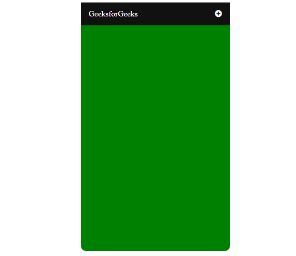
A glimpse of complete Navigation:
Creating Structure: In this section, we will create a basic site structure and also attach the CDN link of the Font-Awesome for the icons which will be used as a menu icon.
CDN links for the Icons from the Font Awesome:
<link rel=”stylesheet” href=”https://cdnjs.cloudflare.com/ajax/libs/font-awesome/4.7.0/css/font-awesome.min.css”>
HTML code to make the structure:
HTML
<!DOCTYPE html>
<html>
<head>
<title>Mobile Navigation Bar</title>
<meta name="viewport"
content="width=device-width, initial-scale=1">
</head>
<body>
<div class="menu-list">
<div class="geeks">
<a href="#" class="">GeeksforGeeks</a>
<div id="menus">
<a href="#">Language</a>
<a href="#">Practice</a>
<a href="#">Interview</a>
<a href="#">Puzzle</a>
</div>
<a href="javascript:void(0);" class="icon"
onclick="geeksforgeeks()">
<i onclick="myFunction(this)"
class="fa fa-plus-circle">
</i>
</a>
</div>
</div>
</body>
</html>
|
Designing Structure: In the previous section, we created the structure of the basic website where we are going to use the menu icon. In this section, we will design the structure for the navigation bar.
CSS code of structure:
HTML
/* Navigation bar styling */
.menu-list {
max-width: 300px;
margin: auto;
height: 500px;
color: white;
background-color: green;
border-radius: 10px;
}
/* Logo, navigation menu styling */
.geeks {
overflow: hidden;
background-color: #111;
position: relative;
}
/* Styling navigation menu */
.geeks #menus {
display: none;
}
/* Link specific styling */
.geeks a {
text-decoration: none;
color: white;
padding: 14px 16px;
font-size: 16px;
display: block;
}
/* Navigation toggle menu styling */
.geeks a.icon {
display: block;
position: absolute;
right: 0;
top: 0;
}
/* Hover effect on navigation logo and menu */
.geeks a:hover {
background-color: #ddd;
color: black;
}
|
JavaScript code for the animation menu:
Javascript
function geeksforgeeks() {
let x = document.getElementById("menus");
if (x.style.display === "block") {
x.style.display = "none";
} else {
x.style.display = "block";
}
}
function myFunction(x) {
x.classList.toggle("fa-minus-circle");
}
|
Combine the HTML, CSS, and JavaScript code: This is the final code after combining the above sections. It will be the mobile navigation animated menu.
Example:
HTML
<!DOCTYPE html>
<html>
<head>
<title>Mobile Navigation Bar</title>
<meta name="viewport" content=
"width=device-width, initial-scale=1">
<link rel="stylesheet" href=
<style>
/* Navigation bar styling */
.menu-list {
max-width: 300px;
margin: auto;
height: 500px;
color: white;
background-color: green;
border-radius: 10px;
}
/* Logo, navigation menu styling */
.geeks {
overflow: hidden;
background-color: #111;
position: relative;
}
/* Styling navigation menu */
.geeks #menus {
display: none;
}
/* Link specific styling */
.geeks a {
text-decoration: none;
color: white;
padding: 14px 16px;
font-size: 16px;
display: block;
}
/* Navigation toggle menu styling */
.geeks a.icon {
display: block;
position: absolute;
right: 0;
top: 0;
}
/* Hover effect on navigation logo and menu */
.geeks a:hover {
background-color: #ddd;
color: black;
}
</style>
</head>
<body>
<div class="menu-list">
<div class="geeks">
<a href="#" class="">
GeeksforGeeks
</a>
<div id="menus">
<a href="#">Language</a>
<a href="#">Practice</a>
<a href="#">Interview</a>
<a href="#">Puzzle</a>
</div>
<a href="javascript:void(0);"
class="icon" onclick="geeksforgeeks()">
<i onclick="myFunction(this)"
class="fa fa-plus-circle">
</i>
</a>
</div>
</div>
<script>
// Function to toggle the bar
function geeksforgeeks() {
let x = document.getElementById("menus");
if (x.style.display === "block") {
x.style.display = "none";
} else {
x.style.display = "block";
}
}
// Function to toggle the plus menu into minus
function myFunction(x) {
x.classList.toggle("fa-minus-circle");
}
</script>
</body>
</html>
|
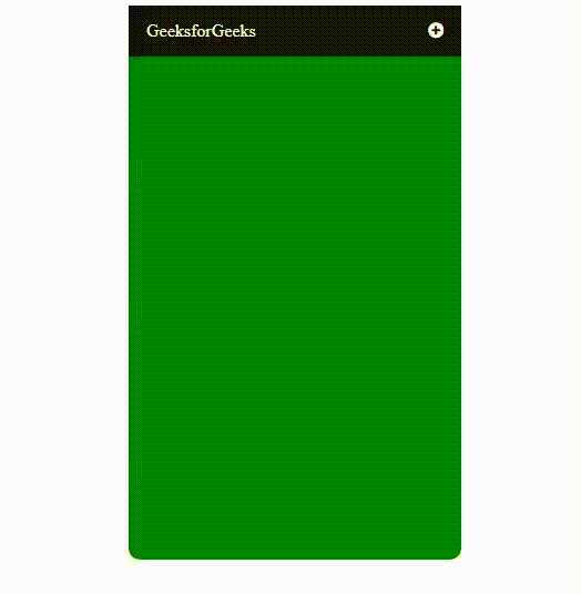
Output:
Share your thoughts in the comments
Please Login to comment...