CSS Image Reflection
Last Updated :
20 Dec, 2023
CSS Image Reflection is a visual effect where an image appears as if it is reflected on some reflective surface, thereby generating a mirrored or inverted version of the original image below it. To achieve the Image Reflection in CSS, the CSS box-reflect Property can be applied. The value of the box-reflect property can be like above, below, right , or left.
However, the box-reflect Property is not supported by all browsers. Use -webkit-box-reflect property for WebKit-based browsers that are Chrome and Safari. There are a variety of values that can be defined to achieve the reflection in various directions. Additionally, the reflection with fading effect can also be done with the help of linear-gradient.
Note: Use –webkit– to the box-reflect property, to see the effect on the specific browser.
Image Reflection below the Original Image
The original image can be reflected below the original one. To achieve it, we need to set the value of the box-reflect Property as below.
Example: The example below illustrates the reflection of an image using the property box-reflect with the value below.
HTML
<!DOCTYPE html>
<html lang="en">
<head>
<meta charset="UTF-8">
<meta name="viewport"
content="width=device-width,
initial-scale=1.0">
<title>Image Reflection</title>
<style>
.gfg {
font-size: 40px;
font-weight: 700;
color: green;
}
.texttitle {
font-size: 20px;
padding: 10px;
}
img {
width: 30%;
height: 30%;
-webkit-box-reflect: below;
}
.box {
display: flex;
flex-direction: column;
align-items: center;
}
</style>
</head>
<body>
<div class="box">
<div class="gfg">GeeksforGeeks</div>
<div class="texttitle">
CSS Image Reflection with
property box-reflect and
value below
</div>
<img src=
alt="GfGwebdesign">
</div>
</body>
</html>
|
Output:

Image Reflection to the Right
To achieve the Image Reflection to the right side of the original image, we need to set the value of the CSS box-reflect Property as right.
Example: The example below illustrates the reflection of an image using the property box-reflect with the value right.
HTML
<!DOCTYPE html>
<html lang="en">
<head>
<meta charset="UTF-8">
<meta name="viewport"
content="width=device-width,
initial-scale=1.0">
<title>Image Reflection</title>
<style>
.gfg {
font-size: 40px;
font-weight: 700;
color: green;
}
.texttitle {
font-size: 20px;
padding: 10px;
}
img {
width: 30%;
height: 30%;
-webkit-box-reflect: right;
}
.box {
display: flex;
flex-direction: column;
}
</style>
</head>
<body>
<div class="box">
<div class="gfg">GeeksforGeeks</div>
<div class="texttitle">
CSS Image Reflection with
property box-reflect and
value right
</div>
<img src=
alt="GfGwebdesign">
</div>
</body>
</html>
|
Output:
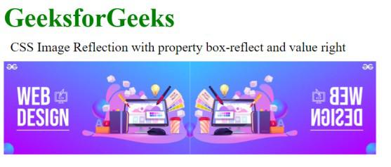
Image Reflection offset
For defining the space between the original image and the reflection of the image.
Example: The example below illustrates the reflection of an image using the property box-reflect with the value right and space between the original image and the reflection.
HTML
<!DOCTYPE html>
<html lang="en">
<head>
<meta charset="UTF-8">
<meta name="viewport"
content="width=device-width,
initial-scale=1.0">
<title>Image Reflection</title>
<style>
.gfg {
font-size: 40px;
font-weight: 700;
color: green;
}
.texttitle {
font-size: 20px;
padding: 10px;
}
img {
width: 400px;
height: 300px;
-webkit-box-reflect: right 10px;
}
.box {
display: flex;
flex-direction: column;
}
</style>
</head>
<body>
<div class="box">
<div class="gfg">GeeksforGeeks</div>
<div class="texttitle">
CSS Image Reflection with
property box-reflect and
value right with space
</div>
<img src=
alt="GfGwebdesign">
</div>
</body>
</html>
|
Output:

Image Reflection with Gradient
To achieve the Image Reflection with gradient, we need to set the CSS box-reflect Property with the direction and linear gradient.
Example: The example below illustrates the reflection of an image using the property box-reflect with the value right and fading effect using linear-gradient.
HTML
<!DOCTYPE html>
<html lang="en">
<head>
<meta charset="UTF-8">
<meta name="viewport"
content="width=device-width,
initial-scale=1.0">
<title>Image Reflection</title>
<style>
.gfg {
font-size: 40px;
font-weight: 700;
color: green;
}
.texttitle {
font-size: 20px;
padding: 10px;
}
img {
width: 400px;
height: 300px;
-webkit-box-reflect:
right 10px linear-gradient(to right,
rgba(62, 5, 5, 0.3),
rgba(95, 91, 80, 0.3));
}
.box {
display: flex;
flex-direction: column;
}
</style>
</head>
<body>
<div class="box">
<div class="gfg">GeeksforGeeks</div>
<div class="texttitle">
CSS Image Reflection with
property box-reflect and
value right with linear gradient
</div>
<img src=
alt="GfGwebdesign">
</div>
</body>
</html>
|
Output:

Output
Browser Support
- Chrome: 4.0 -webkit-
- Opera: 15.0 -webkit-
- Firefox: Not Supported
- Edge: 79.0 -webkit-
Share your thoughts in the comments
Please Login to comment...