Controlling the specificity of CSS Modules in a Next.js App
Last Updated :
15 Sep, 2023
CSS Modules are one of the popular techniques that are used for local scoping CSS in JavaScript behavioral applications. In Next.js applications, CSS Modules are mostly used to generate the unique class names for our styles, preventing them from conflicting with the styles from different components or libraries. In this article, we will look into the approaches for Controlling the specificity of CSS Modules in a Next.js App.
Approaches for Controlling the Specificity of CSS Modules in a Next.js App
- Combining CSS Modules and Component Hierarchies
- Using Dynamic Styling with Scoped Variables
Steps to Create Next.JS application
Create the New Next.js Application by following the below commands in the VScode terminal.
npx create-next-app css-module-hierarchy
cd css-module-hierarchy
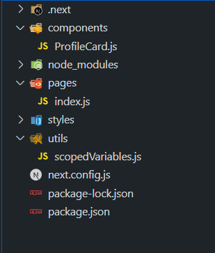
Project Structure
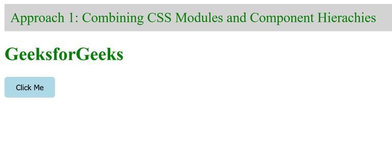
Approach 1: Combining CSS Modules and Component Hierarchies
In this approach, we are using the natural hierarchy in components to control CSS Modules’ specificity in Next.js App. The components here are paired with their own CSS Module. The ‘Header’ component, features a CSS Module with the classes like “.header” and “.nav”, which controls the layout and style of the header section. The same is done with the ‘Button; component, which ensures specificity and prevents the types to be leaked to the other parts of the app.
Syntax:
.button {
    /* Button styling */
}
const Button = ({ children }) => {
    return <button className={styles.button}>
                    {children}
           </button>;
};
Example: Now, add the below code in the respective files as shown in the above directory structure.
Javascript
import React from "react";
import styles from "./Button.module.css";
const Button = ({ children }) => {
return (
<button className={styles.button}>
{children}
</button>
);
};
export default Button;
|
Javascript
import React from "react";
import styles from "./Header.module.css";
const Header = () => {
return (
<header className={styles.header}>
<nav className={styles.nav}>
<a className={styles.logo} href="#">
GeeksforGeeks
</a>
</nav>
</header>
);
};
export default Header;
|
Javascript
import React from "react";
import Header from "../components/Header";
import Button from "../components/Button";
const Home = () => {
return (
<div>
<Header />
<h1 style={{ color: "green" }}>
GeeksforGeeks
</h1>
<Button>Click Me</Button>
</div>
);
};
export default Home;
|
CSS
.button {
padding: 10px 20px;
background-color: lightblue;
border: none;
border-radius: 5px;
cursor: pointer;
}
|
CSS
.header {
background-color: lightgray;
padding: 10px;
}
.nav {
display: flex;
justify-content: space-between;
align-items: center;
}
.logo {
color: green;
text-decoration: none;
font-size: 24px;
}
|
Step to run the application:
Now, run the application by executing the below command in the terminal:
npm run dev
Output:
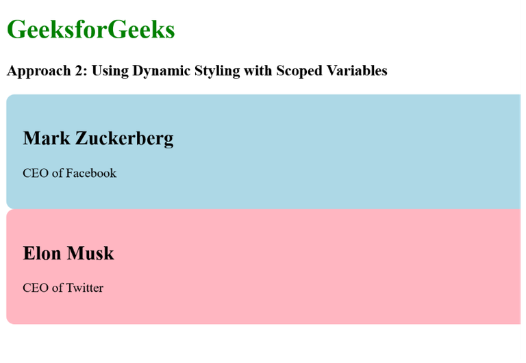
Approach 2: Using Dynamic Styling with Scoped Variables
In this approach, we are using the Dynamic Styling with Scoped Variables in which we have created Custom CSS in JavaScript utility which is “scopedVariables.js”. In this the styles for the “ProfileCard” are been specified, incorporating CSS variables that control the styling color. In the “ProfileCard” component, we have used the scoped variables and CSS variables for actually applying the dynamic styling. This component also accepts the props like name, jobTitle, etc. So by injecting the props into the scoped styles, we created component-specific styles that are actually dynamic and also isolated and avoid clashes.
Syntax:
const generateScopedStyles = (componentName, variableValue) => {
    return `
        .${componentName} {
              --custom-variable: ${variableValue};
              /* Other styles using the custom variable */
         }
      `;
};
export default generateScopedStyles;
Example: Now, add the below code in the respective files as shown in the above directory structure:
Javascript
import React from "react";
import generateScopedStyles from "../utils/scopedVariables";
const ProfileCard = ({
name,
backgroundColor,
jobTitle,
}) => {
const componentName = "profile-card";
const dynamicStyles = generateScopedStyles(
componentName,
backgroundColor
);
return (
<div
className={componentName}
style={{ backgroundColor }}
>
<h2>{name}</h2>
<p>{jobTitle}</p>
<style jsx>{dynamicStyles}</style>
</div>
);
};
export default ProfileCard;
|
Javascript
import React from "react";
import ProfileCard from "../components/ProfileCard";
const Home = () => {
return (
<div>
<h1 style={{ color: "green" }}>
GeeksforGeeks
</h1>
<h3>
Approach 2: Using Dynamic Styling with
Scoped Variables
</h3>
<ProfileCard
name="Mark Zuckerberg"
jobTitle="CEO of Facebook"
backgroundColor="lightblue"
/>
<ProfileCard
name="Elon Musk"
jobTitle="CEO of Twitter"
backgroundColor="lightpink"
/>
</div>
);
};
export default Home;
|
Javascript
const generateScopedStyles = (
componentName,
variableValue
) => `
.${componentName} {
--profile-card-bg-color: ${variableValue};
background-color: let(--profile-card-bg-color);
padding: 20px;
border-radius: 10px;
}
`;
export default generateScopedStyles;
|
Step to run the application:
Now, run the application by executing the below command in the terminal:
npm run dev
Output:
Share your thoughts in the comments
Please Login to comment...