Data visualization is a powerful tool for presenting information in an effective manner. However, choosing the right colors for your visualizations can make a significant difference in how your audience interprets and understands the data. In this article, we’ll explore fantastic color palettes specifically designed for data visualization, covering a range of styles and purposes. paraphrase
Understanding Color Palettes for Data Visualization
There are three main types of data visualization color palettes:
- Categorical palettes: Used for data with distinct categories that have no inherent order. For example, different colors could represent different product categories in a sales chart.
- Sequential palettes: Ideal for data with a sequential order, like time or temperature. Colors transition from light to dark (or vice versa) to represent increasing or decreasing values.
- Diverging palettes: Used to show data with a central value (often zero). Colors on one side of the palette get lighter or darker, representing values above the center. The other side of the palette uses a different color gradient to represent values below the center.
Categorical Color Palettes
Categorical color palettes are ideal for distinguishing between discrete data groups without implying any order or magnitude. Effective categorical palettes limit colors to around ten unique shades to prevent visual confusion and ensure each category is distinct.
For instance, in a sales chart, different product categories like electronics, clothing, and accessories could each be assigned a unique color. It’s important to choose colors that are easily differentiable and don’t create confusion, especially if there are many categories.
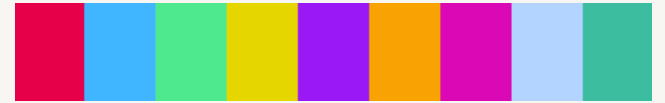
1. Retro Metro
A vibrant blend of reds, pinks, oranges, yellows, greens, blues, and purples that are lively and engaging. The lively and engaging nature of these colors makes this palette suitable for presentations or visualizations that aim to be eye-catching and energetic. It’s ideal for grabbing the audience’s attention and making the data stand out.

"#ea5545”, “#f46a9b”, “#ef9b20”, “#edbf33”, “#ede15b”, “#bdcf32”, “#87bc45”, “#27aeef”, “#b33dc6”
These codes are used to define colors in various digital applications, including web design, graphics editing software, and data visualization tools.
In “Retro Metro” color palette, each hexadecimal color code corresponds to a specific color in the palette. For example:
- “#ea5545”: A vibrant shade of red.
- “#f46a9b”: A lively pink color.
- “#ef9b20”: A vibrant orange hue.
- “#edbf33”: A bright yellow shade.
- “#ede15b”: A lively yellow-green color.
- “#bdcf32”: A vibrant green shade.
- “#87bc45”: A lively green hue.
- “#27aeef”: A bright blue color.
- “#b33dc6”: A vibrant purple shade.
2. Dutch Field
Features bold colors like hot pink, sky blue, lime green, and orange, providing a modern look that pops.
The modern look that pops from this palette is perfect for contemporary designs. It’s designed to make categorical distinctions clear and memorable, often used in consumer-facing visuals where immediate impact is crucial. The code is:
[“#e60049”, “#0bb4ff”, “#50e991”, “#e6d800”, “#9b19f5”, “#ffa300”, “#dc0ab4”, “#b3d4ff”, “#00bfa0”]
3. River Nights
Uses deeper hues including dark red, purple, various blues, and greens for a more subdued but equally distinct presentation.

The use of deeper, more subdued hues lends a sophisticated and professional look, suitable for serious or formal data representations. It’s effective for conveying important data without the visual distraction of overly bright colors.
[“#b30000”, “#7c1158”, “#4421af”, “#1a53ff”, “#0d88e6”, “#00b7c7”, “#5ad45a”, “#8be04e”, “#ebdc78”]
4. Spring Pastels
Typically involves softer, lighter colors such as pale pinks, soft greens, light blues, and lavenders.
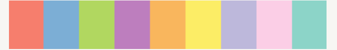
The gentle nature of pastel colors makes this palette ideal for visuals that need to be visually soothing or for applications where a softer, more approachable look is desirable. It’s great for healthcare, social topics, or children-focused data.
[“#fd7f6f”, “#7eb0d5”, “#b2e061”, “#bd7ebe”, “#ffb55a”, “#ffee65”, “#beb9db”, “#fdcce5”, “#8bd3c7”]
Sequential Color Palettes
Sequential color palettes are typically used for visualizing data with a natural progression or order, such as time series data, temperature gradients, or any data where values increase or decrease along a continuum. The colors in a sequential palette transition smoothly from light to dark or from one hue to another to represent increasing or decreasing values.
Few examples of a sequential color palette:
- Lightest shade: This represents the lowest values in the dataset and is often a very light or pastel version of the color.
- Intermediate shades: These shades represent moderate values in the dataset and gradually increase or decrease in intensity as the values progress.
- Darkest shade: This represents the highest values in the dataset and is typically the most intense or darkest version of the color.
The key characteristics of sequential color palettes are their smooth transition from one color to another and their ability to effectively convey quantitative information.
For instance, in a temperature map, a sequential color palette might start with light blue for colder temperatures, transition through intermediate shades of blue and green for moderate temperatures, and end with dark red for warmer temperatures.
1. Blue to Yellow (Default)
Transitions from deep blue to vibrant yellow, effectively representing scales from low to high.

["#115f9a", "#1984c5", "#22a7f0", "#48b5c4", "#76c68f", "#a6d75b", "#c9e52f", "#d0ee11", "#d0f400"]
2. Grey to Red
Starts with light grey and moves through darker greys to deep red, suitable for emphasizing increases in magnitude with warmth.

["#d7e1ee", "#cbd6e4", "#bfcbdb", "#b3bfd1", "#a4a2a8", "#df8879", "#c86558", "#b04238", "#991f17"]
3. Black to Pink
Graduates from black to various shades of pink, offering a unique and striking visual for data intensity.

["#2e2b28", "#3b3734", "#474440", "#54504c", "#6b506b", "#ab3da9", "#de25da", "#eb44e8", "#ff80ff"]
4. Blues
Uses multiple shades of blue, ideal for conveying a range of data points in a visually coherent manner.

["#0000b3", "#0010d9", "#0020ff", "#0040ff", "#0060ff", "#0080ff", "#009fff", "#00bfff", "#00ffff"]
Diverging Color Palettes
Diverging color palettes are used to visualize data that has a central point of reference, often zero or another meaningful midpoint. These palettes are particularly useful for highlighting deviations from this central value. The colors diverge from the central point in two different directions, typically using contrasting hues or shades to represent positive and negative deviations.
Diverging color palette features:
- Central Color: This represents the central value or reference point in the dataset. It’s often a neutral color, such as white or gray, or a color that doesn’t carry much perceptual weight.
- Colors for Positive Deviations: These colors represent values above the central point and typically transition to darker shades or hues.
- Colors for Negative Deviations: These colors represent values below the central point and usually transition to lighter shades or hues.
The key feature of a diverging color palette is that it effectively shows both the direction and magnitude of deviations from the central value. This makes it useful for visualizing data where positive and negative deviations are equally important, such as comparing performance against a benchmark or showing changes from a baseline.
For example, in a choropleth map showing changes in unemployment rates, a diverging color palette might use shades of blue to represent decreases in unemployment rates below the national average (negative deviations) and shades of red to represent increases in unemployment rates above the national average (positive deviations), with white or gray representing areas where unemployment rates are close to the national average.
1. Blue to Red (Default)
Ideal for highlighting values around a midpoint, with cool blues and warm reds diverging from a neutral grey.

["#1984c5", "#22a7f0", "#63bff0", "#a7d5ed", "#e2e2e2", "#e1a692", "#de6e56", "#e14b31", "#c23728"]
2. Orange to Purple
Provides a stark contrast between warm orange and cool purple, suitable for emphasizing deviations from a central value.
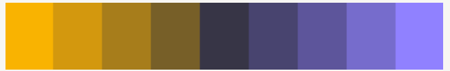
["#ffb400", "#d2980d", "#a57c1b", "#786028", "#363445", "#48446e", "#5e569b", "#776bcd", "#9080ff"]
3. Pink Foam
Features a transition from teal to pink, offering a less conventional but visually appealing divergence.

["#54bebe", "#76c8c8", "#98d1d1", "#badbdb", "#dedad2", "#e4bcad", "#df979e", "#d7658b", "#c80064"]
4. Salmon to Aqua
Moves from salmon pink to aqua, effectively drawing attention to the extremes in data sets.

["#e27c7c", "#a86464", "#6d4b4b", "#503f3f", "#333333", "#3c4e4b", "#466964", "#599e94", "#6cd4c5"]
Criteria for Selecting Effective Color Palettes
To guarantee efficacy and aesthetic appeal, take into account the following factors when choosing a color scheme for your data visualization:
- Contrast: Select hues that will allow your visualizations to stand out. To make sure that text and data markers stand out against the backdrop, this is very crucial.
- Variety: To ensure flexibility in your visualizations, search for color palettes that provide a variety of colors, tones, and tints. You may properly express numerous data types or values with this variation.
- Contextual Appropriateness: Take your data visualization’s context into account. For instance, a serious financial presentation would not be appropriate for a lively and lively color scheme, but it could be appropriate for a casual marketing report.
- Number of Colors: Your palette’s color selection will be based on your unique requirements. For a basic bar graph, a modest color scheme of three to four may be sufficient; however, bigger color schemes may be needed for more intricate visualizations or ones with many data categories.
Best Practices for using Color Palettes for Data Visualization
Adhering to established practices when using color in data visualization is just as essential as choosing the appropriate color scheme. Here are some pointers to remember:
- Restrict the amount of colors used: An overly colorful depiction might be disorienting and overpowering. employ no more than five to seven different hues, and be sure to employ them all throughout your vision.
- Preserve color consistency: Using colors consistently may help you create a visual language that flows and emphasizes the importance of each hue in your visualizations. Refrain from altering the color designations for identical data categories in several displays.
- Employ color wisely to emphasize key information or communicate certain meanings. Color should be chosen with purpose. Don’t use color blindly or without a good reason.
- Give context and legends: Every color used in your visualization should have a legend or key explaining its significance. This aids viewers in correctly interpreting the facts and comprehending the context.
With the help of color palettes, you may produce visually striking and significant data visualizations. Effective use of color may draw attention to important points, improve the readability and appeal of complicated material, and strengthen your message. Now that you have a firm grasp on the 12 fantastic color schemes, use cases, and best practices included in this article, you can create visually appealing and impactful data visualizations.
Also Refer:
Share your thoughts in the comments
Please Login to comment...