Charts.js General
Last Updated :
14 Dec, 2023
Chart.js General Accessibility ensures the accessibility rendered on user-provided canvas elements. Users can add accessibility features like ARIA attributes or fallback content within the canvas elements. This ensures that the content of the canvas, and chart information is accessible to all the user who relies on assistive technologies.
Accessible canvas elements
role="img": indicates that the canvas should be treated as an image, suitable for contexts where the canvas represents graphical content.aria-label: provides a text description of the content or purpose of the canvas, enhancing accessibility for users who rely on screen readers.
Colors
Chart.js allows color customization in the charts. For the geometric elements like lines and bars, we can set background and border colors and for the Text elements such as labels and titles, we can set the font colors.
It mainly supports three color options which are set by default.
- backgroundColor: The option is used to configure the background color for chart elements.
- borderColor: This option is used to set the color of element borders.
- borderWidth: This option is mainly used to adjust the width of element borders.
Data Structures
Chart.js General data structure is the backbone of chat.js or any other charting library, with the help of data structures we can determine how data is organized, manipulated, and finally displayed in the chats. To deep dive into the topic must visit Data Structures.
Different Types of Data Structures:
- Primitive Array: This structure uses an array of numbers for data points, each corresponding to a label.
- Object Array: Here, each data point is an object specifying x and y values, allowing for complex chart types like scatter plots.
- Object Array using Custom Properties: This format uses an array of objects with custom properties, providing flexibility in data representation and parsing.
Fonts
Chart.js General Fonts are the global font settings that can be applied in the visual chart allowing to style of the text elements. Using this setting we can customize the text element by applying options like font family, size, weight, color, and more properties. All these options are present in Chart.default.font.
General Fonts Configuration Options
Below are the configuration options for General Fonts:
- family: This option specifies the font family for the text elements in the chart. It follows the CSS font-family options like
Arial, Helvetica etc.
- size: This option specifies the actual font size presented in px format form. By default, the size of the text is 12 px.
- style: This option is used to set the font style by customizing text into normal, italic, and oblique variants.
- weight: This option is used to control the thickness of font characters.
- lineHeight: This option determines the height of each line of text. The default height is 1.2 which can be given in number/string form.
Options
- Chart Level Options: We use these options to decide the overall main style of the chart, like what kind of chart do we have to make and what would be the size of it.
- Dataset Level Options: Here, you make each group of data in your chart look just right. You can make certain data stand out or blend in.
- Dataset Animation Options: With these options we can add some animations to the chart, we can set how our data on the charts appear with animations.
- Dataset Element Level Options: Here we focus on small parts of your chart, like bars, lines, or dots. With the help of this we can highlight some important part of the dataset.
- Scale Options: Here with these options we modify the scales, like the axes. We can set the labels, look and the range of the number on the scales.
- Plugin Options: We use the plugin options when we are using extra tools or features for the chart, so we can do that with the help of plugins.
- Scriptable Options: These options gives us the complete freedom, so that we can be creative and write own piece of code to do some specific stuff for the chart and the related data.
- Indexable Options: With these options we can make a list where each item on the list matches a point in your data. It simply works as an elements of the array.
- Option Context: These are some more complex options. It’s about how your chart understands what it’s working with at any time, like which part of the data or the chart itself.
Padding
The empty area between the canvas’s edges and the chart elements is known as padding in Chart.js. It can be used to provide a border around the chart or to make sure that none of its components are placed too close to the canvas’ edges.
Padding can be applied in different formats as follows.
- Number: The padding value is a number that is applied to all sides (top, bottom, left, right).
- {top, left, right, bottom} object: The padding value is an object like the “right” property defines the right padding, the “left” property defines the left padding, and so on.
- {x, y} object: This padding value is a shorthand for defining left/right and top/bottom to the same values. If {x: 10px, y: 5px } defines left and right with 10px of padding and top and bottom having 5px of padding.
Performance
Chart.js charts are speedily rendered thanks to their utilization of canvas elements. This choice of rendering contributes to swift performance, allowing for the creation of dynamic and visually appealing charts.
Data Structure and Format
- parsing: Converting raw data into a format understandable by Chart.js for efficient processing and rendering.
- normalization of data: Standardizing data to a common scale or format, ensuring consistency and accuracy in chart representation.
- Decimation: Reducing the number of data points displayed in a chart for improved performance without sacrificing essential information.
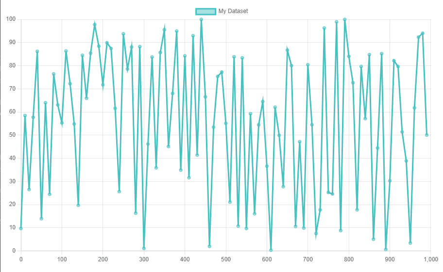
Example 1: In this example, we will decimate a large data and create a line chart. It will create a simple chart, which will display the subset of a large dataset.
HTML
<!DOCTYPE html>
<html lang="en">
<head>
<meta charset="UTF-8">
<meta name="viewport"
content="width=device-width,
initial-scale=1.0">
<title>Decimated Line Chart</title>
<script src=
</script>
</head>
<body>
<canvas id="myChart"
width="500"
height="300">
</canvas>
<script>
// Example large dataset
const rawData =
Array.from({ length: 1000 }, (_, i) =>
({ x: i, y: Math.random() * 100 }));
// Decimation function
function decimateData(data, nth) {
return data.filter((_, i) => i % nth === 0);
}
// Decimating the dataset
const decimatedData = decimateData(rawData, 10);
// Chart data with color options
const data = {
datasets: [{
label: 'My Dataset',
data: decimatedData,
borderColor: 'rgb(75, 192, 192)', // Line color
backgroundColor: 'rgba(75, 192, 192, 0.5)', // Fill color
fill: false, // Disable filling under the line
}]
};
// Chart configuration
const config = {
type: 'line',
data: data,
options: {
scales: {
x: {
type: 'linear',
position: 'bottom'
}
}
}
};
// Initializing the chart
new Chart(
document.getElementById('myChart'),
config
);
</script>
</body>
</html>
|
Output:
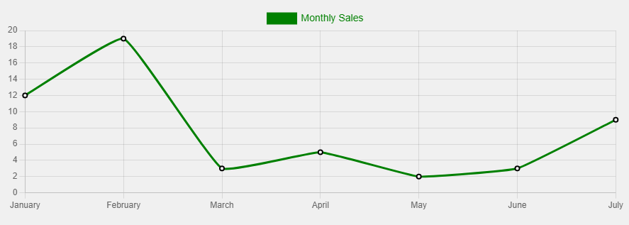
Example 2: In this example, we are using some styling options like backgroundColor, borderColor, etc. It will create a line chart of a smaller dataset as compared to the previous example.
HTML
<!DOCTYPE html>
<html lang="en">
<head>
<meta charset="UTF-8">
<meta name="viewport"
content="width=device-width,
initial-scale=1.0">
<title>Styled Line Chart</title>
<script src=
</script>
<style>
/* Adding some basic styling to the body */
body {
font-family: 'Arial', sans-serif;
display: flex;
justify-content: center;
align-items: center;
height: 100vh;
background-color: #f0f0f0;
}
</style>
</head>
<body>
<canvas id="myChart"
width="600" height="200">
</canvas>
<script>
// Sample dataset
const data = {
labels: ['January',
'February',
'March',
'April',
'May',
'June',
'July'],
datasets: [{
label: 'Monthly Sales',
data: [12, 19, 3, 5, 2, 3, 9],
fill: false,
borderColor: 'green', // Border color
backgroundColor: 'green', // Background color for points
pointBorderColor: 'grren', // Border color for points
pointBackgroundColor: '#fff', // Fill color for points
pointBorderWidth: 2,
tension: 0.1 // Bezier curve tension
}]
};
// Chart configuration
const config = {
type: 'line',
data: data,
options: {
scales: {
y: {
beginAtZero: true
}
},
plugins: {
legend: {
labels: {
color: 'Green', // Color for labels
font: {
size: 14 // Font size
}
}
}
}
}
};
// Initializing the chart
new Chart(
document.getElementById('myChart'),
config
);
</script>
</body>
</html>
|
Output:
Share your thoughts in the comments
Please Login to comment...