Change Color Scheme of ggplot2 Plot Using ggthemr Package in R
Last Updated :
20 Dec, 2023
The open-source tool ggplot2 in R is used for statistical data visualization. To make the plots made by ggplot2 more appealing and to apply colors, different designs, and styling ggthemr Package in R is a great help.
ggthemr Package in R Programming Language is developed by Ciarán Tobin and maintained by Mikata Project.
The idea behind this package is to set the theme once so that there’s no need to update the styling again and again.
The theme has several parts:
- Spacing around the plot and between elements
- The color palette for the background, axes, gridlines, text, etc.
- Text size
- Layout of axes lines and gridlines
Installing the ggthemr Package in R
To use this package, we need to install it using:
R
install.packages("ggthemr")
library(ggthemr)
|
Output:

ggthemr Package in R
On some versions of R there might be a warning like this.
If you also see the same warning, you need to install the different version of the package using.
R
install.packages("remotes")
library(remotes)
install_github("cttobin/ggthemr")
library(ggthemr)
|
Output:

ggthemr Package in R
The ‘remotes’ package is used to fetch packages from various sources like GitHub.
- Now you might see this.
- Just press the Enter key to skip the updates and load the package.
Using ggthemr Package in R with ‘ggplot2’
Now that the package is installed and loaded, let’s use it with the ggplot2 for changing the color scheme.
In ggthemr we have these preset color palette to choose from:
flat, flat dark, dust, light, earth, fresh, chalk, lilac, carrot, pale, copper, grape, greyscale, sky, solarized, grass, sea, camouflage.
To do that just use any of the above themes with ggthemr:
R
ggthemr("lilac")
library(ggplot2)
set.seed(123)
x <- rnorm(100)
y <- rnorm(100)
ggplot() +
geom_point(aes(x = x, y = y))
|
Output:

ggthemr Package in R
From now onwards any plot created using ggplot2 will have the same theme ‘lilac’.
For resetting it to default ggplot2 settings, use:
‘flat dark’ theme in ggthemr Package in R
R
library(ggthemr)
library(ggplot2)
ggthemr("flat dark")
set.seed(123)
x <- rnorm(50)
y <- 0.5 * x + rnorm(50, sd = 0.2)
df <- data.frame(x = x, y = y)
ggplot(df, aes(x = x, y = y)) +
geom_point(size = 3) +
geom_smooth(method = "lm", se = FALSE, size = 1) +
labs(x = "X", y = "Y", title = "Scatter Plot with a line")
|
Output:
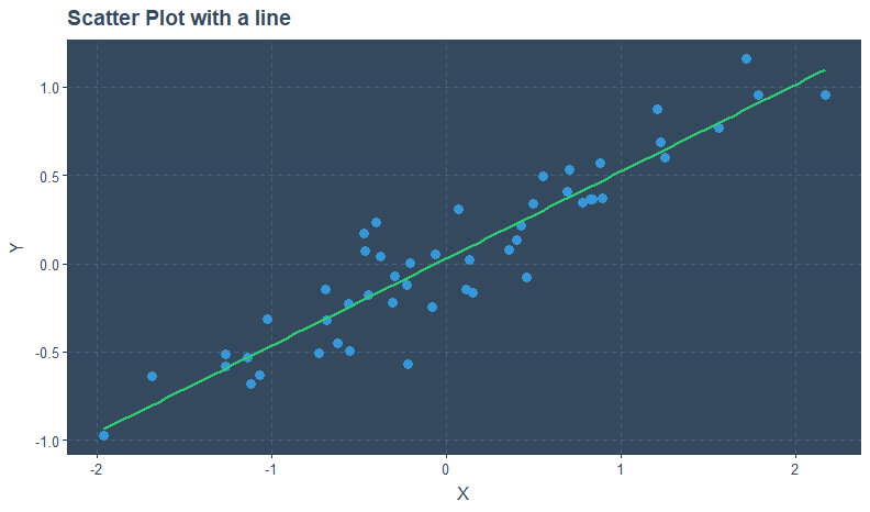
ggthemr Package in R
Custom Palettes in ggthemr Package in R
define_palette( ) can be used to make customized theme and then can be passed to ggthemr similar to above palettes.
R
library(ggplot2)
library(ggthemr)
random_colors <- swatch <- c("#FFB6C1", "#FFD700", "#9370DB", "#FFA07A", "#00BFFF")
custom_palette <- define_palette(
swatch = random_colors,
gradient = c(lower = "#FFB6C1", upper = "#9370DB")
)
ggthemr(custom_palette)
set.seed(123)
x <- rnorm(50)
y <- 0.5 * x + rnorm(50, sd = 0.2)
df <- data.frame(x = x, y = y)
ggplot(df, aes(x = x, y = y)) +
geom_point(size = 3) +
geom_smooth(method = "lm", se = FALSE, size = 1) +
labs(x = "X", y = "Y", title = "Scatter Plot with a line")
|
Output:

Custom color palette in ggthemr
Here with the use of define_palette( ) we are using colors from defined random_colors in swatch which takes a vector of color codes. Then gradient takes two values- lower and upper and is used to specify gradient of colors for any required continuous variables in the plot if available.
Then simply take sample data and plot a graph with ggplot2.
Sky Theme in ggthemr Package in R
R
library(ggthemr)
ggthemr("sky")
ggplot(mtcars, aes(x = mpg, y = disp, color = factor(cyl))) +
geom_point() +
ggtitle("sky Theme") +
xlab("Miles per Gallon") +
ylab("Displacement")
|
Output:
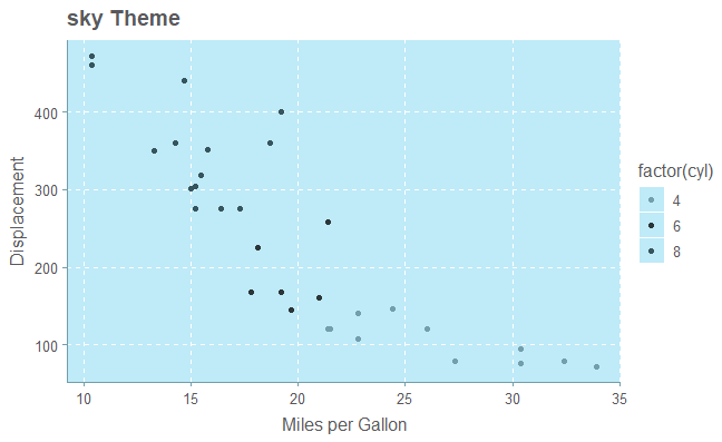
ggthemr Package in R
let’s use the mtcars dataset in the ggplot2 package to make scatter plot.
R
ggplot(data = mtcars,
aes(x = hp, y = mpg, col = disp)) + geom_point()
|
Output:

ggthemr Package in R
Adding Size, color, and shape and then plotting .
R
ggplot(data = mtcars,
aes(x = hp, y = mpg, size = disp)) + geom_point()
|
Output:

ggthemr Package in R
Adding color and shape in ggthemr Package in R
R
ggplot(data = mtcars,
aes(x = hp, y = mpg, col = factor(cyl),
shape = factor(am))) +
geom_point()
|
Output:
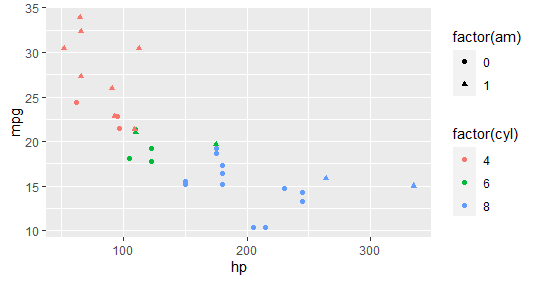
ggthemr Package in R
Conclusion:
In this article, we have seen ways to change color scheme of plots that are plotted with ggplot2 using the package ggthemr. In this way more advanced plots plotted using ggplot2 can look good aesthetically and they are easy for understanding too!
Share your thoughts in the comments
Please Login to comment...