Box plot in Plotly using graph_objects class
Last Updated :
02 Dec, 2021
Plotly is a Python library which is used to design graphs, especially interactive graphs. It can plot various graphs and charts like histogram, barplot, boxplot, spreadplot and many more. It is mainly used in data analysis as well as financial analysis. plotly is an interactive visualization library.
Box plot using graph objects class
If Plotly Express does not accommodate a good starting point, then it is also possible to use the more generic go.Box class from plotly.graph_objects. Box plot is a consistent way of distribution of data which are based on five main component shown below:
- Minimum : the lowest data point excluding any outliers.
- Maximum : the largest data point excluding any outliers.
- Median (Q2 / 50th Percentile) : the middle value of the dataset.
- First quartile (Q1 / 25th Percentile) : also known as the lower quartile qn(0.25), is the median of the lower half of the dataset.
- Third quartile (Q3 / 75th Percentile) : also known as the upper quartile qn(0.75), is the median of the upper half of the dataset.
Syntax: class plotly.graph_objects.Box(arg=None, alignmentgroup=None, boxmean=None, boxpoints=None, customdata=None, customdatasrc=None, dx=None, dy=None, fillcolor=None, hoverinfo=None, hoverinfosrc=None, hoverlabel=None, hoveron=None, hovertemplate=None, hovertemplatesrc=None, hovertext=None, hovertextsrc=None, ids=None, idssrc=None, jitter=None, legendgroup=None, line=None, lowerfence=None, lowerfencesrc=None, marker=None, mean=None, meansrc=None, median=None, mediansrc=None, meta=None, metasrc=None, name=None, notched=None, notchspan=None, notchspansrc=None, notchwidth=None, offsetgroup=None, opacity=None, orientation=None, pointpos=None, q1=None, q1src=None, q3=None, q3src=None, quartilemethod=None, sd=None, sdsrc=None, selected=None, selectedpoints=None, showlegend=None, stream=None, text=None, textsrc=None, uid=None, uirevision=None, unselected=None, upperfence=None, upperfencesrc=None, visible=None, whiskerwidth=None, width=None, x=None, x0=None, xaxis=None, xcalendar=None, xsrc=None, y=None, y0=None, yaxis=None, ycalendar=None, ysrc=None, **kwargs)
Parameters:
x: Sets the x sample data or coordinates. See overview for more info.
y: Sets the y sample data or coordinates. See overview for more info.
hoverinfo: Determines which trace information appear on hover.
marker: Instance or dict with compatible properties.
mean: Sets the mean values.
median: Sets the median values.
Example:
Python3
import plotly.graph_objects as px
import numpy as np
np.random.seed(42)
random_y1= np.random.randint(1,101,100)
random_y2= np.random.randint(1,101,100)
x = ['A', 'B', 'C', 'D']
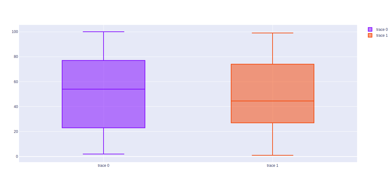
plot = px.Figure()
plot.add_trace(px.Box(y=random_y1))
plot.add_trace(px.Box(y=random_y2))
plot.show()
|
Output:
Horizontal Box Plot
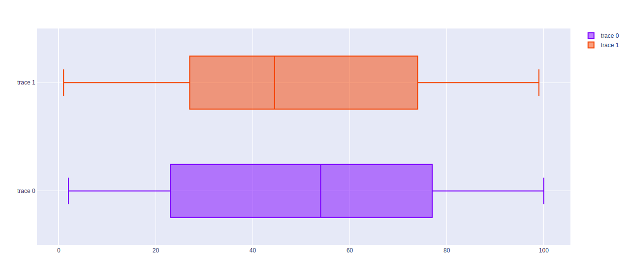
The horizontal box plot is a box plot in which the x-variable and y-values are shown horizontally in the graph. It can be created by passing the x argument of the box plot.
Example: Use the x argument for horizontal graphs
Python3
import plotly.graph_objects as px
import numpy as np
np.random.seed(42)
random_x1= np.random.randint(1,101,100)
random_x2= np.random.randint(1,101,100)
x = ['A', 'B', 'C', 'D']
plot = px.Figure()
plot.add_trace(px.Box(x=random_x1))
plot.add_trace(px.Box(x=random_x2))
plot.show()
|
Output:
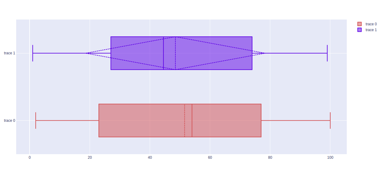
Finding Mean and Standard Deviation
The mean and standard deviation of the data plotted by boxplot can be found using the boxmean parameter. It can take two values –
- True for mean
- sd for standard deviation.
Example:
Python3
import plotly.graph_objects as px
import numpy as np
np.random.seed(42)
random_x1= np.random.randint(1,101,100)
random_x2= np.random.randint(1,101,100)
x = ['A', 'B', 'C', 'D']
plot = px.Figure()
plot.add_trace(px.Box(x=random_x1, marker_color = 'indianred', boxmean=True))
plot.add_trace(px.Box(x=random_x2, marker_color='royalblue', boxmean='sd'))
plot.show()
|
Output:
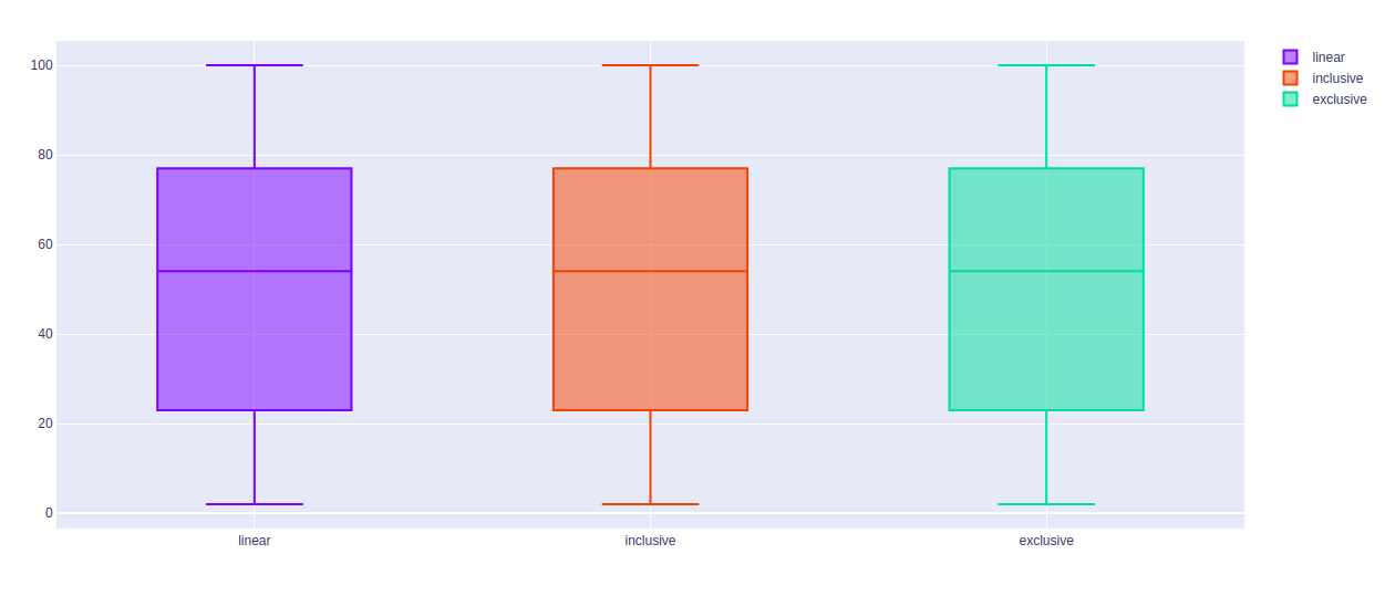
Changing Algorithms for Quartiles
The algorithm to choose quartiles can also be selected in plotly. It is computed by using linear algorithm by default. However, it provides two more algorithms for doing the same i.e. inclusive and exclusive. It can be done by passing the quartilemethod argument.
Example 1:
Python3
import plotly.graph_objects as px
import numpy as np
np.random.seed(42)
random_y= np.random.randint(1,101,100)
x = ['A', 'B', 'C', 'D']
plot = px.Figure()
plot.add_trace(px.Box(y=random_y, quartilemethod="linear", name="linear"))
plot.add_trace(px.Box(y=random_y, quartilemethod="inclusive", name="inclusive"))
plot.add_trace(px.Box(y=random_y, quartilemethod="exclusive", name="exclusive"))
plot.show()
|
Output:
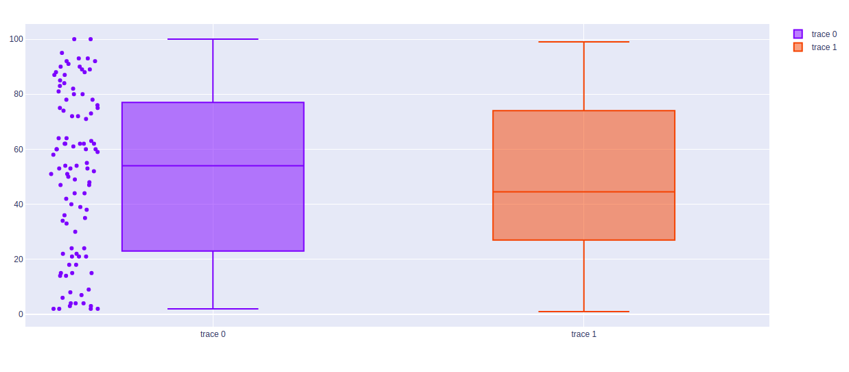
Showing The Underlying Data
Underlying data can be shows using the boxpoints arguments. The value of this argument can be of three types –
- all for all points
- outliers for outliers only
- false for none of the above
Example:
Python3
import plotly.graph_objects as px
import numpy as np
np.random.seed(42)
random_y1= np.random.randint(1,101,100)
random_y2= np.random.randint(1,101,100)
x = ['A', 'B', 'C', 'D']
plot = px.Figure()
plot.add_trace(px.Box(y=random_y1, boxpoints="all"))
plot.add_trace(px.Box(y=random_y2, boxpoints="outliers"))
plot.show()
|
Output:
Share your thoughts in the comments
Please Login to comment...