Bootstrap 5 Layout Breakpoints
Last Updated :
04 Oct, 2023
Bootstrap 5 layout breakpoints are specific screen widths at which the appearance and behavior of elements on a webpage change. These breakpoints enable responsive design, adjusting content layout and design for various devices, like mobile, tablet, and desktop.
- Core Concept:
- Breakpoints in responsive design determine when layouts adapt to specific device sizes or viewports.
- media queries use breakpoints to apply styles based on screen parameters like min-width.
- Bootstrap CSS starts with minimal styles for small screens, adding layers for larger devices enhancing performance and user experience.
- Available breakpoints: Bootstrap offers 6 default responsive breakpoints (grid tiers). Customize them with source Sass files if needed.
- Media queries: Media queries are essential tools for designing responsive layouts based on breakpoints.
Syntax:
<div class="col-sm-4">Column 1</div>
<div class="col-sm-4">Column 2</div>
...
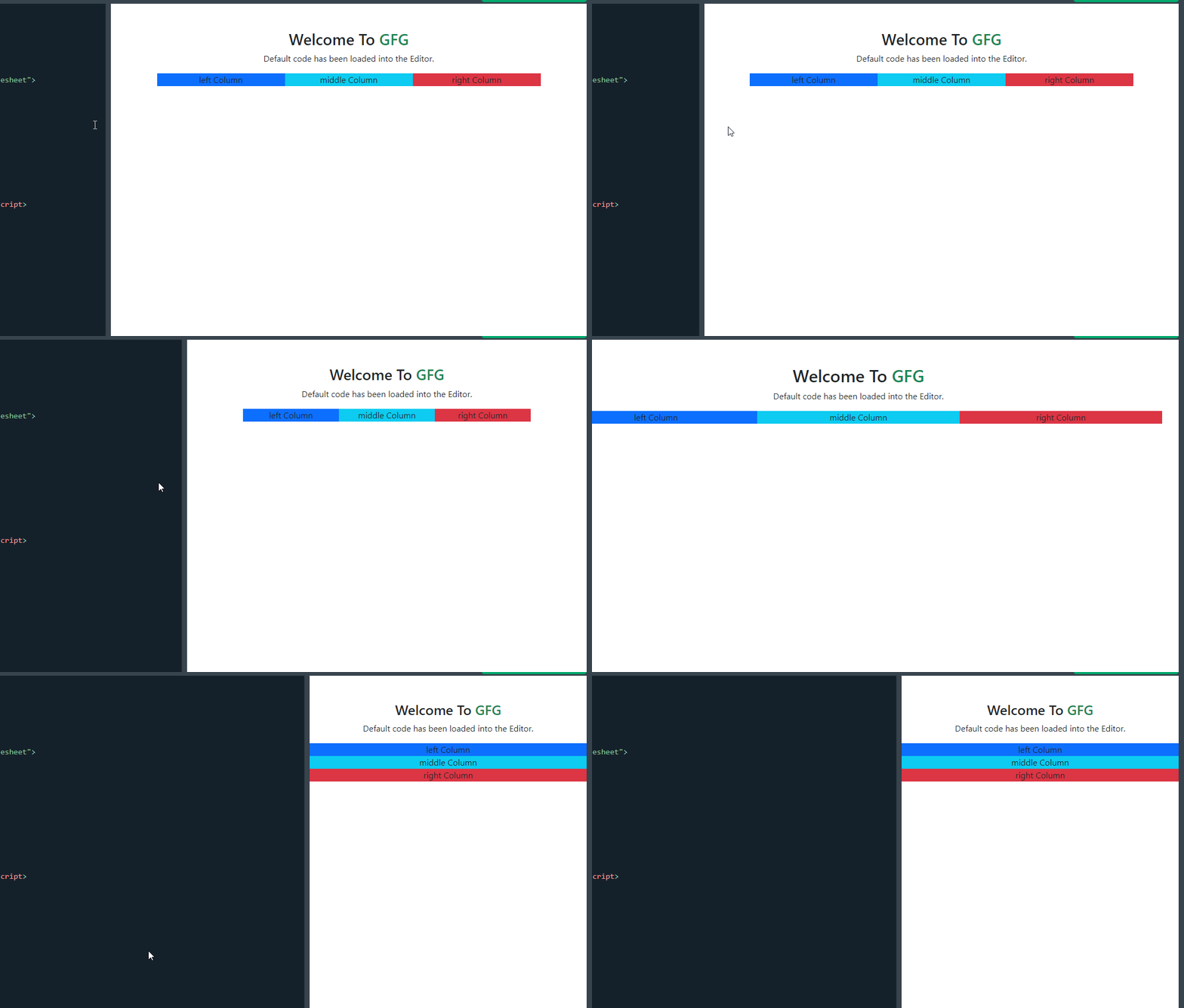
Example 1: In this example, the col-sm-4 class is utilized to create a balanced three-column layout on small screens and above. Same col-sm-2 class can be used to utilize to create and balance the 6 columns layout on a small screen and above than small screens. And col-md-3 is used for medium screens like tablets, to balance the 4 columns on a screen.
HTML
<!DOCTYPE html>
<html lang="en">
<head>
<meta charset="UTF-8">
<meta name="viewport"
content="width=device-width,
initial-scale=1.0">
<title>Bootstrap 5 Layout Breakpoints Example</title>
<link href=
rel="stylesheet">
</head>
<body>
<div class="container text-center mt-5">
<h2>
Welcome To
<span class="text-success">
GFG
</span>
</h2>
<p>
Default code has been loaded
into the Editor.
</p>
<div class="row">
<div class="col-sm-4 bg-primary">
Column 1
</div>
<div class="col-sm-4 bg-info">
Column 2
</div>
<div class="col-sm-4 bg-danger">
Column 3
</div>
</div>
</div>
</body>
</html>
|
Output:

output
Example 2: In this example, we will creat a three-column layout using Bootstrap’s grid system. Each column contains a card component with an image and some sample content. The images are sourced from placeholder URLs, and you can replace them with your actual image URLs. The custom CSS class custom-img ensures that the images are responsive within their parent container.
HTML
<!DOCTYPE html>
<html lang="en">
<head>
<meta charset="UTF-8">
<meta name="viewport"
content="width=device-width,
initial-scale=1.0">
<title>Complex Bootstrap 5 Layout Example</title>
<link href=
rel="stylesheet">
</head>
<body>
<div class="container text-center mt-5">
<h2>
Welcome To
<span class="text-success">
GFG
</span>
</h2>
<p>
Default code has been loaded into the Editor.
</p>
<div class="row">
<div class="col-md-4">
<div class="card">
<img src=
alt="Image 1"
class="card-img-top">
<div class="card-body">
<h5 class="card-title">BOOTSTRAP 5</h5>
<p class="card-text">
Bootstrap is a widely-used open-source
front-end framework for web development,
providing a collection of HTML, CSS, and
JavaScript components and tools that
enable developers to build responsive,
mobile-first websites with ease1.....
</p>
</div>
</div>
</div>
<div class="col-md-4">
<div class="card">
<img src=
alt="Image 2"
class="card-img-top">
<div class="card-body">
<h5 class="card-title">
GEEKSFORGEEKS
</h5>
<p class="card-text">
A computer science portal for geeks Filters
DSA Self Paced in C++, JAVA Most popular
course on DSA trusted by over 1,00,000+
students!......
</p>
</div>
</div>
</div>
<div class="col-md-4">
<div class="card">
<img src=
alt="Image 3" class="card-img-top">
<div class="card-body">
<h5 class="card-title">
Card Title 3
</h5>
<p class="card-text">
add your data...
</p>
</div>
</div>
</div>
</div>
</div>
</body>
</html>
|
Output:

OUTPUT
Reference: https://getbootstrap.com/docs/5.0/layout/breakpoints/
Share your thoughts in the comments
Please Login to comment...