Bootstrap 5 Grid XLarge
Last Updated :
08 Feb, 2024
Bootstrap is a free and open-source tool for creating responsive websites and web applications. It is the most popular HTML, CSS, and JavaScript framework for developing responsive, mobile-first websites. Nowadays, the websites are perfect for all browsers (IE, Firefox, and Chrome) and all sizes of screens (Desktop, Tablets, Phablets, and Phones).
Grid XLarge
The Bootstrap XLarge grid activates when the screen size is ≥1200 px. It utilizes an auto-column layout, adapting seamlessly to various screen sizes. Variable width for each element can be specified using classes like `.container-lg-4`, providing flexibility. If the screen size is below 1200 px, the element automatically expands to take up 100% of the screen width.
Syntax:
<tag_name  class="class-xl">
Content of the element
</tag_name>
Using only Grid Xlarge
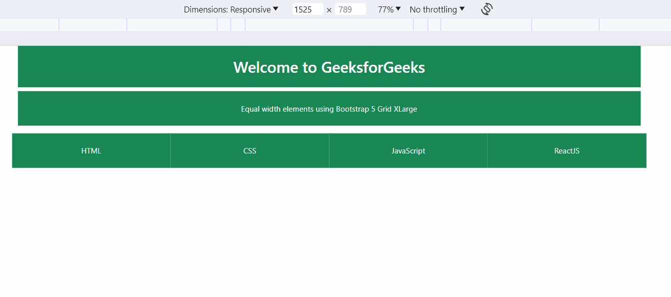
Example: Illustration of Grid XLarge with Equal Size and using only Grid Xlarge in Bootstrap.
HTML
<!DOCTYPE html>
<html lang="en">
<head>
<meta charset="UTF-8">
<meta name="viewport"
content="width=device-width, initial-scale=1.0">
<title>Bootstrap 5 Grid XLarge</title>
<link rel="stylesheet" href=
integrity="sha256-MBffSnbbXwHCuZtgPYiwMQbfE7z+GOZ7fBPCNB06Z98="
crossorigin="anonymous">
</head>
<body>
<div class="container text-center">
<h2 class="p-4 bg-success text-white">
Welcome to GeeksforGeeks
</h2>
<p class="p-4 bg-success text-white">
Equal width elements using
Bootstrap 5 Grid XLarge
</p>
<div class="row">
<div class="col-xl bg-success text-white p-4">
HTML
</div>
<div class="col-xl bg-success text-white p-4">
CSS
</div>
<div class="col-xl bg-success text-white p-4">
JavaScript
</div>
<div class="col-xl bg-success text-white p-4">
ReactJS
</div>
</div>
</div>
<script src=
integrity="sha256-YMa+wAM6QkVyz999odX7lPRxkoYAan8suedu4k2Zur8="
crossorigin="anonymous"></script>
</body>
</html>
|
Output:
Auto Layout Columns
Example: Illustration of Auto Layout Column using Boostrap.
HTML
<!DOCTYPE html>
<html lang="en">
<head>
<meta charset="UTF-8">
<meta name="viewport"
content="width=device-width, initial-scale=1.0">
<title>Bootstrap 5 Grid XLarge - Auto Layout Columns</title>
<link rel="stylesheet" href=
integrity="sha256-MBffSnbbXwHCuZtgPYiwMQbfE7z+GOZ7fBPCNB06Z98="
crossorigin="anonymous">
</head>
<body class="container text-center">
<h2 class="p-4 bg-success text-white">
Welcome to GeeksforGeeks
</h2>
<p class="p-4 bg-success text-white">
Variable width content
</p>
<div class="row">
<div class="col-xl-2 col-lg-3 col-md-4
col-sm-6 col-12 p-4 bg-success
text-white">
HTML
</div>
<div class="col-xl-2 col-lg-3 col-md-4
col-sm-6 col-12 p-4 bg-success
text-white">
CSS
</div>
<div class="col-xl-2 col-lg-3 col-md-4
col-sm-6 col-12 p-4 bg-success
text-white">
Javascript
</div>
<div class="col-xl-2 col-lg-3 col-md-4
col-sm-6 col-12 p-4 bg-success
text-white">
ReactJs
</div>
<div class="col-xl-2 col-lg-3 col-md-4
col-sm-6 col-12 p-4 bg-success
text-white">
NextJs
</div>
<div class="col-xl-2 col-lg-3 col-md-4
col-sm-6 col-12 p-4 bg-success
text-white">
MongoDB
</div>
</div>
<script src=
integrity="sha256-9XQy42k1z6v5Od1F7L1P4j3Lko8dADJ3g23Bd7MooP7yyA2MIu+tgslXqUNW8Asg"
crossorigin="anonymous">
</script>
</body>
</html>
|
Output:

Explanation
In the given layout, a grid system with 12 columns is implemented for each row, utilizing only 6 div elements. Each div is assigned classes that determine its alignment based on the screen size. For instance, in larger screens (greater than 1200px), each row is structured with 4 columns using the col-lg-3 class for optimal spacing. As the screen size decreases, the number of columns in each row adjusts proportionally, ensuring the effective utilization of all 12 units while using only 6 div elements.
Share your thoughts in the comments
Please Login to comment...