Bootstrap 5 Grid Medium
Last Updated :
08 Feb, 2024
Bootstrap is a free and open-source tool for creating responsive websites and web applications. It is the most popular HTML, CSS, and JavaScript framework for developing responsive, mobile-first websites. Nowadays, the websites are perfect for all browsers (IE, Firefox, and Chrome) and all sizes of screens (Desktop, Tablets, Phablets, and Phones). It provides a Faster and Easier way for Development.
Grid Medium
Bootstrap Grid uses a 12-column grid layout to style the website. It is used to create a responsive and consistent website. A medium grid is applied when the screen size is ≥768 px. A 12-column grid is divided equally between the screen size. Variable width can be specified by mentioning the number for example, .container-md-4. If the screen size is less than 768 px, then the element takes 100% width of the screen.
| Breakpoint |
Description |
Size (px) |
| xs |
Extra Small (default) |
< 576 |
| sm |
Small |
≥ 576 |
| md |
Medium |
≥ 768 |
| lg |
Large |
≥ 992 |
| xl |
Extra Large |
≥ 1200 |
| xxl |
Extra Extra Large |
≥ 1400 |
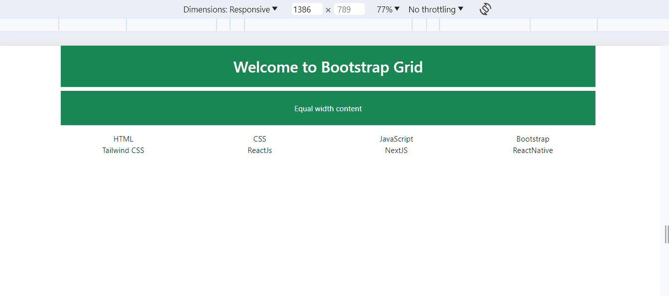
Grid Medium with Equal Size.
Example: In this example, each row contains four columns, and each column has equal width on medium-sized screens (≥ 768px). The content is centered and styled with Bootstrap classes.
HTML
<!DOCTYPE html>
<html lang="en">
<head>
<meta charset="UTF-8">
<meta name="viewport"
content="width=device-width, initial-scale=1.0">
<title>Bootstrap 5 Grid Medium</title>
<link rel="stylesheet" href=
integrity="sha256-MBffSnbbXwHCuZtgPYiwMQbfE7z+GOZ7fBPCNB06Z98="
crossorigin="anonymous">
</head>
<body class="container text-center">
<h2 class="p-4 bg-success text-white">
Welcome to Bootstrap Grid
</h2>
<p class="p-4 bg-success text-white">
Equal width content
</p>
<div class="row">
<div class="col-md">HTML</div>
<div class="col-md">CSS</div>
<div class="col-md">JavaScript</div>
<div class="col-md">Bootstrap</div>
</div>
<div class="row">
<div class="col-md">Tailwind CSS</div>
<div class="col-md">ReactJs</div>
<div class="col-md">NextJS</div>
<div class="col-md">ReactNative</div>
</div>
<script src=
integrity="sha256-9XQy42k1z6v5Od1F7L1P4j3Lko8dADJ3g23Bd7MooP7yyA2MIu+tgslXqUNW8Asg"
crossorigin="anonymous">
</script>
</body>
</html>
|
Output:
Auto Column Layout
Example: Illustration of Auto Layout Column using Boostrap.
HTML
<!DOCTYPE html>
<html lang="en">
<head>
<meta charset="UTF-8">
<meta name="viewport"
content="width=device-width, initial-scale=1.0">
<title>Bootstrap 5 Grid XLarge</title>
<link rel="stylesheet" href=
integrity="sha256-MBffSnbbXwHCuZtgPYiwMQbfE7z+GOZ7fBPCNB06Z98="
crossorigin="anonymous">
<style>
[class*="col"],
h2,
p {
padding: 1rem;
background-color: green;
border: 2px solid #fff;
color: #fff;
}
</style>
</head>
<body class="container text-center">
<h2>Welcome to GeeksforGeeks</h2>
<p>Variable width content</p>
<div class="row">
<div class="col-xl-2 col-lg-3
col-md-4 col-sm-6 col-12">
HTML
</div>
<div class="col-xl-2 col-lg-3
col-md-4 col-sm-6 col-12">
CSS
</div>
<div class="col-xl-2 col-lg-3
col-md-4 col-sm-6 col-12">
JavaScript
</div>
<div class="col-xl-2 col-lg-3
col-md-4 col-sm-6 col-12">
ReactJS
</div>
</div>
<div class="row">
<div class="col-xl-2 col-lg-3
col-md-4 col-sm-6 col-12">
MongoDB
</div>
<div class="col-xl-2 col-lg-3
col-md-4 col-sm-6 col-12">
NextJs
</div>
<div class="col-xl-2 col-lg-3
col-md-4 col-sm-6 col-12">
ReactNative
</div>
<div class="col-xl-2 col-lg-3
col-md-4 col-sm-6 col-12">
NodeJS
</div>
</div>
</body>
</html>
|
Output:

Share your thoughts in the comments
Please Login to comment...