ARIA Attributes in React Accessibility
Last Updated :
18 Apr, 2024
Accessible Rich Internet Applications (ARIA) attributes play a crucial role in enhancing accessibility in React applications. These attributes provide additional information to assistive technologies, such as screen readers, about the structure, behavior, and purpose of user interface components. By using ARIA attributes in React, developers can ensure that their applications are accessible to users with disabilities, improving usability and inclusivity.
ARIA Attributes in Web Accessibility
ARIA (Accessible Rich Internet Applications) attributes are essential for enhancing web accessibility by providing additional information to assistive technologies. These attributes help screen readers interpret the structure, behavior, and purpose of user interface components, ensuring that users with disabilities can navigate and interact with web content effectively. By utilizing ARIA attributes in HTML elements, developers can make their websites more inclusive and accessible to individuals with visual impairments or other disabilities, thereby promoting a more equitable online experience for all users.
How ARIA attributes can be applied to React components to improve accessibility
To effectively use ARIA attributes in React components, developers should carefully consider the accessibility requirements of each element and apply the appropriate attributes accordingly. By incorporating ARIA attributes thoughtfully and following best practices, developers can significantly enhance the accessibility of their React applications, making them more inclusive and usable for all users.
Approach to Implementing ARIA attributes in a React App
- The <button> element represents a clickable button in the React component.
- aria-label: This attribute provides an accessible name for the button. It is particularly useful when the visible text content of the button is not descriptive enough or when there is no visible text content at all. In this case, “Click me” serves as the accessible name for the button.
- aria-disabled: This attribute indicates whether the button is disabled. It takes a boolean value (true or false). When set to true, it informs assistive technologies that the button is currently not interactive. In our case, the value is determined by the disabled prop passed to the component.
- role=”button”: This attribute defines the role of the element, in this case, as a button. It helps assistive technologies understand the purpose of the element, making it easier for users to navigate and interact with it.
- aria-haspopup: This attribute indicates that the button controls a pop-up menu or dialog. It takes a boolean value (true or false). In our case, it is set to true, suggesting that clicking the button will reveal a dropdown menu. This attribute helps convey additional context to users of assistive technologies.
- aria-controls: This attribute specifies the ID of the element that the button controls. In our example, it suggests that the button controls the dropdown menu with the ID “dropdown-menu”. This association helps assistive technologies understand the relationship between the button and the controlled element.
- tabIndex: This attribute determines if an element is focusable and in what order it is focused when the user navigates using the keyboard. A value of -1 indicates that the element should be focusable but not reachable via sequential keyboard navigation. In our case, the button’s tabIndex is dynamically set to 0 when it’s not disabled, allowing it to receive focus.
- style: This attribute allows inline CSS styling to be applied to the button. In our example, we’re using it to change the cursor style to “not-allowed” when the button is disabled, indicating to users that it’s not currently interactive.
Steps to Implementing ARIA attributes in a React App:
Step 1: Create react app using the following command.
npx create-react-app <-foldername->
Step 2: Move to the project directory.
cd <-foldername->
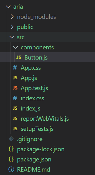
Project Structure:
Exaplanation:
- It is demonstrating how to add ARIA roles, states, and properties to various React elements.
- It is showing how ARIA attributes enhance accessibility by providing context and behavior information to assistive technologies.
- It is highlighting the impact of ARIA attributes on the user experience for individuals with disabilities through example outputs and screen reader demonstrations.
Example: Below is an example of ARIA attributes in React accessibility.
JavaScript
//App.js
import Button from './components/Button';

function App() {
  const disabled = false;
  const onclick= () => {
     alert("Button Clicked")
  }
  return (

         <>
         <div>
          ARIA ATTRIBUTE EXAMPLE ||
          button that using some aria attribute
          </div>
          <div>
         <Button onClick={onclick} disabled={disabled}/>
         </div>
         </>

  );
}

export default App;
// Button component
import React from 'react';

function Button({ onClick, disabled }) {
    const handleClick = (event) => {
        if (onClick && !disabled) {
            onClick(event);
        }
    };

    const handleKeyPress = (event) => {
        if (event.key === 'Enter' && onClick && !disabled) {
            onClick(event);
        }
    };

    return (
        <button
            onClick={handleClick}
            onKeyPress={handleKeyPress}
            aria-pressed="true"
            disabled={disabled}
            aria-label="Click me"
            aria-disabled={disabled}
            role="button"
            aria-haspopup="true"
            aria-controls="dropdown-menu"
            tabIndex={disabled ? -1 : 0}
            style={{ cursor: disabled ? 'not-allowed' : 'pointer' }}
        >
            Click Me
        </button>
    );
}

export default Button;
Start your application using the following command.
npm start
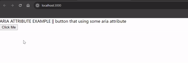
Output:
FAQs on ARIA Attributes
Can ARIA attributes be applied to React components dynamically?
Yes, ARIA attributes can be applied dynamically to React components based on user interactions, component state changes, or other dynamic conditions. This allows developers to adjust accessibility properties and behavior dynamically to meet the needs of users with disabilities.
Are there any best practices for using ARIA attributes in React applications?
Yes, some best practices for using ARIA attributes in React applications include using semantic HTML elements whenever possible, minimizing the use of ARIA attributes, ensuring correct usage and semantics, testing for accessibility, and documenting the usage of ARIA attributes in the codebase.
How can I test the accessibility of my React application with ARIA attributes?
Accessibility testing tools and screen readers can be used to evaluate the effectiveness of ARIA attributes in a React application. Conducting manual testing with keyboard navigation and assistive technologies is also essential to ensure that the application is usable for users with disabilities.
What are some common ARIA attributes used in React applications?
Some common ARIA attributes used in React applications include role, aria-label, aria-labelledby, aria-describedby, aria-hidden, aria-expanded, and aria-controls. These attributes help define roles, states, properties, and relationships between elements to improve accessibility.
Share your thoughts in the comments
Please Login to comment...