Angular PrimeNG Ripple Component
Last Updated :
14 Sep, 2022
Angular PrimeNG is an open-source front-end UI library that has many native Angular UI components which help developers to build a fast and scalable web solution. In this article, we will be seeing Angular PrimeNG Ripple Component.
The Ripple Component is used to apply a ripple effect animation to the host element. It needs to be enabled for each component by setting this.primengConfig.ripple to true. After this, the pRipple directive can be used on elements to apply the ripple effect to them.
Angular PrimeNG Ripple Component Styling Classes:
- p-ripple: This class is applied to the host element.
- p-ink: This class is applied to the ripple element and is used to change the color of the ripple.
- p-ink-active: This class is applied to the ripple element when it is animating.
Syntax:
<div pRipple>....</div>
Creating Angular Application and Installing the Module:
Step 1: Create an Angular application using the following command.
ng new appname
Step 2: After creating your project folder i.e. appname, move to it using the following command.
cd appname
Step 3: Finally, Install PrimeNG in your given directory.
npm install primeng --save
npm install primeicons --save
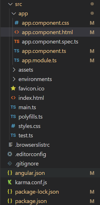
Project Structure: The project Structure will look like this after following the above steps:
Project Structure
Run the below command:
ng serve --open
Example 1: In this example, we used the pRipple directive to apply the ripple effect to the card component.
app.component.html
<div style="text-align: center">
<h2 style="color: green">GeeksforGeeks</h2>
<h4>Angular PrimeNG Ripple Component</h4>
<div class="cards flex justify-content-center mt-5">
<p-card
header="Card Without Ripple Effect"
[style]="{'width': '350px', 'margin-right': '20px'}">
<p>Ripple Component Demo</p>
</p-card>
<p-card
pRipple
header="Card With Ripple Effect"
[style]="{'width': '300px'}">
<p>Ripple Component Demo</p>
</p-card>
</div>
</div>
|
app.component.ts
import { Component, OnInit } from '@angular/core';
import { PrimeNGConfig } from 'primeng/api';
@Component({
selector: 'app-root',
templateUrl: './app.component.html',
styles: [
`
.cards{
user-select: none;
}
`
]
})
export class AppComponent implements OnInit{
constructor(private primengConfig: PrimeNGConfig) { }
ngOnInit() {
this.primengConfig.ripple = true;
}
}
|
app.module.ts
import { NgModule } from '@angular/core';
import { BrowserModule }
from '@angular/platform-browser';
import { BrowserAnimationsModule }
from '@angular/platform-browser/animations';
import { AppComponent } from './app.component';
import { CardModule } from 'primeng/card';
import { RippleModule } from 'primeng/ripple';
@NgModule({
imports: [
BrowserModule,
BrowserAnimationsModule,
CardModule,
RippleModule
],
declarations: [AppComponent],
bootstrap: [AppComponent],
})
export class AppModule { }
|
styles.css
.p-card-body{
background-color: green;
padding: 0;
color: white;
}
|
Output:
Example 2: In this example, we customized the color of the ripple effect using CSS.
app.component.html
<div style="text-align: center">
<h2 style="color: green">GeeksforGeeks</h2>
<h4>Angular PrimeNG Ripple Component</h4>
<div class="cards flex align-items-center flex-column mt-8">
<div class="flex justify-content-center">
<p-card
pRipple
class="default"
header="Default Ripple"
[style]="{'width': '200px'}">
<p>Ripple Component Demo</p>
</p-card>
<p-card
pRipple
class="red"
header="Red Ripple"
[style]="{'width': '200px'}">
<p>Ripple Component Demo</p>
</p-card>
</div>
<div class="flex justify-content-center mt-3">
<p-card
pRipple
class="pink"
header="Pink Ripple"
[style]="{'width': '200px'}">
<p>Ripple Component Demo</p>
</p-card>
<p-card
pRipple
class="purple"
header="Purple Ripple"
[style]="{'width': '200px'}">
<p>Ripple Component Demo</p>
</p-card>
</div>
<div class="flex justify-content-center mt-3">
<p-card
pRipple
class="green"
header="Green Ripple"
[style]="{'width': '200px'}">
<p>Ripple Component Demo</p>
</p-card>
<p-card
pRipple
class="yellow"
header="Yellow Ripple"
[style]="{'width': '200px'}">
<p>Ripple Component Demo</p>
</p-card>
</div>
</div>
</div>
|
app.component.ts
import { Component, OnInit } from '@angular/core';
import { PrimeNGConfig } from 'primeng/api';
@Component({
selector: 'app-root',
templateUrl: './app.component.html',
styles: [
`
.cards{
user-select: none;
}
`
]
})
export class AppComponent implements OnInit{
constructor(private primengConfig: PrimeNGConfig) { }
ngOnInit() {
this.primengConfig.ripple = true;
}
}
|
app.module.ts
import { NgModule } from '@angular/core';
import { BrowserModule }
from '@angular/platform-browser';
import { BrowserAnimationsModule }
from '@angular/platform-browser/animations';
import { AppComponent } from './app.component';
import { CardModule } from 'primeng/card';
import { RippleModule } from 'primeng/ripple';
@NgModule({
imports: [
BrowserModule,
BrowserAnimationsModule,
CardModule,
RippleModule
],
declarations: [AppComponent],
bootstrap: [AppComponent],
})
export class AppModule { }
|
styles.css
.default .p-card-body{
background-color: green;
padding: 0;
color: white;
}
.p-ripple.red .p-ink {
background: rgba(255, 0, 0, .3);
}
.p-ripple.pink .p-ink {
background: rgba(255, 0, 204, 0.3);
}
.p-ripple.purple .p-ink {
background: rgba(153, 0, 255, 0.5);
}
.p-ripple.green .p-ink {
background: rgba(47, 255, 0, 0.3);
}
.p-ripple.yellow .p-ink {
background: rgba(204, 255, 0, 0.3);
}
|
Output:
Reference: http://primefaces.org/primeng/ripple
Share your thoughts in the comments
Please Login to comment...