Angular PrimeNG PanelMenu Component
Last Updated :
13 Feb, 2023
Angular PrimeNG is an open-source framework with a rich set of native Angular UI components that are used for great styling and this framework is used to make responsive websites with very much ease. In this article, we will know how to use the PanelMenu component in Angular PrimeNG. We will also learn about the properties, styling along with their syntaxes that will be used in the code.
PanelMenu component: It is used to make a menu in the form of a panel. It can be considered as a combination of accordion and tree components
Properties:
- model: It is an array of menu items. It accepts the array data type as input & the default value is null.
- style: It is used to set an inline style of the component. It is of the string data type & the default value is null.
- styleClass: It is used to set the style class of the component. It is of the string data type & the default value is null.
- multiple: It is used to specify whether multiple tabs can be activated at the same time or not. It is of the boolean data type & the default value is true.
- transitionOptions: It is used to set the transition options of the animation. It is of the string data type & the default value is 400ms cubic-bezier(0.86, 0, 0.07, 1).
Styling:
- p-panelmenu: It is a container element.
- p-panelmenu-header: It is an accordion header of the root submenu.
- p-panelmenu-content: It is an accordion content of the root submenu.
- p-menu-list: It is an element list.
- p-menuitem: It is an element menuitem.
- p-menuitem-text: It is the label of a menuitem.
- p-menuitem-icon: It is an icon of a menuitem.
- p-panelmenu-icon: It is the arrow icon of an accordion header.
Creating Angular application & module installation:
- Step 1: Create an Angular application using the following command.
ng new appname
- Step 2: After creating your project folder i.e. appname, move to it using the following command.
cd appname
- Step 3: Install PrimeNG in your given directory.
npm install primeng --save
npm install primeicons --save
Project Structure: After complete installation, it will look like the following:

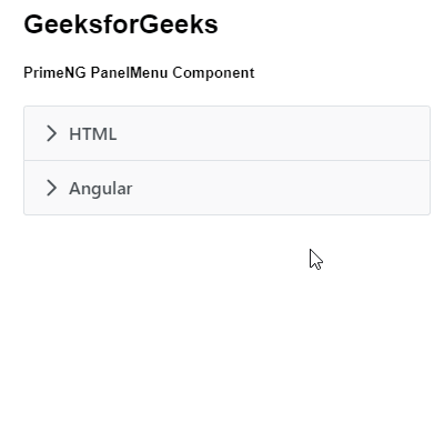
Example 1: This is the basic example that illustrates how to use the PanelMenu component.
app.component.html
<h2>GeeksforGeeks</h2>
<h5>PrimeNG PanelMenu Component</h5>
<p-panelMenu [model]="gfg"></p-panelMenu>
|
app.module.ts
import { NgModule } from '@angular/core';
import { BrowserModule } from '@angular/platform-browser';
import { BrowserAnimationsModule }
from '@angular/platform-browser/animations';
import { AppComponent } from './app.component';
import { PanelMenuModule } from 'primeng/panelmenu';
@NgModule({
imports: [BrowserModule,
BrowserAnimationsModule,
PanelMenuModule],
declarations: [AppComponent],
bootstrap: [AppComponent]
})
export class AppModule {}
|
app.component.ts
import { Component } from '@angular/core';
import { MenuItem } from 'primeng/api';
@Component({
selector: 'my-app',
templateUrl: './app.component.html'
})
export class AppComponent {
gfg: MenuItem[];
ngOnInit() {
this.gfg = [
{
label: 'HTML',
items: [
{
label: 'HTML 1'
},
{
label: 'HTML 2'
}
]
},
{
label: 'Angular',
items: [
{
label: 'Angular 1'
},
{
label: 'Angular 2'
}
]
}
];
}
}
|
Output:
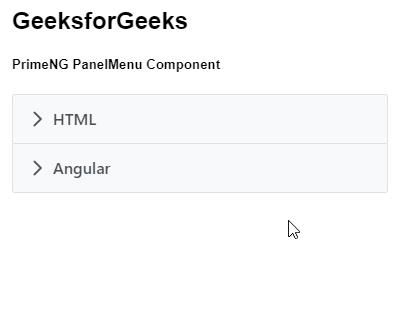
Example 2: In this example, we will know how to use multiple property in the panelmenu component.
app.component.html
<h2>GeeksforGeeks</h2>
<h5>PrimeNG PanelMenu Component</h5>
<p-panelMenu [multiple]='false' [model]="gfg"></p-panelMenu>
|
app.module.ts
import { NgModule } from '@angular/core';
import { BrowserModule } from '@angular/platform-browser';
import { BrowserAnimationsModule }
from '@angular/platform-browser/animations';
import { AppComponent } from './app.component';
import { PanelMenuModule } from 'primeng/panelmenu';
@NgModule({
imports: [BrowserModule,
BrowserAnimationsModule,
PanelMenuModule],
declarations: [AppComponent],
bootstrap: [AppComponent]
})
export class AppModule {}
|
app.component.ts
import { Component } from '@angular/core';
import { MenuItem } from 'primeng/api';
@Component({
selector: 'my-app',
templateUrl: './app.component.html'
})
export class AppComponent {
gfg: MenuItem[];
ngOnInit() {
this.gfg = [
{
label: 'HTML',
items: [
{
label: 'HTML 1'
},
{
label: 'HTML 2'
}
]
},
{
label: 'Angular',
items: [
{
label: 'Angular 1'
},
{
label: 'Angular 2'
}
]
}
];
}
}
|
Output:
Reference: https://primeng.org/panelmenu
Share your thoughts in the comments
Please Login to comment...