Angular PrimeNG Badge Styling
Last Updated :
29 Sep, 2022
Angular PrimeNG is a collection of Interactive UI components for Angular applications. Developers can use these components to make beautiful and responsive web interfaces in no time as most of the components have all the necessary functions implemented. In this article, we will see the Angular PrimeNG Badge Styling.
The Badge Component is generally used as a status indicator for other elements. It can be used as a standalone component or with other elements using the pBadge directive provided by the BadgeModule.
Angular PrimeNG Badge Styling Classes:
- p-badge: This class is applied to the badge element.
- p-overlay-badge: This class is the wrapper of the badge and its target.
- p-badge-dot: This class is applied to the badge element when it has no value.
- p-badge-success: This class is applied to the badge element with success severity.
- p-badge-info: This class is applied to the badge element with success severity.
- p-badge-warning: This class is applied to the badge element with success severity.
- p-badge-danger: This class is applied to the badge element with success severity.
- p-badge-lg: This class is applied to the badge element with large size.
- p-badge-xl: This class is applied to the badge element with extra-large size.
Syntax:
// In app.component.css

:host ::ng-deep .Styling-Class {
    // CSS styling
}
Creating Angular Application and Installing the Module:
Step 1: Create an Angular application using the following command.
ng new appname
Step 2: After creating your project folder i.e. appname, move to it using the following command.
cd appname
Step 3: Finally, Install PrimeNG in your given directory.
npm install primeng --save
npm install primeicons --save
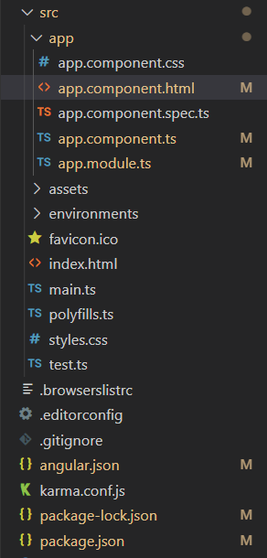
Project Structure: The project Structure will look like this after following the above steps:

Project Structure
Example 1: In this example, we changed the background color of the badges to green using the background-color property of the p-badge class.
app.component.html
<h1 style="color:green">
GeeksforGeeks
</h1>
<h3>Angular PrimeNG Badge Styling</h3>
<p-badge value="2"
class="mr-2">
</p-badge>
<p-badge value="4"
class="mr-2">
</p-badge>
<p-badge value="6"
class="mr-2">
</p-badge>
<p-badge value="8">
</p-badge>
|
app.component.css
:host ::ng-deep .p-badge {
background-color: green;
}
|
app.component.ts
import { Component } from '@angular/core';
@Component({
selector: 'app-root',
templateUrl: './app.component.html',
styleUrls: ['./app.component.css'],
})
export class AppComponent { }
|
app.module.ts
import { NgModule } from '@angular/core';
import { BrowserModule } from '@angular/platform-browser';
import { HttpClientModule } from '@angular/common/http';
import { BrowserAnimationsModule }
from '@angular/platform-browser/animations';
import { AppComponent } from './app.component';
import { FormsModule } from '@angular/forms';
import { BadgeModule } from 'primeng/badge';
@NgModule({
imports: [
BrowserModule,
BrowserAnimationsModule,
HttpClientModule,
FormsModule,
BadgeModule
],
declarations: [AppComponent],
bootstrap: [AppComponent]
})
export class AppModule { }
|
Output:
Example 2: In this example, we targeted the large badges using the p-badge-lg class and changed their background color to red.
app.component.html
<h1 style="color:green">
GeeksforGeeks
</h1>
<h3>Angular PrimeNG Badge Styling</h3>
<p-badge value="2"
class="mr-2"
size="large">
</p-badge>
<p-badge value="4"
class="mr-2">
</p-badge>
<p-badge value="6"
class="mr-2"
size="large">
</p-badge>
<p-badge value="8"
size="xlarge">
</p-badge>
|
app.component.css
:host ::ng-deep .p-badge.p-badge-lg {
background-color: red;
}
|
app.component.ts
import { Component } from '@angular/core';
@Component({
selector: 'app-root',
templateUrl: './app.component.html',
styleUrls: ['./app.component.css'],
})
export class AppComponent { }
|
app.module.ts
import { NgModule } from '@angular/core';
import { BrowserModule } from '@angular/platform-browser';
import { HttpClientModule } from '@angular/common/http';
import { BrowserAnimationsModule }
from '@angular/platform-browser/animations';
import { AppComponent } from './app.component';
import { FormsModule } from '@angular/forms';
import { BadgeModule } from 'primeng/badge';
@NgModule({
imports: [
BrowserModule,
BrowserAnimationsModule,
HttpClientModule,
FormsModule,
BadgeModule
],
declarations: [AppComponent],
bootstrap: [AppComponent]
})
export class AppModule { }
|
Output:
Reference: http://primefaces.org/primeng/badge
Share your thoughts in the comments
Please Login to comment...