Octave – Basics of Plotting Data
Last Updated :
13 Feb, 2023
Octave has some in-built functions for visualizing the data. Few simple plots can give us a better way to understand our data. Whenever we perform a learning algorithm on an Octave environment, we can get a better sense of that algorithm and analyze it. Octave has lots of simple tools that we can use for a better understanding of our algorithm.
In this tutorial, we are going to learn how to plot data for better visualization and understanding it in the Octave environment.
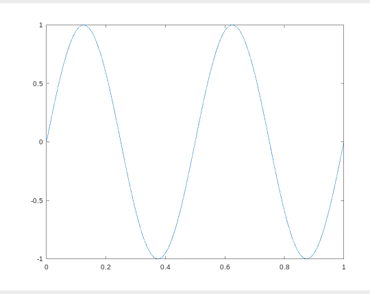
Example 1 : Plotting a sine wave using the plot() and and sin() function:
MATLAB
var_x = [0:0.01:1];
var_y = sin(4 * pi * var_x);
plot(var_x, var_y);
|
Output :
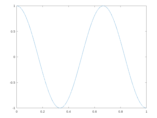
Example 2 : Plotting a cosine wave using the plot() and and cos() function:
MATLAB
var_x = [0:0.01:1];
var_y = cos(3 * pi * var_x);
plot(var_x, var_y);
|
Output :
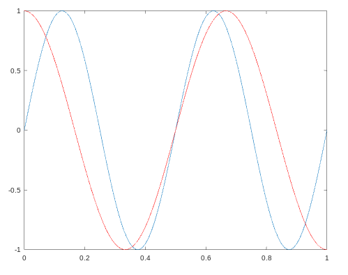
Example 3 : We can plot, one plot over another plot by holding the previous plot with the hold on command.
MATLAB
var_x = [0:0.01:1];
var_y1 = sin(4 * pi * var_x);
var_y2 = cos(3 * pi * var_x);
plot(var_x, var_y1);
hold on;
plot(var_x, var_y2, 'r');
|
Output :
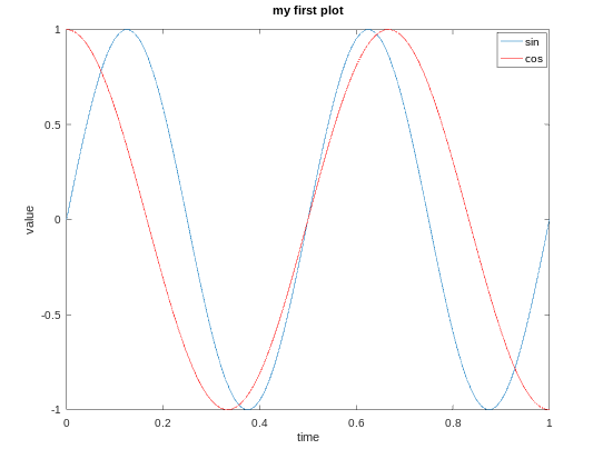
Example 4 : We can add labels for the x-axis and the y-axis along with the legends and title with the below code.
MATLAB
var_x = [0:0.01:1];
var_y1 = sin(4 * pi * var_x);
var_y2 = cos(3 * pi * var_x);
plot(var_x, var_y1);
hold on;
plot(var_x, var_y2, 'r');
xlabel('time');
ylabel('value');
title('my first plot');
legend('sin', 'cos');
|
Output :
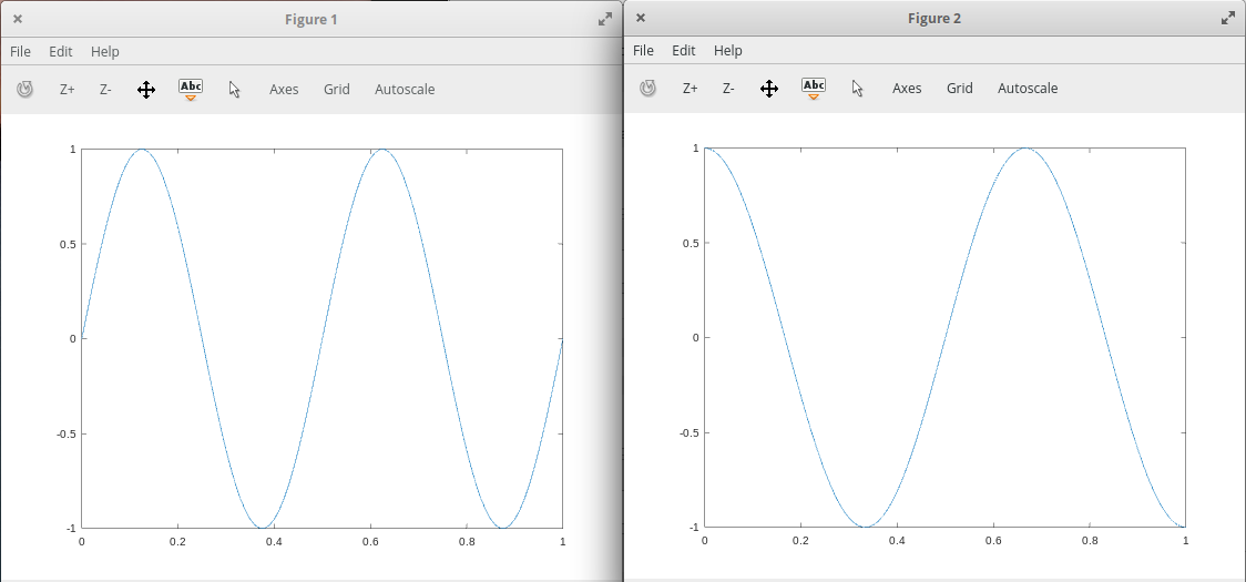
Example 5 : We can also plot data on different figures.
MATLAB
var_x = [0:0.01:1];
var_y1 = sin(4 * pi * var_x);
var_y2 = cos(3 * pi * var_x);
figure(1);
plot(var_x,var_y);
figure(2);
plot(var_x,var_y2);
|
Output :
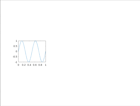
Example 6 : We can divide a figure into a m x n grid using the subplot() function. In the below code the first 2 parameter shows m and n and 3rd parameter is the grid count from top to left.
MATLAB
var_x = [0:0.01:1];
var_y = sin(4 * pi * var_x);
subplot(3, 3, 4), plot(var_x, var_y);
|
Output :
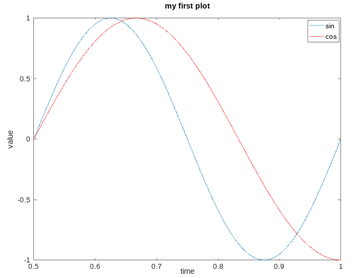
Example 7 : We can change the axis values of any plot using the axis() function.
MATLAB
var_x = [0:0.01:1];
var_y1 = sin(4 * pi * var_x);
var_y2 = cos(3 * pi * var_x);
plot(var_x, var_y1);
hold on;
plot(var_x, var_y2, 'r');
xlabel('time');
ylabel('value');
title('my first plot');
legend('sin', 'cos');
axis([0.5 1 -1 1])
|
Here the first 2 parameters shows the range of the x-axis and the next 2 parameters shows the range of the y-axis.
Output :
Example 8 : We can save our plots in our present working directory :
In order to print this plot at our desired location, we can use cd with it as shown below :
MATLAB
cd '/home/dikshant/Documents'; print -dpng 'plot.png'
|
We can close a figure/plot using the close command.
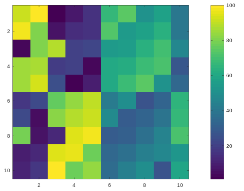
Example 9 : We can visualize a matrix using the imagesc() function.
MATLAB
matrix = magic(10)
imagesc(matrix)
|
Output :
matrix =

    92    99     1     8    15    67    74    51    58    40
    98    80     7    14    16    73    55    57    64    41
     4    81    88    20    22    54    56    63    70    47
    85    87    19    21     3    60    62    69    71    28
    86    93    25     2     9    61    68    75    52    34
    17    24    76    83    90    42    49    26    33    65
    23     5    82    89    91    48    30    32    39    66
    79     6    13    95    97    29    31    38    45    72
    10    12    94    96    78    35    37    44    46    53
    11    18   100    77    84    36    43    50    27    59
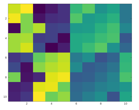
The above plot is of 10×10 grid, each grid represents a value with a color. The same color value results in the same color.
We can also make a color bar with this plot to see which value corresponds to which color using the colorbar command. We can use multiple commands at a time by separating them with a comma(,) in Octave environment.
MATLAB
matrix = magic(10)
imagesc(matrix), colorbar;
|
Output :
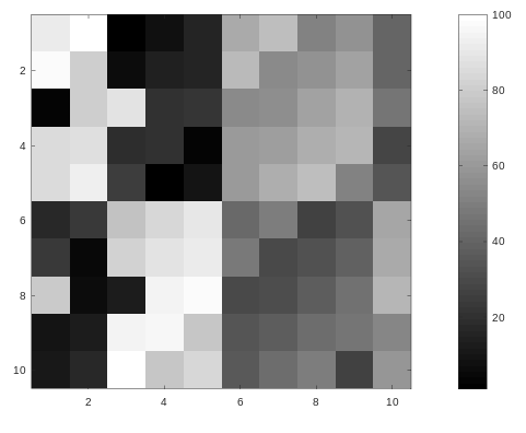
Drawing the magic square with a gray-scale colormap :
MATLAB
matrix = magic(10)
imagesc(matrix), colorbar, colormap gray;
|
Output :
Share your thoughts in the comments
Please Login to comment...