Youden plot
Last Updated :
02 Nov, 2022
A Youden Plot is a scatter plot representation of results obtained from N laboratories on two similar materials. The main objective of the plot is to find out which of the N labs gave unreliable or faulty results.
Structure of the plot
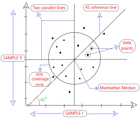
Fig 1: Structure of a youden plot
As shown in Fig 1, the following elements are present in a Youden plot:
- x-axis: readings of sample I from N labs.
- y-axis: readings of sample II from N labs.
- Two parallel lines are drawn parallel to the x & y-axis in such a way that the data points on both sides of the line are same.
- Manhattan Median: The point where the two parallel lines intersect each other is known as the Manhattan median. A 45° reference line is drawn passing this point.
- There is a 95% coverage circle around the manhattan median.
Intuition
Youden plots help in understanding the variations that occur in the measurements of two similar samples. It tells as about two types of variability: [As shown in Fig 2]
- Within-Lab variability: The variations in the results when multiple tests are performed on the two samples (A & B) within the same lab. It leads to repeatability problems.
- Between-Lab variability: The variations in the results among different labs performing tests on the same two samples (A & B). It leads to reproducibility problems.
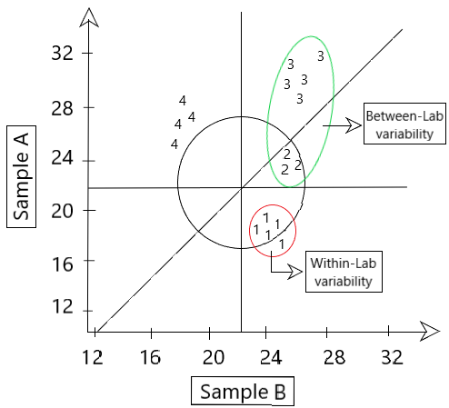
Fig 2: Lab variabilities shown in Youden plot
The plot also helps in detecting the presence of various types of errors like systematic and random errors.
Systematic Error: These errors occur due to inconsistencies present in the experiment like faulty or uncalibrated equipment. They are fixable as we can find the source of the error by replicating the experiments. These are usually found within one lab performing the experiment.
Random Error: These errors are unsystematic as they occur at random. They cannot be fixed due to their unpredictable nature.
- If random error >> systematic error, then the data points will cluster in the circle around the manhattan median. They lie further away from the 45° reference line.
- If systematic error >> random error, then the data points will cluster around the 45° reference line in an elliptical pattern.
Any data points lying outside the coverage circle are called Outliers and they contribute to total error.
Requirement
The major requirement of this plot lies in the medical field mainly focusing on quality control. It helps in identifying various things like:
- Inconsistencies like repeatability and reproducibility.
- Which lab results are inaccurate (outliers)
- Comparisons among and between lab experiments.
Code Implementation in R
R
YoudenPlot <- function(A, B){
plot(A,B,asp = 1, xlab = "A", ylab = "B", pch=".")
MMofA <- median(A)
MMofB <- median(B)
abline(h = MMofB, v = MMofA)
curve(x-(MMofA-MMofB),add=TRUE)
d <- mean(A-B)
d_prime <- A-B-d
r <- 2.45*mean(abs(d_prime))*sqrt(pi)/2
t <- seq(0,2*pi,by=0.01)
x <- r*cos(t)+MMofA
y <- r*sin(t)+MMofB
lines(x,y)
}
A <- rnorm(500,10,100)
B <- rnorm(500,10,100)
YoudenPlot(A,B)
|
Output
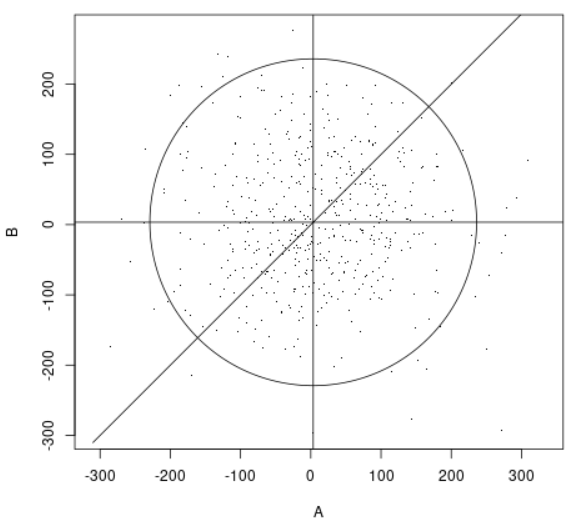
Fig 3: Code output of the sample youden plot
Youden plot is a very powerful graphical tool used to analyse inter-laboratory data and help in finding within as well as between laboratory errors. Moreover, the Youden plot is considered to be useful for analyzing the performance of laboratories. It is prominently used in the fields of medical research for the purpose of quality assessment. For any doubt/query, comment below.
Share your thoughts in the comments
Please Login to comment...