What is Information Visualization in Design?
Last Updated :
15 May, 2024
Information visualization is the process of interchanging data and real-life situations. Raw numbers can be transformed into vivid visual tales. Using charts, graphs, and interactive displays, designers can convert abstract ideas into simple pictures that even a layperson can comprehend in a split-second. When designers are conversant with information visualization, they can easily simplify difficult concepts. Well-crafted infographics and dashboards break through blockages to bring out insights that cannot be revealed by texts only. Using visuals, our perception of things is heightened as we judge patterns using our eyes.
What makes information visualization captivating is its human touch on data. Abstract facts are given emotional power via persuasive visual narratives. Data visualization has opened up exciting opportunities for design practitioners whereby analytics meets aesthetics: where complex data becomes beautiful simplification. It’s an ever-growing field where data turns to knowledge in seconds.
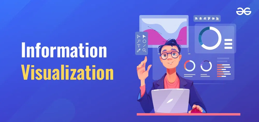
Information Visualization
Its primary task is to make easy-to-grasp graphics and images out of intricate data. It makes it easier to deal with big numbers, statistics as well as facts. This will be appreciated by those who are not experts in the field of data since they can get the right meaning from it much faster. Therefore, a good visualization of data illustrates the most important parts of complicated data sets. This changes obscure figures into clear visual stories and revelations. Some reasons why information visualization is important for beginners include its way of making complex ideas simple to understand, providing narratives through patterns in the data, and enabling quicker and better decision making.
In summary – information visualization simplifies perplexing data into visuals that are easily understood by others. This helps bring out insights, trends and opportunities from otherwise complex information. Numbers matter because they need to be used or acted on.
Information visualization facilitates comprehension, intuition, conclusions, narratives and participation by transforming intricate sets of data into simple but eye-catching images.
The following are the key Benefits of information visualization:
- Makes complicated data easy to understand: It converts complex numbers and statistics into simpler pictures and charts. This helps people to understand better.
- Identify insights and patterns: By visualizing data, simplifying it leads to more visible hidden insights and patterns. These “insights” would have been difficult to find in raw data.
- Better decision-making: People make faster and sounder decisions if they have simplified data along with insights. Visualized data that is easy to comprehend assists in identifying improved options.
- Narration: Complex data is transformed into a well-coordinated story or flow of information thus making it stick better in one’s mind through simple graphs or pictures.
- Encourage audience participation: Colorful displays of information are far more likely than mere columns of numbers or text walls to draw attention and hold interest
Complex datasets are used in various fields with respect to information visualization thereby providing a deep dive into, highlight of the insights from, and monitoring changes inside intricate data sets as well as making better decisions. It makes easier to discover and make sense of data.
Information visualization is employed for many purposes across several industries and positions:
- Business Reports: Business reports use visual elements such as charts and graphs to show trends, sales, marketing, operations and finance departments.
- Data Analysis : Data analysts utilize info graphics to explore data, identify patterns and share their discoveries with others.
- Academic Research: Professors and scientists turn complex academic data into simple charts, graphs or interactive visualizations that illustrate concepts.
- News Reporting: News uses info-graphs, maps or charts to explain trends, polls, statistics and researches in a more understandable manner for everyone.
- Product Design: Design teams get usage analytics and user research out in front of them so they can inform improvements on products.
- Medicine: Doctors employ medical visualization technology whereby MRI scans x-ray images etcetera are converted into simplified forms which helps them diagnose various ailments.
What is information visualization?
Information visualization is presenting data visually using charts, graphs, maps, etc. to amplify understanding and insight.
How does information visualization help?
It leverages visual perception to reveal patterns, relationships and trends that would be hard to see in raw data.
What are some common types of visualizations?
Common types include bar charts, line graphs, tree maps, network diagrams, dashboards, infographics, and interactive maps.
What can you visualize?
Almost any data can be visualized – statistics, metrics, survey results, financial data, social connections, processes, hierarchies and more.
Who uses information visualization?
It is used across many fields including business, journalism, government, education, research and social media.
What are the benefits of visualizing data?
Benefits include finding insights, improving memory, enhancing engagement, communicating clearly, simplifying complexity, and driving action.
What makes an effective visualization?
Effective visuals are clear, focused, intuitively represent the data, reveal key insights, and connect to the audience goals.
What tools can I use to create visualizations?
Many free and paid tools exist like Tableau, Power BI, RawGraphs, Canva, Venngage, Flourish and more.
Conclusion
Transforming complex data into easy-to-understand visuals like charts, graphs, and interactive dashboards is what is called information visualization. This simplifies large numbers and statistics which in turn helps to bring out patterns and trends faster that are useful for the businesses. The main advantages of good information visualization are better understanding of complicated data, quicker analysis leading to deeper insights, improved communication of technical concepts to diverse audiences, and better decisions making. Properly visualized, however, intricate data sets can be grasped more easily across industries. Simplicity clarity and insight are features of information visualization. The increasing relevance thereof enables experienced persons in the field as well as new ones to move from confusion to comprehension.
Share your thoughts in the comments
Please Login to comment...