What is badges in Bootstrap ?
Last Updated :
24 Aug, 2021
Introduction: In Bootstrap v5, Badges are simple and basic components that are used to display an indicator or count a number. This is quite useful for mail count and alerting purposes, among other things. Badges are identical to labels, with the exception that they have more rounded corners. Badges scale to match the size of the immediate parent element by using relative font sizing and em units. As of Bootstrap v5, badges no longer have the focus or hover styles for links.
Approach: We can create badges .badge class within <span> elements to create rectangular badges. We can also create different badges variations using a contextual class (like .badge-secondary) with minimal effort. Below is the procedure to implement a simple badge in Bootstrap.
Step 1: Include Bootstrap and jQuery CDN into the <head> tag before all other stylesheets to load our CSS.
<link rel=”stylesheet” href=”https://maxcdn.bootstrapcdn.com/bootstrap/4.5.2/css/bootstrap.min.css”>
<script src=”https://ajax.googleapis.com/ajax/libs/jquery/3.5.1/jquery.min.js”></script>
<script src=”https://cdnjs.cloudflare.com/ajax/libs/popper.js/1.16.0/umd/popper.min.js”></script>
<script src=”https://maxcdn.bootstrapcdn.com/bootstrap/4.5.2/js/bootstrap.min.js”></script>
Step 2: Add <span> tag in <body> tag.
<h1>GeeksForGeeks <span>New</span> </h1>
Step 3: Add the .badge class together with a contextual class (like .badge-secondary) within <span> elements.
<h1>GeeksForGeeks <span class="badge badge-secondary">New</span></h1>
Note: Users of screen readers and other assistive technology may find badges perplexing depending on how they’re utilized. While badges’ design gives users a visual clue as to what they are for, these users will only see the badge’s text. These badges may appear as random extra words or numbers at the end of a phrase, depending on the context.
Example 1: In this example, We will display badges in front of the text to highlight the text. In the below example, the “New” badge is displayed. Badges will be able to notify the user about any “New” post, or message that has been there on his account. Badges can be used as links to navigate directly to a webpage or web pages buttons to provide a counter.
index.html
<!DOCTYPE html>
<html lang="en">
<head>
<title>Badges Example</title>
<meta charset="utf-8" />
<meta name="viewport"
content="width=device-width, initial-scale=1" />
<link
rel="stylesheet"
href=
<script src=
</script>
<script src=
</script>
<script src=
</script>
</head>
<body style="color: green">
<div class="container">
<h2>Badges in Bootstrap</h2>
<h1>
GeeksForGeeks Example
<span class="badge badge-secondary">
New
</span>
</h1>
<h2>
GeeksForGeeks Example
<span class="badge badge-secondary">
New
</span>
</h2>
<h3>
GeeksForGeeks Example
<span class="badge badge-secondary">
New
</span>
</h3>
<h4>
GeeksForGeeks Example
<span class="badge badge-secondary">
New
</span>
</h4>
<h5>
GeeksForGeeks Example
<span class="badge badge-secondary">
New
</span>
</h5>
<h6>
GeeksForGeeks Example
<span class="badge badge-secondary">
New
</span>
</h6>
</div>
</body>
</html>
|
Output:
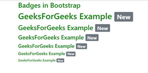
Badges in Bootstrap
Example 2: In the example, we will use badges inside a button that display the counter. It shows that the user has 4 Notifications, 10 Messages, and 2 updates. It will notify the user to check those notifications, messages, and updates. We can also change the background utility to change the color of badges. We can use red to show danger, or we can use a yellow color to show a warning, etc.
index.html
<!DOCTYPE html>
<html lang="en">
<head>
<title>Badges Example</title>
<meta charset="utf-8" />
<meta name="viewport"
content="width=device-width, initial-scale=1" />
<link
rel="stylesheet"
href=
/>
<script src=
</script>
<script src=
</script>
<script src=
</script>
</head>
<body style="color: green">
<button type="button"
class="btn btn-primary">
Notifications
<span class="badge bg-secondary">
4
</span>
</button>
<button type="button"
class="btn btn-primary">
Messages
<span class="badge bg-warning">
1
0</span>
</button>
<button type="button"
class="btn btn-primary">
Updates
<span class="badge bg-danger">
2
</span>
</button>
</body>
</html>
|
Output:
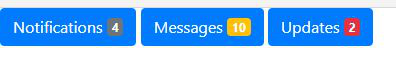
Counter displayed using badges in Bootstrap
Example 3: In this example, We will also change our background utility classes to quickly modify the appearance of a badge. Please note that when using Bootstrap’s default .bg-light, you’ll likely need a text color utility like .text-dark for proper styling. This is because background utilities do not set anything but background color.
index.html
<!DOCTYPE html>
<html lang="en">
<head>
<title>Badges Example</title>
<meta charset="utf-8" />
<meta name="viewport" content="width=device-width, initial-scale=1" />
<link
rel="stylesheet"
href=
<script src=
</script>
<script src=
</script>
<script src=
</script>
</head>
<body>
<span class="badge bg-primary">
Primary
</span>
<span class="badge bg-secondary">
Secondary
</span>
<span class="badge bg-success">
Success
</span>
<span class="badge bg-danger">
Danger
</span>
<span class="badge bg-warning text-dark">
Warning
</span>
<span class="badge bg-info text-dark">
Info
</span>
<span class="badge bg-light text-dark">
Light
</span>
<span class="badge bg-dark">
Dark
</span>
</body>
</html>
|
Output:
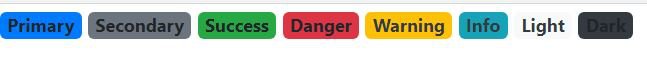
Different background colors to badges to add meaning to them
Note: Giving assistive technology a sense of purpose Color can be used to add meaning, but users of assistive technology, such as screen readers, will not be able to understand it. Ascertain that the information represented by the color is either apparent from the content itself (e.g. visible text) or is included through alternative means.
Share your thoughts in the comments
Please Login to comment...