Spacing and Margin in Pygal
Last Updated :
16 Aug, 2023
Python is a popular scripting language used for data analysis due to its vast library collection using which we can analyze the data. One of them is the Pygal library which is specifically tailored to create interactive and visually appealing charts. Pygal provides an extensive range of chart types, customization options, and interactive features.
Sizing, Spacing, and Margins in Pygal Chart
These customizations are used to make the charts more interactive and readable to users. Three key elements that play a pivotal role in achieving this are sizing, spacing, and margin. These three aspects manage how elements within a chart are positioned and how much space they occupy. In this article, we will learn how to use them to customize charts using Pygal in Python.
Customize Sizing in Pygal
To configure the size of the chart in Pygal we can use “width” and “height” properties while creating an object.
Customize Width in Pygal Plot
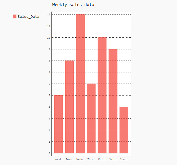
To set the width of charts and plots in Pygal we can use the “width” attribute while creating the object of charts and plots same as used in the below example in pygal.Bar() method. Using the “width” attribute we can control the horizontal space occupied by the plot.
Python3
import pygal
bar_chart = pygal.Bar(width=450)
bar_chart.title = "Weekly sales data"
bar_chart.x_labels = ['Monday', 'Tuesday',
'Wednesday', 'Thrusday',
'Friday', 'Saturday',
'Sunday']
bar_chart.add('Sales_Data', [5, 8, 12, 6, 10, 9, 4])
bar_chart.render_to_file('bar_chart.svg')
|
Output:
Customize Height in Pygal Plot
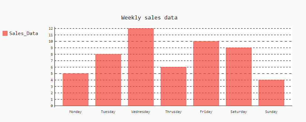
We can customize the height of a plot using the “height” attribute. It allows us to control the vertical space occupied by the plots or graphs in Pygal.
Python3
import pygal
bar_chart = pygal.Bar(height=300)
bar_chart.title = "Weekly sales data"
bar_chart.x_labels = ['Monday', 'Tuesday',
'Wednesday', 'Thrusday',
'Friday', 'Saturday',
'Sunday']
bar_chart.add('Sales_Data', [5, 8, 12, 6, 10, 9, 4])
bar_chart.render_to_file('bar_chart.svg')
|
Output:
Explicit Sizing in Pygal
In Pygal, the “explicit_size” attribute allows us to customize both height and width together. For that, we have to set “explicit_size” as “True” and then set the height and width of a plot as passed in the pygal.Bar() method in the below code.
Python3
import pygal
bar_chart = pygal.Bar(explicit_size=True, height=300, width=450)
bar_chart.title = "Weekly sales data"
bar_chart.x_labels = ['Monday', 'Tuesday',
'Wednesday', 'Thrusday',
'Friday', 'Saturday',
'Sunday']
bar_chart.add('Sales_Data', [5, 8, 12, 6, 10, 9, 4])
bar_chart.render_to_file('bar_chart_explicit_size.svg')
|
Output:
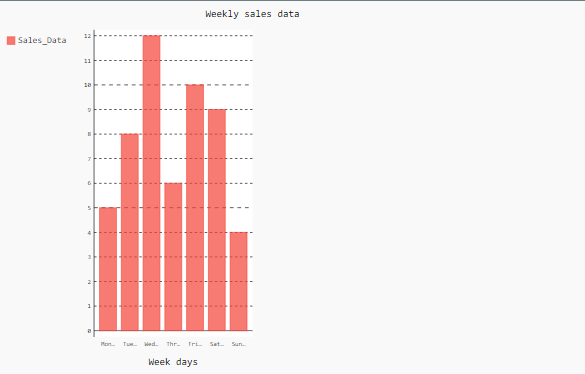
Spacing in Pygal Plot
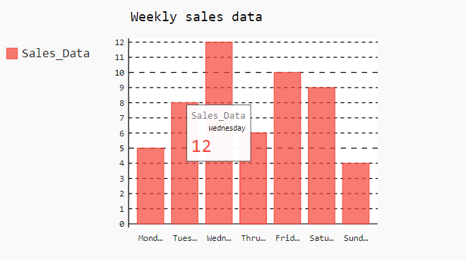
In Pygal, spacing is automatically adjusted between the elements of the plots for the optimal visualization of the plot. Although, we can also adjust the spacing using the “spacing” attribute in Pygal.
Pygal Chart with Default Spacing
Below is the Python program for plotting a bar plot with the default spacing.
Python3
import pygal
bar_chart = pygal.Bar()
bar_chart.title = "Weekly sales data"
bar_chart.x_labels = ['Monday', 'Tuesday',
'Wednesday', 'Thrusday',
'Friday', 'Saturday',
'Sunday']
bar_chart.add('Sales_Data', [5, 8, 12, 6, 10, 9, 4])
bar_chart.render_to_file('bar_chart_spacing.svg')
|
Output:
Pygal Chart with Custom Spacing
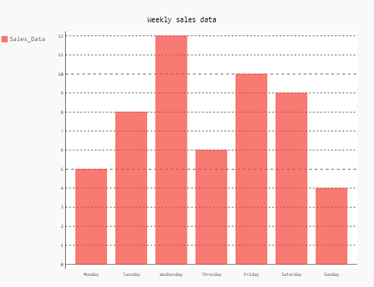
In the below code, we have drawn a bar plot with a custom spacing of 100 using the ‘spacing’ attribute. We can see in the output that custom spacing is applied on all sides of the plot due to which bar plot size is decreased.
Python3
import pygal
bar_chart = pygal.Bar(spacing=100)
bar_chart.title = "Weekly sales data"
bar_chart.x_labels = ['Monday', 'Tuesday',
'Wednesday', 'Thrusday',
'Friday', 'Saturday',
'Sunday']
bar_chart.add('Sales_Data', [5, 8, 12, 6, 10, 9, 4])
bar_chart.render_to_file('bar_chart_spacing.svg')
|
Output:
Margin in Pygal Plot
Margin is used to create space around any object. In this case, the margin is created around the plot using the attributes margin_top, margin_bottom, margin_right, and margin_left. A proper margin ensures that the plot is well-positioned within its container. Let’s see the examples.
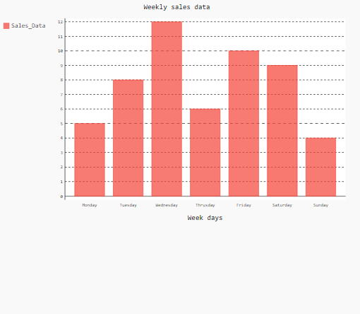
Customize Top Margin in Pygal Plot
In Pygal, we can create the margin at the top of the plot using the attribute ‘margin_top’. In the below example, we have given the margin at the top of 100 pixels. Therefore, a space between the title and plot is created as seen in the output.
Python3
import pygal
bar_chart = pygal.Bar(margin_top=100)
bar_chart.title = "Weekly sales data"
bar_chart.x_labels = ['Monday', 'Tuesday',
'Wednesday', 'Thrusday',
'Friday', 'Saturday',
'Sunday']
bar_chart.add('Sales_Data', [5, 8, 12, 6, 10, 9, 4])
bar_chart.render_to_file('bar_chart.svg')
|
Output:
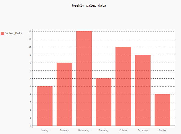
Customize Bottom Margin in Pygal Plot
In Pygal, we can create the margin at the bottom of the plot using the attribute ‘margin_bottom’. In the below example, we have given the margin at the bottom of 100 pixels. Therefore, a space between the plot and the bottom of its parent container is created as seen in the output.
Python3
import pygal
bar_chart = pygal.Bar(margin_bottom=100)
bar_chart.title = "Weekly sales data"
bar_chart.x_title = "Week days"
bar_chart.x_labels = ['Monday', 'Tuesday',
'Wednesday', 'Thrusday',
'Friday', 'Saturday',
'Sunday']
bar_chart.add('Sales_Data', [5, 8, 12, 6, 10, 9, 4])
bar_chart.render_to_file('bar_chart_margin.svg')
|
Output:
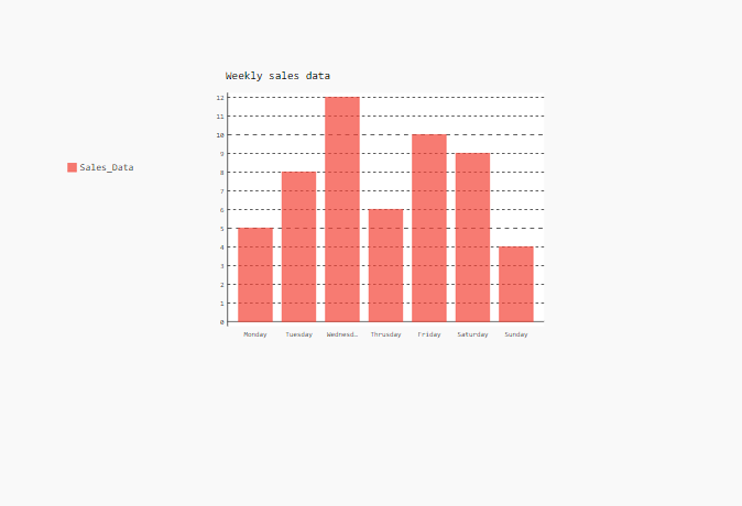
Customize Right Margin in Pygal Plot
In Pygal, we can create the margin at the left of the plot using the attribute ‘margin_left‘. In the below example, we have given the margin at the left of 100 pixels. Therefore, a space between the legend label and the plot is created as seen in the output.
Python3
import pygal
bar_chart = pygal.Bar(margin_left=200)
bar_chart.title = "Weekly sales data"
bar_chart.x_title = "Week days"
bar_chart.x_labels = ['Monday', 'Tuesday',
'Wednesday', 'Thrusday',
'Friday', 'Saturday',
'Sunday']
bar_chart.add('Sales_Data', [5, 8, 12, 6, 10, 9, 4])
bar_chart.render_to_file('bar_chart_margin.svg')
|
Output:
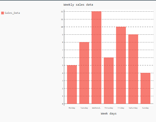
Customize Right Margin in Pygal Plot
In Pygal, we can create the margin at the right of the plot using the attribute ‘margin_right’. In the below example, we have given the margin at the right of 400 pixels. Therefore, a space between the plot and the left border of its parent container is created which results in the squeezed of the bar plot as seen in the output.
Python3
import pygal
bar_chart = pygal.Bar(margin_right=400)
bar_chart.title = "Weekly sales data"
bar_chart.x_title = "Week days"
bar_chart.x_labels = ['Monday', 'Tuesday',
'Wednesday', 'Thrusday',
'Friday', 'Saturday',
'Sunday']
bar_chart.add('Sales_Data', [5, 8, 12, 6, 10, 9, 4])
bar_chart.render_to_file('bar_chart_margin.svg')
|
Output:
Share your thoughts in the comments
Please Login to comment...