Solid Gauge Chart in Pygal
Last Updated :
10 Jul, 2020
Pygal is a Python module that is mainly used to build SVG (Scalar Vector Graphics) graphs and charts. SVG is a vector-based graphics in the XML format that can be edited in any editor. Pygal can create graphs with minimal lines of code that can be easy to understand and write.
Solid Gauge Chart
Gauges are the popular charts which help for dashboards, they anticipate a number in a range at a glance. It can use colored bands, hands, and combinations to display multiple values and their relation to a numeric scale.
Syntax:
gauge = pygal.SolidGauge()
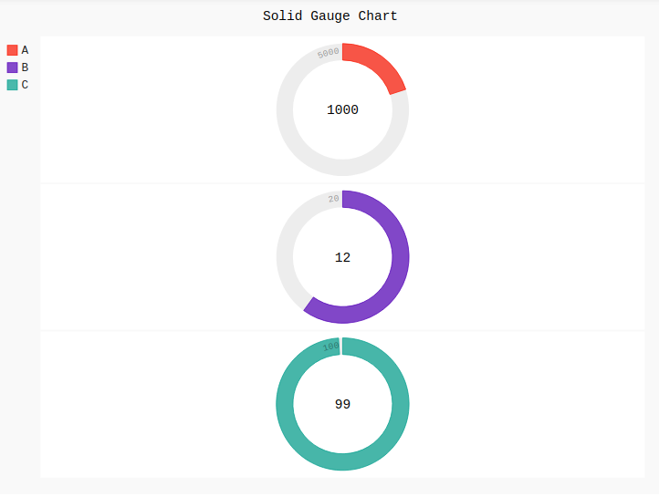
Example 1:
Python3
import pygal
Solid_Gauge = pygal.SolidGauge(inner_radius = 0.75)
Solid_Gauge.title = 'Solid Gauge Chart'
Solid_Gauge.add('A', [{'value': 1000, 'max_value': 5000}])
Solid_Gauge.add('B', [{'value': 12, 'max_value': 20}])
Solid_Gauge.add('C', [{'value': 99, 'max_value': 100}])
Solid_Gauge
|
Output:
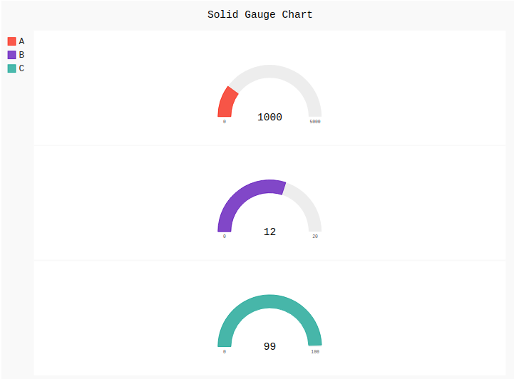
Example 2:
Python3
import pygal
Solid_Gauge = pygal.SolidGauge(inner_radius = 0.75,
half_pie = True)
Solid_Gauge.title = 'Solid Gauge Chart'
Solid_Gauge.add('A', [{'value': 1000, 'max_value': 5000}])
Solid_Gauge.add('B', [{'value': 12, 'max_value': 20}])
Solid_Gauge.add('C', [{'value': 99, 'max_value': 100}])
Solid_Gauge
|
Output:
Share your thoughts in the comments
Please Login to comment...