Sidebar Menu With Tooltips by using CSS
Last Updated :
05 Oct, 2023
A sidebar menu with tooltips in CSS is a user interface element typically located on the side of a webpage. It displays navigation options and provides tooltips (hover-over text) to explain each option when the user interacts with it, enhancing usability and user experience.
Prerequisites
Approach
- We use HTML to create an essential structure for our sidebar menu, which contains an unordered list (<ul>) of menu items inside a fixed-position sidebar.
- Each menu item is represented by a list item (<li>) with an anchor link (<a>) and a title attribute for tooltips.
- We use styles for a fixed sidebar, including its width, background color, and text color.
- we use CSS pseudo-elements (::before) to display tooltips with a fade-in effect on link hover.
- The viewport meta tag helps ensure the design is responsive to different screen sizes.
- On screens 768px or less in width, the sidebar becomes full-width, enabling vertical expansion, and ensuring responsiveness for smaller devices.
Example: In this example, we are using the above-explained approach.
HTML
<!DOCTYPE html>
<html lang="en">
<head>
<meta charset="UTF-8">
<meta name="viewport"
content=
"width=device-width,initial-scale=1.0">
<style>
.sidebar {
width: 300px;
background-color: #333;
color: #fff;
position: fixed;
top: 0;
left: 0;
height: 100%;
}
.sidebar ul {
list-style: none;
padding: 0;
}
.sidebar li {
padding: 12px;
text-align: center;
}
.sidebar a {
color: #fff;
text-decoration: none;
display: block;
padding: 10px;
position: relative;
}
/* Tooltip styling */
.sidebar a::before {
content: attr(title);
position: absolute;
background-color: rgba(0, 0, 0, 0.6);
color: #fff;
padding: 5px 10px;
border-radius: 2px;
visibility: hidden;
opacity: 0;
transition: opacity 0.3s, visibility 0.3s;
bottom: 100%;
left: 50%;
transform: translateX(-50%);
}
.sidebar a:hover::before {
visibility: visible;
opacity: 1;
}
@media (max-width: 768px) {
.sidebar {
width: 100%;
/* Take full width on smaller screens */
height: auto;
/* Allow the content to expand vertically */
}
.sidebar ul {
text-align: center;
}
.sidebar li {
padding: 12px 0;
}
}
</style>
<title>
Sidebar Menu with Tooltips
</title>
</head>
<body>
<div class="sidebar">
<ul>
<li>
<a href="#"
title="Home">
Home
</a>
</li>
<li>
<a href="#"
title="About">
About
</a>
</li>
<li>
<a href="#"
title="Services">
Services
</a>
</li>
<li>
<a href="#"
title="Contact">
Contact
</a>
</li>
</ul>
</div>
</body>
</html>
|
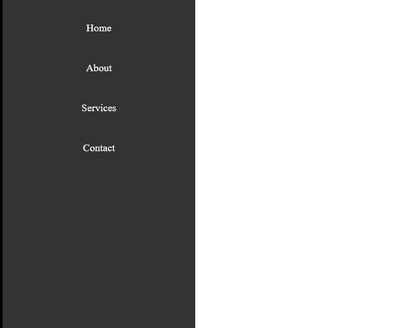
Output:
Share your thoughts in the comments
Please Login to comment...