Semantic UI Integrations for Meteor
Last Updated :
22 Nov, 2023
Semantic UI integration for Meteor is a technique to use the Semantic frontend framework with Meteor. This enables us to use the prebuild component and styles of the Semantic UI in your Meteor projects. With this, you can take advantage of this frontend library to make amazing and responsive websites. Meteor is a full-stack technology that works with React, and Vue and comes with a prebuilt connection to the MongoDB database.
Approach:
Semantic UI has various prebuilt components. so we are going to use them in our meteor project using React as our frontend technology.
Prerequisite:
Steps to Create Meteor Project:
Step 1: Open your terminal and enter the following command to check the version of node. To create a meteor project the node version should be greater than 9 and less than 15. if you don’t have that version install. please the above
node --version
Step 2: To create a meteor project we must have meteor installed in our system write the following command to installed in the system.
npm install -g meteor
Step 3: Create a meteor project using the below command.
meteor create project_name
It will create a meteor project and install all the dependencies
Step 4: Then write the following commands to move into the project folder
cd project_name
Project Structure:
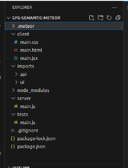
Project Structure
Installing Semantic-UI in Meteor:
Step 1: Install the Semantic:UI Package
meteor add semantic:ui
Step 2: Remove the standard-minifier-css package.
meteor remove standard-minifier-css
Step 3: Install the less and postcss packages.
meteor add less juliancwirko:postcss
Step 4: To configure the postcss package, add the following to your package.json file and save it.
{
  "devDependencies": {
    "autoprefixer": "^6.3.1"
  },
  "postcss": {
    "plugins": {
      "autoprefixer": {"browsers": ["last 2 versions"]}
    }
  }
}
Step 5: create custom.semantic.json file in a folder of your project
mkdir - p client/lib/semantic-ui/
touch client/lib/semantic-ui/custom.semantic.json
Step 6: Install the packages
meteor npm install
Semantic UI is now installed in the project
Using Semantic Components like Button Input and Message
In this example we have used a button component and a input component to take the input from the user and then used a message component to display the text
Example 1: Below is the implementation of the above approach.
Javascript
import React, { useState } from "react";
export const ButtonExample = () => {
const [answer, setAnswer] =
useState("");
const [showMessage, setShowMessage] =
useState(false);
return (
<div
style={{
display: "flex",
justifyContent: "center",
flexDirection: "column",
alignItems: "center",
margin: "auto",
padding: "auto",
}}
>
<h2>
Welcome to GFG Meteor
Semantic example
</h2>
<div className="ui input focus">
<input
type="text"
placeholder="Say Something ..."
onChange={(e) => setAnswer(e.target.value)} />
</div>
<div
className="ui animated fade button "
onClick={() => setShowMessage(true)}
style={{
padding: "10px",
}}>
<div className="visible content">
Sent to GFG
</div>
<div className="hidden content">
<i className="arrow right icon" />
</div>
</div>
{showMessage ? (
<div class="ui message" style={{ color: "grey" }}>
<div class="header" style={{ color: "green" }}>
GFG says
</div>
<p>{answer}</p>
</div>
) : (
<></>
)}
</div>
);
};
|
To run the project type the following in the terminal:
meteor run
Output:
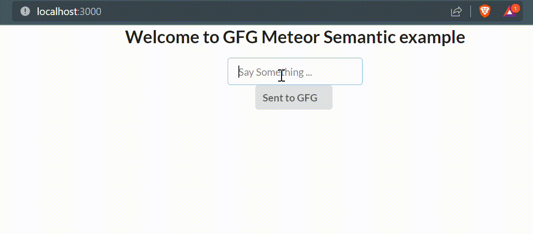
Output 1
Using Image and Reveal Component to upload image and display it
In this example we have used a file input component to take the image from the user and then reveal component to display the image in the reveal component by hovering over it
Example 2: Below is the implementation of the above approach.
Javascript
import React, { useState }
from "react";
export const ImageExample = () => {
const [img, setImg] =
useState(null)
const ImageUpload = (e) => {
setImg(URL.createObjectURL(e.target.files[0]));
}
return (
<div style={{
display: "flex",
justifyContent: "center", flexDirection: "column",
alignItems: "center", margin: "auto",
padding: "auto"
}}>
<h2>
Welcome to GFG Meteor Semantic example
</h2>
<div className="ui input focus">
<input type="file"
placeholder="Upload Image"
onChange={ImageUpload} />
</div>
{img ?
<div className="ui small circular
rotate reveal image">
<img src=
className="visible content" style={{
width: "100px",
heigth: "100px"
}} />
<img src={img}
className="hidden content" style={{
width: "100px",
heigth: "100px"
}} />
</div> : <></>}
</div>
)
}
|
To run the project type the following in the terminal:
meteor run
Output:
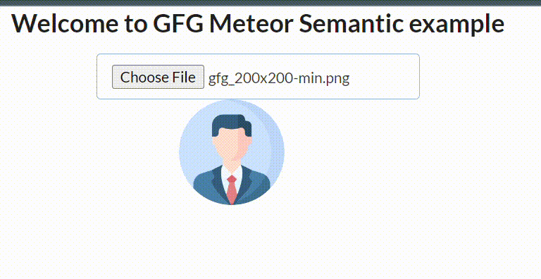
Output 2
Share your thoughts in the comments
Please Login to comment...