Scatter Plot on Polar Axis using Matplotlib
Last Updated :
27 Feb, 2024
Scatter plots are essential for comprehending the interactions between variables in data visualization. Although scatter plots are frequently created in Cartesian coordinates, we can also make scatter plots on polar axes using Matplotlib. With this feature, one can see circular or angular data in innovative ways, such as cyclical trends or directed patterns. In this article, we are going to cover the concept of scatter plots on polar axis using Matplotlib in Python, including how to create them, visualize them and customize them.
Scatter Plot on Polar Axis
Polar coordinates represent points in a plane by their distance from a reference point (the origin) and the angle formed with a reference axis (often the positive x-axis), in contrast to Cartesian coordinates, which employ the x and y axes.
Let’s consider a simple example where we have a dataset containing directional data, such as wind direction at different times. We want to visualize this data on a polar plot as scatter points.
Visualizing Scatter Plot on Polar Axis
- This code creates an array of 100 equally spaced angles between 0 and 2π (full circle) using
np.linspace.
- These angles represent the positions of data points on the polar axis.
The r generates an array of 100 random numbers between 0 and 1 using np.random.rand, representing the distances of data points from the origin along the radial axis.
Python3
import matplotlib.pyplot as plt
import numpy as np
theta = np.linspace(0, 2*np.pi, 100)
r = np.random.rand(100)
colors = np.random.rand(100)
plt.figure(figsize=(8, 8))
ax = plt.subplot(111, polar=True)
ax.scatter(theta, r, c=colors, s=100, cmap='hsv', alpha=0.75)
plt.title('Scatter Plot on Polar Axis', fontsize=15)
plt.show()
|
Output:
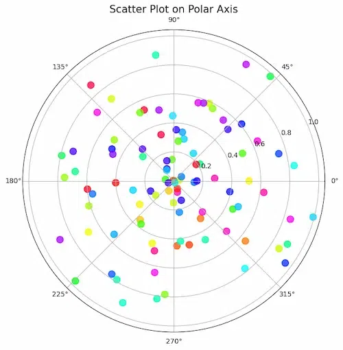
The data points are scattered fairly evenly around the polar axis. The theta values correspond to the angles of the points, and the r values correspond to the distances of the points from the origin. The points closer to the origin are colored blue, while the points further from the origin are colored red.
Scatter Plot on Polar Axis, with Offset Origin
- A scatter plot on polar axis displays data points in a circular manner.
- The offset origin by
np.pi/4 shifts the starting point of the plot, providing a different reference.
Python3
plt.figure(figsize=(8, 8))
ax = plt.subplot(111, polar=True, theta_offset=np.pi/4)
ax.scatter(theta, r, c=colors, s=100, cmap='hsv', alpha=0.75)
plt.title('Scatter Plot on Polar Axis with Offset Origin', fontsize=15)
plt.show()
|
Output:
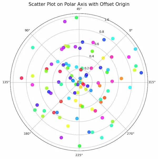
The data is plotted using polar coordinates, where each point is represented by an angle (theta) and a radius (r).
- The origin of the plot is offset by pi/4 radians, which means that the zero angle is located at the 45-degree mark on the polar axis.
- The data points are represented by colored circles with varying sizes.
- The color of each point is determined by its hue, saturation, and value (HSV color model).
- The size of each point is set to 100 and the transparency is set to 0.75.
Scatter Plot on Polar Axis Confined to a Sector
- This code creates a polar scatter plot and confines it to a specified sector (45 to 135 degrees).
- The
set_thetamin and set_thetamax functions control the angular range for the scatter plot, providing a focused view within the specified sector.
Python3
plt.figure(figsize=(8, 8))
ax = plt.subplot(111, polar=True)
ax.scatter(theta, r, c=colors, s=100, cmap='hsv', alpha=0.75)
ax.set_thetamin(45)
ax.set_thetamax(135)
plt.title('Scatter Plot on Polar Axis Confined to a Sector', fontsize=15)
plt.show()
|
Output:
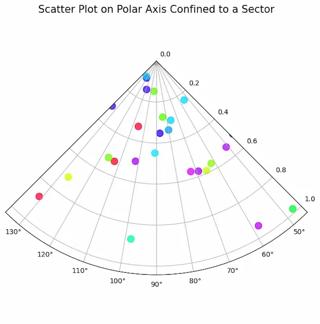
- The data points are colored according to a hue saturation value (HSV) colormap i.e the color of each point corresponds to its angle (theta) value. The size of the data points is also varied, with larger points corresponding to larger values of r.
- The plot is confined to a sector between 45 and 135 degrees as data is only relevant for this range of angles.
Conclusion
In conclusion, learning how to use Matplotlib in Python to plot scatter points on polar axes provides a revolutionary method for displaying directional or circular data patterns.
Share your thoughts in the comments
Please Login to comment...