ReactJS useOrientation Custom Hook
Last Updated :
02 Feb, 2023
React useOrientation Custom Hook is a powerful tool for building responsive layouts in React applications. It allows developers to easily detect the current screen orientation of a device, which can then be used to adjust the layout of a component based on whether the device is in portrait or landscape mode. The useOrientation hook is a custom hook exported by the react-use library and can be imported and used in any functional component. It allows you to create designs that adapt to the device’s screen size and orientation, providing a better user experience. For example, you can change the layout of your navigation bar based on whether the device is in landscape or portrait mode, create a game that responds to the device’s orientation, and changes the gameplay accordingly. Or, you can choose to display photos in portrait or landscape mode, depending on how the device is oriented.
Syntax:
const {angle,type} = useOrientation();
Parameters:
The useOrientation hook does not take any parameters, and it returns an object that contains several properties related to the device’s screen orientation.
- angle: The angle variable will have the degree of rotation of the device, which ranges from 0 to 360.
- type: type variable will have the device’s current screen orientation as a string, it can be “landscape-primary”, “landscape-secondary”, “portrait-primary”, or “portrait-secondary”.
Creating React Application:
Step 1: Make a project directory, head over to the terminal, and create a react app named useorientation-example using the following command:
npx create-react-app useorientation-example
Step 2: After the useorientation-example app is created, switch to the new folder useorientation-example by typing the command below:
cd useorientation-example
Step to include useOrientation hook:
To use the useOrientation hook in your project, you will need to install the react-use library first. You can install it by running the following command in your terminal:
npm install react-use
Then, you can import the hook in your React component:
import { useOrientation } from 'react-use';
Project Structure: We will modify the folder and keep the files we need for this example. Now, make sure your file structure looks like this:
.png)
Project Directory
Let’s see a few examples of how useOrientation hook works in practice.
Example 1: Render different content based on the orientation of the screen.
- We will use the useOrientation hook from the react-use library to determine the orientation of the screen.
- We will use a ternary operator to check the value of the type and render either the LandscapeContent component or the PortraitContent component based on the value of the type.
- If the type is landscape-primary it will render LandscapeContent otherwise it will render PortraitContent.
- This way, the component will render different content based on the device’s screen orientation and provide a better user experience.
App.js:
Javascript
import { useOrientation } from 'react-use';
import './App.css';
const PortraitContent = () => {
return (
<div>
<h1>Welcome to the portrait mode</h1>
<p className="content-portrait">Here is some information that's
specific to portrait mode</p>
</div>
);
}
const LandscapeContent = () => {
return (
<div>
<h1>Welcome to the landscape mode</h1>
<p className="content-landscape">Here is some information that's
specific to landscape mode</p>
</div>
);
}
const App = () => {
const { type } = useOrientation();
return (
<div>
{type === 'landscape-primary' ? (
<LandscapeContent />
) : (
<PortraitContent />
)}
</div>
);
}
export default App;
|
App.css: Add the following code to App.css to style the application.
CSS
* {
color: green;
font-weight: bold;
}
.content-landscape {
color: black;
font-size: 25px;
}
.content-portrait {
color: red;
}
|
Step to run the application: Run the application by using the following command:
npm start
Output: By default, the React project will run on port 3000. You can access it at localhost:3000 on your browser. Open DevTools by pressing F12 and click on the “Device Toggle Toolbar” to adjust the device orientation.
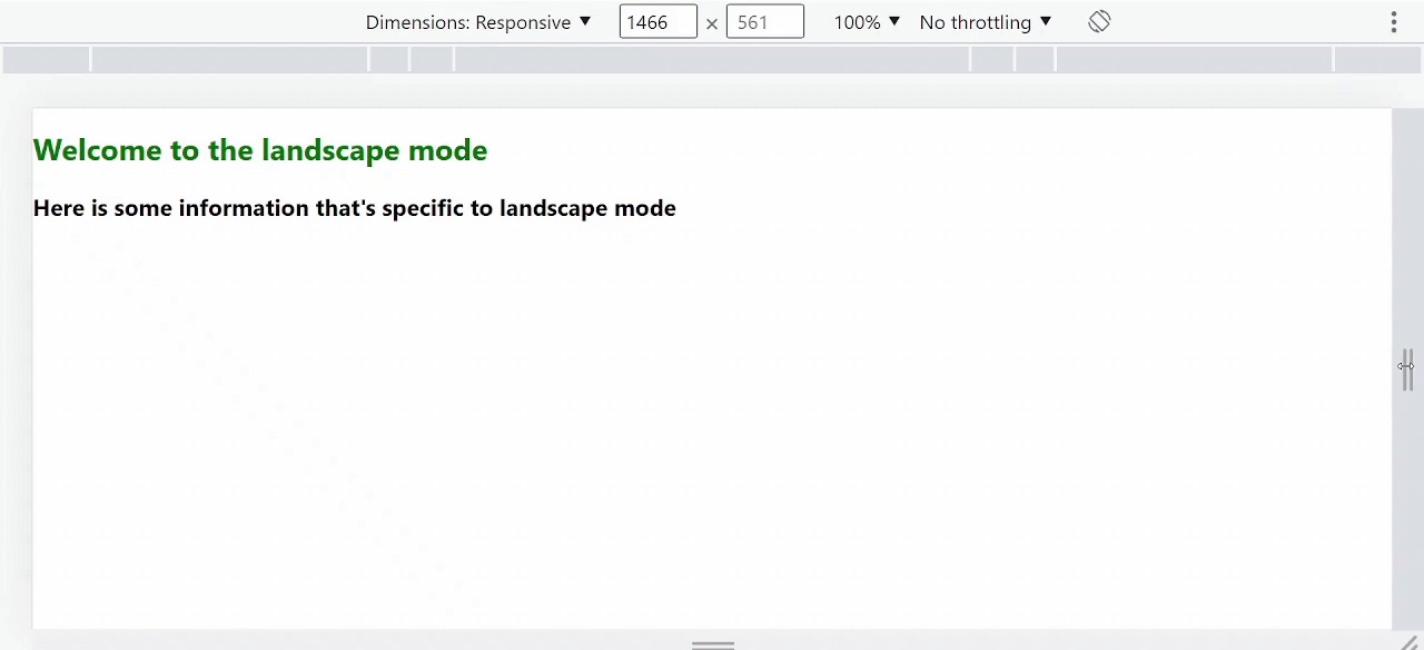
Output : Using the React useOrientation hook to build responsive layouts
As the orientation of our screen changes from landscape to portrait, the content changes.
Example 2: Creating a responsive navigation bar using the useOrientation hook.
In this example, the useOrientation hook determines the current device orientation, either portrait or landscape. A styles object is defined to hold the styles for the navbar. The styles are dynamic and change based on orientation.
App.js:
Javascript
import React from 'react';
import { useOrientation } from 'react-use';
const Navbar = () => {
const { type } = useOrientation();
const styles = {
container: {
display: 'flex',
justifyContent: 'space-between',
padding: '20px',
backgroundColor: 'lightgray',
},
logo: {
fontSize: type === 'portrait-primary'
? '2rem' : '3rem',
color: 'white',
},
navLinks: {
display: 'flex',
flexDirection: type === 'portrait-primary'
? 'column' : 'row',
},
navLink: {
margin: type === 'portrait-primary'
? '10px 0' : '0 10px',
fontSize: type === 'portrait-primary'
? '1.5rem' : '2rem',
color: type === 'portrait-primary'
? 'white' : 'black',
},
};
return (
<div style={styles.container}>
<h1 style={styles.logo}>My App</h1>
<nav style={styles.navLinks}>
<a href="#" style={styles.navLink}>Home</a>
<a href="#" style={styles.navLink}>About</a>
<a href="#" style={styles.navLink}>Contact</a>
</nav>
</div>
);
};
export default Navbar;
|
Step to run the application: Run the application by using the following command:
npm start
Output: By default, the React project will run on port 3000. You can access it at localhost:3000 on your browser. Open DevTools by pressing F12 and click on the “Device Toggle Toolbar” to adjust the device orientation.
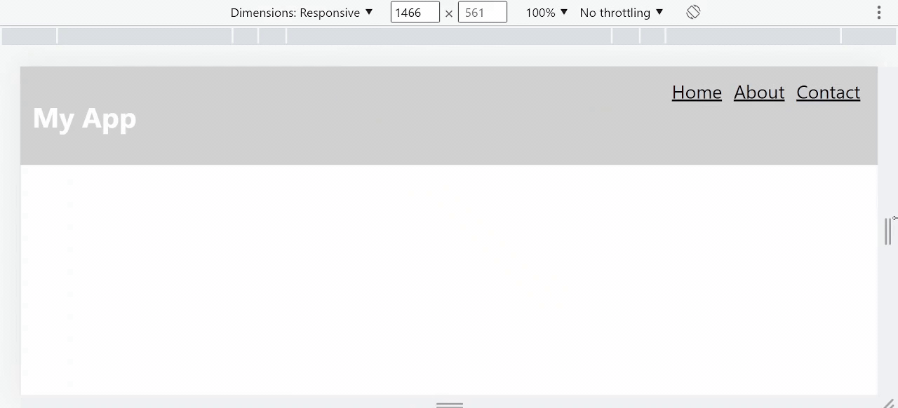
Output: Creating a responsive navigation bar using the useOrientation hook.
As the orientation changes, the styles will update dynamically to provide a responsive layout.
Share your thoughts in the comments
Please Login to comment...