ReactJS Evergreen TagInput Component
Last Updated :
11 Jun, 2021
React Evergreen is a popular front-end library with a set of React components for building beautiful products as this library is flexible, sensible defaults, and User friendly. TagInput Component allows the user to type in multiple values as tags. We can use the following approach in ReactJS to use the Evergreen TagInput Component.
Tag Props:
- children: It is used to denote the tag content.
- onRemove: It is a callback function that is triggered when the removal icon is clicked.
- isRemovable: It is used to indicate whether the tag can be removed or not.
TagInput Props:
- addOnBlur: It is used to indicate whether inputValue should be added to the tags when input blurs or not.
- className: It is used to pass the class name to apply to the container component.
- disabled: It is used to indicate whether the input should be disabled or not.
- height: It is used to denote the vertical size of the input.
- inputProps: It is used to denote the props to pass to the input component.
- inputRef: It is used to denote the ref handler for the input element.
- onAdd: It is a callback function that is triggered when new tags are added.
- onBlur: It is a callback function that is triggered when focus on the input blurs.
- onChange: It is a callback function that is triggered when the tag values change.
- onFocus: It is a callback function that is triggered when the input receives focus.
- onInputChange: It is a callback function that is triggered when the value of the input is changed.
- onRemove: It is a callback function that is triggered when a tag is removed.
- separator: It is used to denote the value or RegExp to split on pasted text or press of entering key.
- tagProps: It is used to provide props to the tag component.
- tagSubmitKey: It is used to denote the key to press in order to submit a new tag while typing.
- values: It is used for the controlled tag values.
Creating React Application And Installing Module:
-
Step 1: Create a React application using the following command:
npx create-react-app foldername
-
Step 2: After creating your project folder i.e. foldername, move to it using the following command:
cd foldername
-
Step 3: After creating the ReactJS application, Install the required module using the following command:
npm install evergreen-ui
Project Structure: It will look like the following.

Project Structure
Example: Now write down the following code in the App.js file. Here, App is our default component where we have written our code.
App.js
import React from 'react'
import { TagInput } from 'evergreen-ui'
export default function App() {
const [values, setValues] = React.useState(['Gourav', 'Ajay'])
return (
<div style={{
display: 'block', width: 700, paddingLeft: 30
}}>
<h4>ReactJS Evergreen TagInput Component</h4>
<TagInput
inputProps={{ placeholder: 'Add Names..' }}
onChange={data => {setValues(data)}}
values={values}
/>
</div>
);
}
|
Step to Run Application: Run the application using the following command from the root directory of the project:
npm start
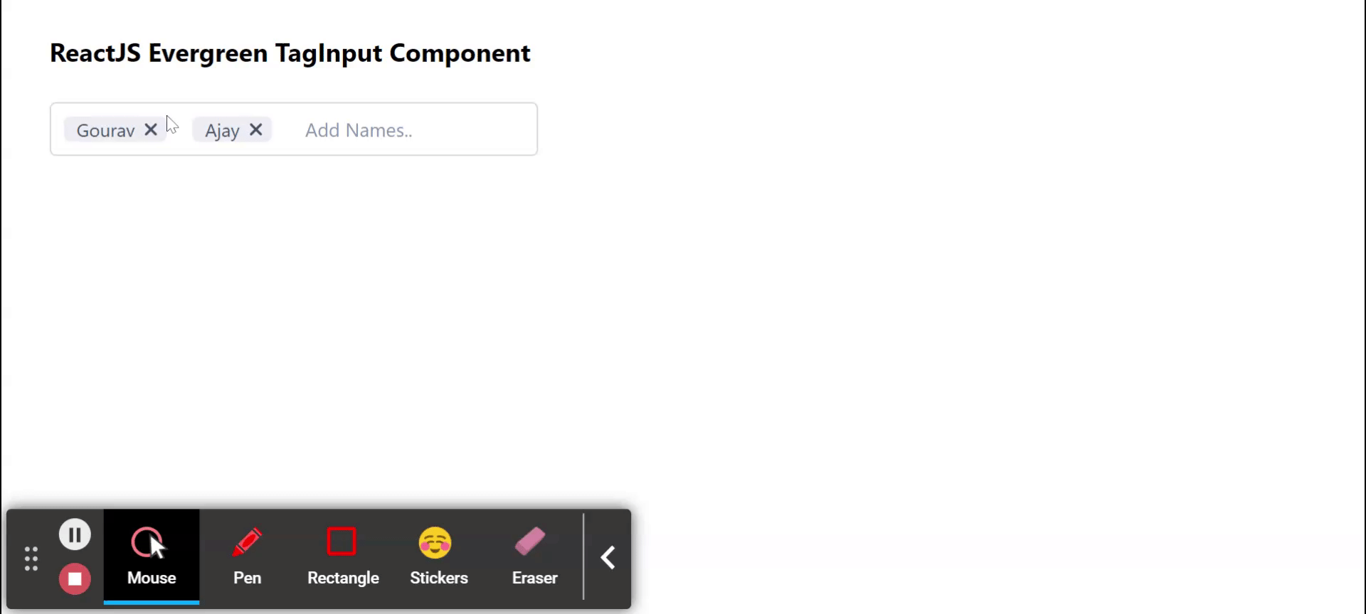
Output: Now open your browser and go to http://localhost:3000/, you will see the following output:
Reference: https://evergreen.segment.com/components/tag-input
Share your thoughts in the comments
Please Login to comment...