ReactJS Blueprint Alert Component
Last Updated :
08 Apr, 2022
BlueprintJS is a React-based UI toolkit for the web. This library is very optimized and popular for building interfaces that are complex data-dense for desktop applications.
Alert Component provides a way for users to notify them about some important information and this helps them to acknowledge the alert content. We can use the following approach in ReactJS to use the ReactJS Blueprint Alert Component.
Alert Props:
- cancelButtonText: It is used to denote the text for the cancel button.
- canEscapeKeyCancel: It is used to indicate whether pressing escape when focused on the Alert should cancel the alert or not.
- canOutsideClickCancel: It is used to indicate whether clicking outside Alert should cancel the alert or not.
- className: It is used to denote a space-delimited list of class names to pass along to a child element.
- confirmButtonText: It is used to denote the text for the confirm button.
- icon: It is used to denote the name of an icon or an icon element to display on the left side.
- intent: It is used to denote the intent to be applied to the confirm button and the icon.
- isOpen: It is used to denote the visibility of the alert.
- loading: The confirm button will be set to its loading state when this is set to true.
- onCancel: It is used to denote the handler which is triggered when the alert is canceled.
- onClose: It is used to denote the handler which is triggered when the Alert is confirmed or canceled.
- onClosed: It is used to denote the lifecycle method invoked just after the CSS close transition ends.
- onClosing: It is used to denote the lifecycle method invoked just before the CSS close transition begins on a child.
- onConfirm: It is used to denote the handler which is triggered when the confirm button is clicked.
- onOpened: It is used to denote the lifecycle method invoked just after the CSS open transition ends.
- onOpening: It is used to denote the lifecycle method invoked just after mounting the child in the DOM.
- portalContainer: It is used to denote the container element into which the overlay renders its contents when usePortal is true.
- style: It is used to denote the CSS styles to apply to the alert.
- transitionDuration: It is used to indicate how long the overlay’s enter/leave transition takes in milliseconds.
Creating React Application And Installing Module:
-
Step 1: Create a React application using the following command:
npx create-react-app foldername
-
Step 2: After creating your project folder i.e. foldername, move to it using the following command:
cd foldername
- Step 3: After creating the ReactJS application, Install the required module using the following command:
npm install @blueprintjs/core
Project Structure: It will look like the following.

Project Structure
Example: Now write down the following code in the App.js file. Here, App is our default component where we have written our code.
App.js
import React from 'react'
import '@blueprintjs/core/lib/css/blueprint.css';
import { Alert } from "@blueprintjs/core";
function App() {
return (
<div style={{
display: 'block', width: 400, padding: 30
}}>
<h4>ReactJS Blueprint Alert Component</h4>
<Alert
confirmButtonText="Okay"
isOpen={true}
loading={false}
>
<p>I am sample alert message!</p>
</Alert>
</div >
);
}
export default App;
|
Step to Run Application: Run the application using the following command from the root directory of the project:
npm start
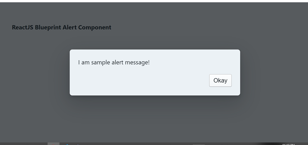
Output: Now open your browser and go to http://localhost:3000/, you will see the following output:
Reference: https://blueprintjs.com/docs/#core/components/alert
Share your thoughts in the comments
Please Login to comment...