React.js Blueprint Tree Component Props
Last Updated :
26 Aug, 2022
BlueprintJS is an open-source UI toolkit for React applications. It is used for making complex and data-heavy web applications. In this article, we will be discussing the Props of the Tree Component of the BluePrintJS library.
The Tree Component is used to display the hierarchical data to the user such as the employee list in an organization or the folder structure in a storage device. A tree contains various children known as TreeNodes.
React.js BluePrint Tree Component Props:
- className: It is a space-separated list of class names to pass to the child nodes.
- contents: It is a required property that denotes the data specifying the contents and appearance of the tree.
- onNodeClick: It is a callback function that is triggered when the user clicks the node anywhere other than caret.
- onNodeCollapse: It is a callback function that is triggered when the caret of an expanded node is clicked.
- onNodeContextMenu: It is a callback function that is triggered when a node is right-clicked or the context menu button is pressed when the node is in focus.
- onNodeDoubleClick: It is a callback function that is triggered when the node is double-clicked.
- onNodeExpand: It is a callback function that is invoked when the caret of a collapsed node is clicked.
- onNodeMouseEnter: It is a callback function that is invoked when the mouse is moved over the node.
- onNodeMouseLeave: It is a callback function that is invoked when the mouse is moved out of the node.
React.js BluePrint TreeNode Component Props:
- childNodes: This property is used to denote the child nodes of this tree node.
- children: This property is used to denote the children of this tree node.
- className: It is a space-separated list of class names to pass to the child component of the node.
- contentRef: It is used to denote the content ref element.
- depth: It is a required property used to denote the depth of the node.
- disabled: This boolean property denotes whether the tree node is disabled.
- hasCaret: This is a boolean property that denotes whether the caret should be shown to expand or collapse the tree node. By default it is true is the tree node has children.
- icon: This property is used to set an icon for the tree node.
- id: It denotes a unique identifier for the tree node.
- isExpanded: This property is inherited from the TreeNode.isExpanded property.
- isSelected: This property denotes whether the tree node is selected
- label: This is a required property used to set the label for the tree node.
- nodeData: This property is used to attach an option custom user object to the tree node.
- onClick: This callback function is invoked when the user clicks the tree node.
- onCollapse: This is a callback function that is triggered when the tree node collapses.
- onContextMenu: This callback function is triggered when the user right-clicks the tree node.
- onDoubleClick: It is a callback function that is invoked when the user double clicks the tree node.
- onExpand: It is a callback function that is called when the tree node expands.
- onMouseEnter: It is a callback function that is invoked when the mouse enters the tree node.
- onMouseLeave: It is a callback function that is invoked when the mouse leaves out of the tree node.
- path: This is a required prop used to denote the path of the tree node.
- secondaryLabel: This prop is used to define a secondary label for the tree node that will be displayed on the right side of the component.
Syntax:
<Tree
    contents={...}
    onNodeMouseEnter={...}
    onNodeMouseLeave={...}
/>
Creating React Application And Installing Modules:
Step 1: Create a React application using the following command:
npx create-react-app myApp
Step 2: After creating your project folder i.e. myApp, move to it using the following command:
cd myApp
Step 3: After creating the ReactJS application, Install the required modules using the following command:
npm install @blueprintjs/core @blueprintjs/icons
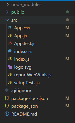
Project Structure: After following the above steps, the project structure will look as below:
Project Structure
Example 1: Now write the following code in the App.js file. This example shows how to make a simple tree structure.
App.js
import React from 'react'
import '@blueprintjs/core/lib/css/blueprint.css';
import '@blueprintjs/icons/lib/css/blueprint-icons.css'
import { Tree } from '@blueprintjs/core';
function App() {
const treeData = [
{
id: 0,
hasCaret: true,
icon: "folder-close",
label: "Folders",
},
{
id: 1,
hasCaret: true,
icon: "cog",
label: "Settings"
},
{
id: 2,
hasCaret: false,
icon: "log-out",
label: "Log Out"
},
];
return (
<div style={{
display: 'block',
width: 400,
padding: 25
}}>
<h2 style={{ color: "green" }}>
GeeksforGeeks
</h2>
<h4>
ReactJS Blueprint
Tree Component Props
</h4>
<Tree
contents={treeData}
/>
</div>
);
}
export default App;
|
Step to run the application: Execute the below command from the root directory of the project to run the app.
npm start
Output:
Example 2: This example shows the use of various tree component properties to expand the tree when we hover over it.
App.js
import React from 'react'
import '@blueprintjs/core/lib/css/blueprint.css';
import '@blueprintjs/icons/lib/css/blueprint-icons.css'
import { Tree } from '@blueprintjs/core';
function App() {
const [isFolderOpen, setFolderOpen] = React.useState(false);
const treeData = [
{
id: 1,
hasCaret: true,
isExpanded: isFolderOpen,
icon: "folder-close",
label: "Folders",
childNodes: [
{
id: 11,
icon: "folder-open",
label: "Documents"
},
{
id: 12,
icon: "folder-open",
label: "Videos"
},
{
id: 13,
icon: "folder-open",
label: "Pictures"
},
{
id: 14,
icon: "folder-open",
label: "Music"
}
]
}
];
return (
<div style={{
display: 'block',
width: 400,
padding: 25
}}>
<h2 style={{ color: "green" }}>
GeeksforGeeks
</h2>
<h4>
ReactJS Blueprint
Tree Component Props
</h4>
<Tree
contents={treeData}
onNodeMouseEnter={() => setFolderOpen(true)}
onNodeMouseLeave={() => setFolderOpen(false)}
/>
</div>
);
}
export default App;
|
Output:
Reference: https://blueprintjs.com/docs/#core/components/tree.props
Like Article
Suggest improvement
Share your thoughts in the comments
Please Login to comment...