React Bootstrap close button disabled state
Last Updated :
30 Oct, 2023
React-Bootstrap Close Button Disabled state is a disabled button that is unclickable and unusable to prevent user interactions. It is a boolean attribute. We will learn more about it by creating a React app.
React-Bootstrap Used Attributes:
- disabled: This attribute is used to disable the button. It is a boolean value that makes the click false.
Syntax:
<CloseButton disabled />
Example 1: In this example, we will see a Close Button Disabled. Write below code in App.js
Javascript
import React from "react";
import CloseButton from "react-bootstrap/CloseButton";
import
"../node_modules/bootstrap/dist/css/bootstrap.min.css";
export default function App() {
return (
<div className="App">
<h2
style={{
color: "green",
textAlign: "center",
}}
>
GeeksforGeeks
</h2>
<h2
style={{
textAlign: "center",
}}
>
React-Bootstrap Close
Button Disabled state
</h2>
<CloseButton disabled />;
</div>
);
}
|
Output: Now open your browser and go to http://localhost:3000/, you will see the following output.

Example 2: In this example, we will see how events will also get disabled when we disable button
Javascript
import React from "react";
import CloseButton from "react-bootstrap/CloseButton";
import
"../node_modules/bootstrap/dist/css/bootstrap.min.css";
export default function App() {
const callGFG = () => {
alert("Hi GeeksforGeeks");
};
return (
<div className="App">
<h2
style={{
color: "green",
textAlign: "center",
}}>
GeeksforGeeks
</h2>
<h2
style={{
color: "green",
textAlign: "center",
}}>
React-Bootstrap Close
Button Disabled state
</h2>
<div
style={{
textAlign: "center",
}}>
Working Button:
<CloseButton
onClick={callGFG}/>
</div>
<br />
<div
style={{
textAlign: "center",
}}>
Disabled Button:
<CloseButton
onClick={callGFG}
disabled
/>
</div>
</div>
);
}
|
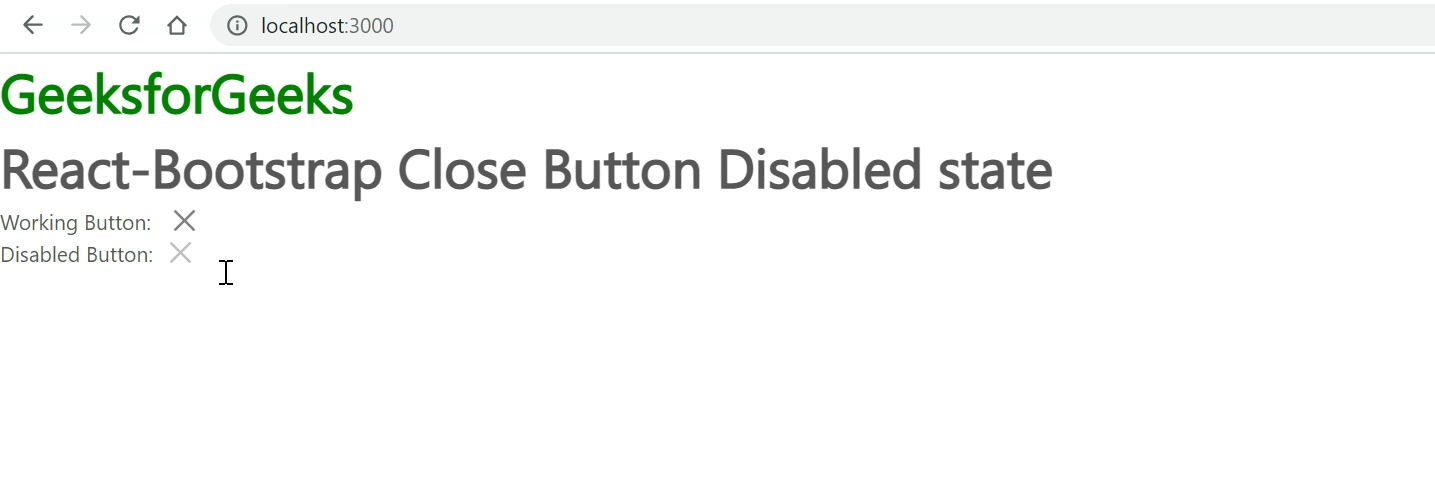
Output:
Share your thoughts in the comments
Please Login to comment...