Plot Mathematical Expressions in Python using Matplotlib
Last Updated :
16 Jun, 2022
For plotting equations we will use two modules Matplotlib.pyplot and Numpy. This module helps you to organize your Python code logically.
Numpy
Numpy is a core library used in Python for scientific computing. This Python library supports you for a large, multidimensional array object, various derived objects like matrices and masked arrays, and assortment routines that makes array operations faster, which includes mathematical, logical, basic linear algebra, basic statistical operations, shape manipulation, input/output, sorting, selecting, discrete Fourier transforms, random simulation and many more operations.
Note: For more information, refer to NumPy in Python
Matplotlib.pyplot
Matplotlib is a plotting library of Python which is a collection of command style functions that makes it work like MATLAB. It provides an object-oriented API for embedding plots into applications using general-purpose GUI toolkits. Each #pyplot# function creates some changes to the figures i.e. creates a figure, creating a plot area in the figure, plotting some lines in the plot area, decoration of the plot with some labels, etc.
Note: For more information, refer to Pyplot in Matplotlib
Plotting the equation
Lets start our work with one of the most simplest and common equation Y = X². We want to plot 100 points on X-axis. In this case, the each and every value of Y is square of X value of the same index.
Python3
import matplotlib.pyplot as plt
import numpy as np
x = np.linspace(-2, 2, 100)
y = x ** 2
fig = plt.figure(figsize = (10, 5))
plt.plot(x, y)
plt.show()
|
Output-
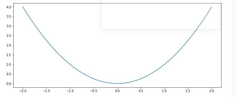
Here note that the number of points we are using in line plot(100 in this case) is totally arbitrary but the goal here is to show a smooth graph for a smooth curve and that’s why we have to pick enough numbers depending on the function. But be careful that do not generate too many points as a large number of points will require a long time for plotting.
Customization of plots
There are many pyplot functions are available for the customization of the plots, and may line styles and marker styles for the beautification of the plot.Following are some of them:
| Function | Description |
|---|
| plt.xlim() | sets the limits for X-axis |
| plt.ylim() | sets the limits for Y-axis |
| plt.grid() | adds grid lines in the plot |
| plt.title() | adds a title |
| plt.xlabel() | adds label to the horizontal axis |
| plt.ylabel() | adds label to the vertical axis |
| plt.axis() | sets axis properties (equal, off, scaled, etc.) |
| plt.xticks() | sets tick locations on the horizontal axis |
| plt.yticks() | sets tick locations on the vertical axis |
| plt.legend() | used to display legends for several lines in the same figure |
| plt.savefig() | saves figure (as .png, .pdf, etc.) to working directory |
| plt.figure() | used to set new figure properties |
Line Styles
| Character | Line style |
|---|
| – | solid line style |
| — | dashed line style |
| -. | dash-dot line style |
| : | dotted line style
|
Markers
| Character | Marker |
|---|
| . | point |
| o | circle |
| v | triangle down |
| ^ | triangle up |
| s | square |
| p | pentagon |
| * | star |
| + | plus |
| x | cross |
| D | diamond |
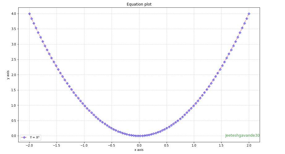
Below is a plot created using some of this modifications:
Python3
import matplotlib.pyplot as plt
import numpy as np
x = np.linspace(-2, 2, 100)
y = x ** 2
fig = plt.figure(figsize = (12, 7))
plt.plot(x, y, alpha = 0.4, label ='Y = X²',
color ='red', linestyle ='dashed',
linewidth = 2, marker ='D',
markersize = 5, markerfacecolor ='blue',
markeredgecolor ='blue')
plt.title('Equation plot')
plt.xlabel('x axis')
plt.ylabel('y axis')
fig.text(0.9, 0.15, 'Jeeteshgavande30',
fontsize = 12, color ='green',
ha ='right', va ='bottom',
alpha = 0.7)
plt.grid(alpha =.6, linestyle ='--')
plt.legend()
plt.show()
|
Output-
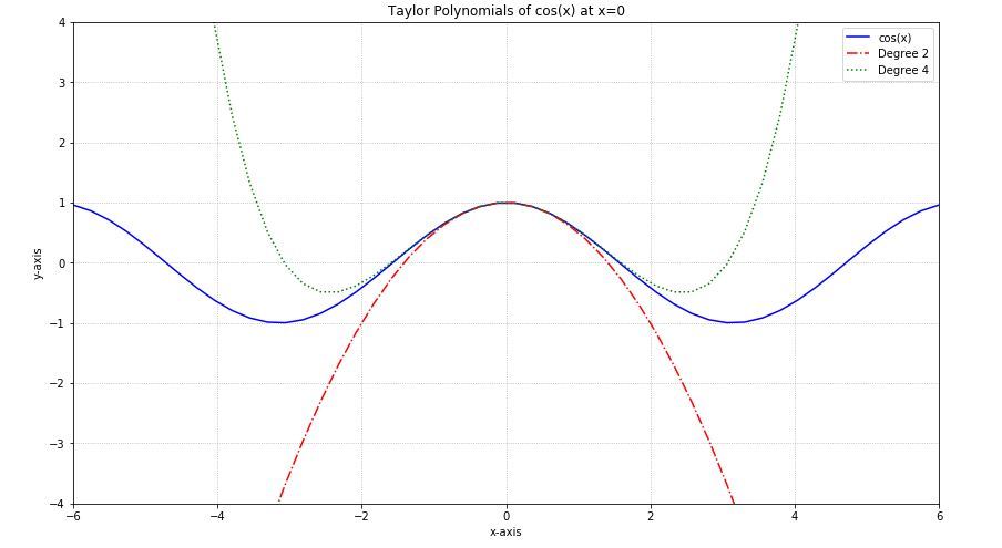
Example 1-
Plotting a graph of the function y = Cos(x) with its Taylor polynomials of degree 2 and 4.
Python3
import matplotlib.pyplot as plt
import numpy as np
x = np.linspace(-6, 6, 50)
fig = plt.figure(figsize = (14, 8))
y = np.cos(x)
plt.plot(x, y, 'b', label ='cos(x)')
y2 = 1 - x**2 / 2
plt.plot(x, y2, 'r-.', label ='Degree 2')
y4 = 1 - x**2 / 2 + x**4 / 24
plt.plot(x, y4, 'g:', label ='Degree 4')
plt.legend()
plt.grid(True, linestyle =':')
plt.xlim([-6, 6])
plt.ylim([-4, 4])
plt.title('Taylor Polynomials of cos(x) at x = 0')
plt.xlabel('x-axis')
plt.ylabel('y-axis')
plt.show()
|
Output-
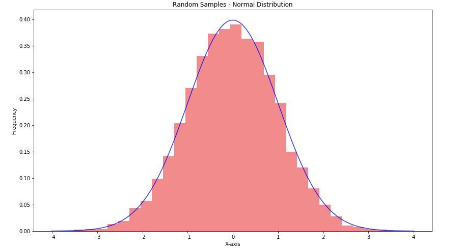
Example 2-
Generating an array of 10000 random entries sampled from normal distribution and creating a histogram along with a normal distribution of the equation:

Python3
import matplotlib.pyplot as plt
import numpy as np
fig = plt.figure(figsize = (14, 8))
samples = np.random.randn(10000)
plt.hist(samples, bins = 30, density = True,
alpha = 0.5, color =(0.9, 0.1, 0.1))
plt.title('Random Samples - Normal Distribution')
plt.ylabel('X-axis')
plt.ylabel('Frequency')
x = np.linspace(-4, 4, 100)
y = 1/(2 * np.pi)**0.5 * np.exp(-x**2 / 2)
plt.plot(x, y, 'b', alpha = 0.8)
plt.show()
|
Output-
Share your thoughts in the comments
Please Login to comment...