Plot Function In R
Last Updated :
18 Apr, 2024
Data visualization is a crucial aspect of data analysis, allowing us to gain insights and communicate findings effectively. In R, the plot() function is a versatile tool for creating a wide range of plots, including scatter plots, line plots, bar plots, histograms, and more. In this article, we’ll explore the plot() function in R Programming Language with multiple examples to showcase its capabilities.
Creating a Scatter Plot using the Plot function
Scatter plots are useful for visualizing the relationship between two variables. Let’s create a simple scatter plot using the plot() function.
R
# Create example data
x <- c(1, 2, 3, 4, 5)
y <- c(2, 3, 5, 4, 6)
# Create a scatter plot
plot(x, y, main = "Scatter Plot", xlab = "X-axis", ylab = "Y-axis",
     col = "blue", pch = 19)
Output:

Plot Function In R
In this example, we create two vectors x and y representing data points. We then use the plot() function to create a scatter plot, specifying the main title, axis labels, point color (col), and point shape (pch).
Creating a Line Plot using the Plot function
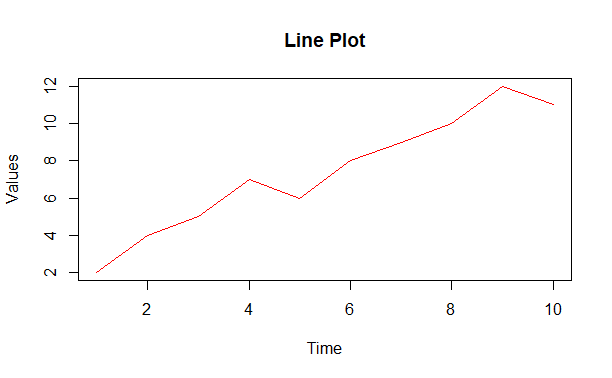
Line plots are commonly used to visualize trends over time or sequential data. Let’s create a line plot using the plot() function.
R
# Create example data
time <- 1:10
values <- c(2, 4, 5, 7, 6, 8, 9, 10, 12, 11)
# Create a line plot
plot(time, values, type = "l", main = "Line Plot", xlab = "Time", ylab = "Values",
     col = "red")
Output:
Plot Function In R
In this example, we create two vectors time and values. We then use the plot() function with the type parameter set to “l” to create a line plot.
Creating a Bar Plot using the Plot function
Bar plots are effective for comparing categorical data or showing counts. Let’s create a bar plot using the plot() function.
R
# Create example data
categories <- c("A", "B", "C", "D")
counts <- c(10, 15, 8, 12)
# Create a bar plot
barplot(counts, names.arg = categories, main = "Bar Plot", xlab = "Categories",
        ylab = "Counts", col = "pink", border = "black", horiz = TRUE)
Output:

Plot Function In R
In this example, we create two vectors categories and counts. We then use the plot() function with the type parameter set to “h” to create a horizontal bar plot.
Conclusion
The plot() function in R provides a versatile tool for creating various types of plots, including scatter plots, line plots, bar plots, histograms, and more. In this article, we’ve explored multiple examples to demonstrate its capabilities in visualizing different types of data
Share your thoughts in the comments
Please Login to comment...