Matplotlib.figure.Figure.add_axes() in Python
Last Updated :
23 Jan, 2023
Matplotlib is a library in Python and it is a numerical – mathematical extension for NumPy library. The figure module provides the top-level Artist, the Figure, which contains all the plot elements. This module is used to control the default spacing of the subplots and top-level containers for all plot elements.
matplotlib.figure.Figure.add_axes() function
The add_axes() method figure module of matplotlib library is used to add an axes to the figure.
Syntax: add_axes(self, *args, **kwargs) Parameters: This accept the following parameters that are described below:
- rect : This parameter is the dimensions [left, bottom, width, height] of the new axes.
- projection : This parameter is the projection type of the Axes.
- sharex, sharey : These parameters share the x or y axis with sharex and/or sharey.
- label : This parameter is the label for the returned axes.
Returns: This method return the axes class depends on the projection used.
Note : To understand multiple axes( multiple rectangle insertion in generated figure) easily, Think of a rectangle which is 1 * 1 (with 0.1 as increment ).Within the rectangle we have arrange those axes with specifying ([a,b,c,d])
(a,b) is the point in southwest corner of the rectangle which we create. c represents width and d represents height of the respective rectangle.
Try this basic example on your own to understand their placement within a rectangle.
import matplotlib.pyplot as plt
import numpy as np
figu = plt.figure()
r = figu.patch
r.set_facecolor(‘lightslategray’)
axes = figu.add_axes([0, 0.4, 0.1, 1])
axes = figu.add_axes([1, 1, 0.2, 0.3])
plt.show()
Below examples illustrate the matplotlib.figure.Figure.add_axes() function in matplotlib.figure: Example 1:
Python3
import numpy as np
import matplotlib.pyplot as plt
fig = plt.figure()
fig.subplots_adjust(top=0.8)
ax1 = fig.add_subplot(211)
t = np.arange(0.0, 1.0, 0.01)
s = np.sin(2 * np.pi * t)
line, = ax1.plot(t, s, color='green', lw=2)
np.random.seed(19680801)
ax2 = fig.add_axes([0.15, 0.1, 0.7, 0.3])
n, bins, patches = ax2.hist(np.random.randn(1000), 50,
facecolor='yellow',
edgecolor='yellow')
fig.suptitle('matplotlib.figure.Figure.add_axes() \
function Example\n\n', fontweight=& quot
bold & quot
)
plt.show()
|
Output: 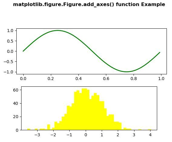 Example-2:
Python3
import numpy as np
import matplotlib.pyplot as plt
fig = plt.figure()
rect = fig.patch
rect.set_facecolor('lightslategray')
ax1 = fig.add_axes([0.1, 0.3, 0.4, 0.4])
rect = ax1.patch
rect.set_facecolor('lightgoldenrodyellow')
for label in ax1.xaxis.get_ticklabels():
label.set_color('green')
label.set_rotation(25)
label.set_fontsize(16)
for line in ax1.yaxis.get_ticklines():
line.set_color('yellow')
line.set_markersize(5)
line.set_markeredgewidth(3)
fig.suptitle('matplotlib.figure.Figure.add_axes() \
function Example\n\n', fontweight ="bold")
plt.show()
|
Output: 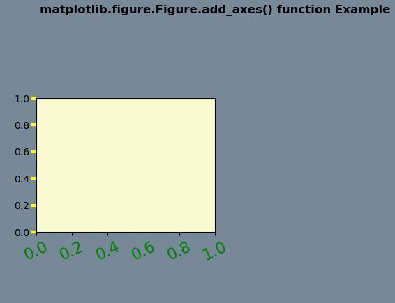
Share your thoughts in the comments
Please Login to comment...