Interactive visualization of data using Bokeh
Last Updated :
28 Mar, 2022
Bokeh is a Python library for creating interactive data visualizations in a web browser. It offers human-readable and fast presentation of data in an visually pleasing manner. If you’ve worked with visualization in Python before, it’s likely that you have used matplotlib. But Bokeh differs from matplotlib.
To install Bokeh type the below command in the terminal.
pip install bokeh
Why you should use Bokeh?
The intended uses of matplotlib and Bokeh are quite different. Matplotlib creates static graphics that are useful for quick and simple visualizations, or for creating publication-quality images. Bokeh creates visualizations for display on the web (whether locally or embedded in a webpage) and most importantly, the visualizations are meant to be highly interactive. Matplotlib does not offer either of these features.
If would you like to visually interact with your data or you would like to distribute interactive visual data to a web audience, Bokeh is the library for you! If your main interest is producing finalized visualizations for publication, matplotlib may be better, although Bokeh does offer a way to create static graphics.
Plotting a simple graph
For this example we will be using one of the built-in dataset, i.e flowers data set. we can use circle() method to plot each data points as a circle on graph, we can also specify custom attributes like:
- first two elements has to be data on x-axis and y-axis respectively.
- color: to assign color dynamically as shown.
- fill_alpha: to assign opacity for circles.
- size: to assign size of each circle.
Example:
Python
from bokeh.plotting import figure, output_file, show
from bokeh.sampledata.iris import flowers
colormap = {'setosa': 'red', 'versicolor': 'green',
'virginica': 'blue'}
colors = [colormap[x] for x in flowers['species']]
p = figure(title="Iris Morphology")
p.xaxis.axis_label = 'Petal Length'
p.yaxis.axis_label = 'Petal Width'
p.circle(flowers["petal_length"],
flowers["petal_width"],
color=colors,
fill_alpha=0.3,
size=15)
output_file("iris1.html", title="iris.py example")
show(p)
|
Output:
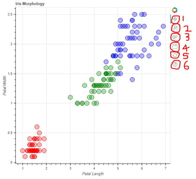
In the above example, output_file() function is used to save the output generated as an html file as bokeh uses web format to provide interactive display. Finally show() function is used to display the generated output.
Note:
- Red color = Setosa, Green = Versicolor, Blue = Virginica
- On top right of every visualization, there are interactive functions provided by bokeh. it allows 1. Pan across plot, 2. Zoom using box selection, 3. Zoom using scroll wheel, 4. Save, 5. Reset, 6. Help
Plotting a bar chart
For this example we will be using custom created data set using list in code itself, i.e fruits data set. output_file() function is used to save the output generated as an html file as bokeh uses web format. we can use ColumnDataSource() function to map the custom data set (two lists) created with each other as a dictionary format. figure() function is used to initialize the graph figure so that data can be plotted on it with various parameters such as:
- x_range: defines data on x-axis.
- plot_width, plot_height: defines width and height of graph.
- toolbar_location: defines location of toolbar.
- title: defines title of graph.
Here we are using simple vertical bars to represent data hence we use vbar() method and to assign various attributes to vertical bars we pass in different parameters inside it, like:
- x: data in x-axis direction
- top: data in y-axis direction
- width: defines width of each bar
- source: source of data
- legend_field: display list of classes present in data
- line_color: defines color for lines in graph
- fill_color: define different colors for data classes
There are many more parameters that can be passed here. Some other properties that can be used are:
- y_range.start: used to define lower limit of data on y-axis.
- y_range.end: used to define upper most limit of data on y-axis.
- legend.orientation: defines orientation of legend bar.
- legend.location: defines location of legend bar.
Finally show() function is used to display the generated output.
Example:
Python
from bokeh.io import output_file, show
from bokeh.models import ColumnDataSource
from bokeh.palettes import Spectral10
from bokeh.plotting import figure
from bokeh.transform import factor_cmap
output_file("fruits_bar_chart.html")
fruits = ['Apples', 'Pears', 'Nectarines',
'Plums', 'Grapes', 'Strawberries',
'bananas','berries','pineapples','litchi']
counts = [51, 34, 4, 28, 119, 79, 15, 68, 26, 88]
source = ColumnDataSource(data=dict(fruits=fruits,
counts=counts))
p = figure(x_range=fruits,
plot_width=800,
plot_height=350,
toolbar_location=None,
title="Fruit Counts")
p.vbar(x='fruits', top='counts',
width=1, source=source,
legend_field="fruits",
line_color='white',
fill_color=factor_cmap('fruits',
palette=Spectral10,
factors=fruits))
p.xgrid.grid_line_color = None
p.y_range.start = 0
p.y_range.end = 150
p.legend.orientation = "horizontal"
p.legend.location = "top_center"
show(p)
|
Output:
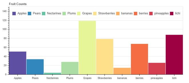
Note: This is a static graph which is also provided by bokeh similar to matplotlib.
Share your thoughts in the comments
Please Login to comment...