How to use portals for rendering content outside the parent DOM hierarchy?
Last Updated :
26 Feb, 2024
Modern web development requires the ability to render content outside of the parent DOM hierarchy. Portals come in handy in such scenarios. They provide a seamless way to render UI elements across different parts of a web application, improving flexibility and performance.
We will discuss about the following usage of portals that render outside the parentDOM hierarchy.
Understanding React Portals:
- Portals in web development act as a way to teleport elements from one part of the DOM tree to another without sacrificing the structural integrity of the application.
- They essentially provide a wormhole through which components can render their children into a DOM node that exists outside the parent component’s DOM hierarchy.
- React Portals utilize a createPortal() method, provided by react-dom, which is the key to this functionality.
- This mechanism allows you to render elements outside the parent DOM hierarchy, providing greater control and flexibility in managing your application’s layout and structure.
Using Portals in React: Step-by-Step Guide:
- Import the necessary modules: Ensure that you have access to the
ReactDOM module from React.
- Create a portal container: Define a container element in the HTML where you want to render the portal content. This can be any valid DOM element.
- Use the createPortal() method: Inside your React component, use the
createPortal() method provided by ReactDOM to render content into the portal container.
- Specify portal content: Define the content you want to render inside the portal as JSX elements.
- Render the portal: Call
createPortal() with the JSX content and the reference to the portal container.
Parameters:
- children: Anything that can be rendered with React, such as a piece of JSX (e.g. <div /> or <SomeComponent />), a Fragment (<>…</>), a string or a number, or an array of these.
- domNode: Some DOM nodes, such as those returned by document.getElementById(). The node must already exist. Passing a different DOM node during an update will cause the portal content to be recreated.
- nodes A unique string or number to be used as the portal’s key.
import {createPortal} from 'react-dom';
createPortal(children, domNode);
Benefits of using React Portals:
- Separation of Concerns: Portals maintain a clean separation of concerns by rendering UI elements outside of their parent components.
- Improved Accessibility: Portals enable effective management of focus and keyboard navigation, enhancing accessibility for users.
- Enhanced Performance: Portals optimize performance by avoiding unnecessary re-renders of the entire application.
Creating a Modal without using Portals :
When creating a modal without portals, a simple component is designed to toggle its visibility using local state management. This method involves rendering the modal content within the component’s DOM hierarchy, potentially causing issues with z-index stacking and CSS containment.
Below is an example that illustrate’s how to creating a modal without using portals.
Javascript
import { useState } from "react";
import "./App.css";
const Modal = ({ onClose }) => {
return (<div className="modal">It's Modal
<button onClick={onClose}>Ok</button>
</div>
);
}
function App() {
const [showModal, setShowModal] = useState(false);
const onClose = () => setShowModal((prev) => !prev);
return (
<div className="wrapper">
<button onClick={onClose}
className="btn">
Show Modal using portal
</button>
{showModal && <Modal onClose={onClose} />}
</div>
);
}
export default App;
|
CSS
.wrapper {
width: 300px;
padding: 20px;
display: flex;
justify-content: center;
flex-direction: column;
align-items: center;
height: auto;
overflow: hidden;
gap: 20px;
position: relative;
border: 2px solid black;
}
.modal {
background-color: green;
width: 200px;
height: 50px;
display: flex;
justify-content: space-evenly;
align-items: center;
border-radius: 15px;
position: absolute;
left: 50%;
top: 20%;
transform: translate(-50%, -20%);
}
.btn {
border: 2px solid black;
width: 200px;
height: 50px;
border-radius: 15px;
}
|
Output:portals
Modal without using Portal
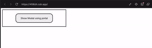
Creating a Modal using Portals :
In contrast, utilizing portals for modal creation involves rendering the modal content outside the parent DOM hierarchy. This ensures proper layering and containment, mitigating potential styling conflicts. With portals, modal elements are seamlessly inserted into a specified DOM node, maintaining cleaner and more predictable rendering behavior.
Example: Below is an example that illustrate’s how to creating a modal using portals.
Javascript
import { useState } from 'react'
import { createPortal }from 'react-dom'
import './App.css'
const Modal = ({ onClose }) => {
return (
<div className="modal">
It's Modal
<button onClick={onClose}>Ok</button>
</div>
)
}
function App() {
const [showModal, setShowModal] = useState(false)
const onClose = () => setShowModal((prev) => !prev)
return (
<div className="wrapper">
<button onClick={onClose}
className="btn">
Show Modal using portal
</button>
{
showModal &&
createPortal(
<Modal onClose={onClose} />,
document.body)
}
</div>
)
}
export default App
|
CSS
.wrapper {
width: 300px;
padding: 20px;
display: flex;
justify-content: center;
flex-direction: column;
align-items: center;
height: auto;
overflow: hidden;
gap: 20px;
position: relative;
border: 2px solid black;
}
.modal {
background-color: green;
width: 200px;
height: 50px;
display: flex;
justify-content: space-evenly;
align-items: center;
border-radius: 15px;
position: absolute;
left: 50%;
top: 20%;
transform: translate(-50%, -20%);
}
.btn {
border: 2px solid black;
width: 200px;
height: 50px;
border-radius: 15px;
}
|
Output:

Modal using portal
Share your thoughts in the comments
Please Login to comment...