Explain the importance of React Portals ?
Last Updated :
15 Apr, 2024
React Portals are a feature that allows developers to render components outside the current React tree hierarchy. This capability is particularly useful for creating components that need to break out of their container, such as modals, tooltips, or any other UI element that requires a different positioning or layering than its parent component. This article will demonstrate how React Portals can be utilized in three different scenarios i.e. creating modals, implementing tooltips, and enabling drag-and-drop functionality.
We will discuss the approach of creating React Portals:
Steps to Create React App and Installing Module
Step 1: Create a new React.js project and install the required dependencies:
npx create-react-app react-portals-example.
Step 2: Navigate to the root directory of your project using the following command.
cd react-portals-example
Exaplanation:
- Create Portal Container: Create a new file named Portal.js in the src directory. This file will contain the logic for rendering components using a portal.
- Create the Modal, Tooltip, and Draggable Components: Inside src, create separate files for each component (Modal.js, Tooltip.js, Draggable.js). These files will define the functional components that use the Portal component to render their children into a DOM node that exists outside the React tree hierarchy.
- Edit the App Component: Modify App.js to include buttons that toggle the visibility of the modal and tooltips, and use the Draggable component to render draggable items.
Project Structure:
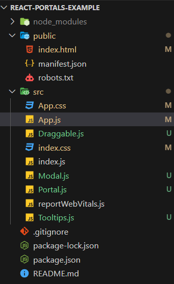
Project Structure
How It Works
ReactDOM.createPortal(children, el): This method takes two arguments. The first is the content you want to render (the children prop), and the second is the DOM node where you want to render it (el). In this case, el is a reference to a DOM element with the ID portal-root. This element should be present in your HTML file (usually in public/index.html) as a placeholder for where the portal content will be rendered.
import React from 'react';
import ReactDOM from 'react-dom';

const Portal = ({ children }) => {
    const el = document.getElementById('portal-root');
    return ReactDOM.createPortal(children, el);
};

export default Portal;
This setup ensures that the modal is rendered directly into the modal-root div in the HTML document, allowing it to overlay the entire page.
<div id="modal-root"></div>
Approach 1: Modal
The Modal component uses the Portal component to render its content. It takes three props: isOpen to control whether the modal is visible, onClose to handle closing the modal, and children to render any content inside the modal.
When you use the Modal component in your application, you pass it the isOpen, onClose, and children props. The Modal component then uses the Portal component to render its content into the portal-root DOM element, allowing the modal to overlay other content on the page. This approach ensures that the modal can be displayed on top of other elements without being constrained by its parent component’s styling or positioning.
JavaScript
import React from 'react';
import Portal from './Portal';

const Modal = ({ isOpen, onClose, children }) => {
    if (!isOpen) return null;

    return (
        <Portal>
            <div className="modal">
                {children}
                <button onClick={onClose}>Close</button>
            </div>
        </Portal>
    );
};

export default Modal;
import React, { useState } from 'react';
import Modal from './Modal';
import Tooltip from './Tooltip';
import Draggable from './Draggable';

function App() {
    const [isModalOpen, setIsModalOpen] = useState(false);

    return (
        <div className="App">
            <button onClick={() =>
                setIsModalOpen(true)}>Open Modal</button>
            <Tooltip text="Drag me!">
                <Draggable>
                    <div>Draggable Item</div>
                </Draggable>
            </Tooltip>
            {isModalOpen && (
                <Modal isOpen={isModalOpen}
                    onClose={() => setIsModalOpen(false)}>
                    <h2>Modal Title</h2>
                    <p>Modal content...</p>
                </Modal>
            )}
        </div>
    );
}

export default App;
Output:
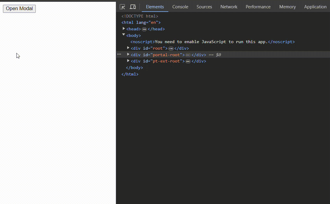
Modal output
In Below code snippet we discuss about how to create a Tooltip component in React using React Portals. This component will display a tooltip with a specified text when the user hovers over its children.
When you use the Tooltip component in your application, you wrap the element or component that you want the tooltip to be associated with in a Tooltip component. You pass the text for the tooltip as a prop to the Tooltip component. The tooltip will then appear when the user hovers over the wrapped element or component.
Let’s break down the code to understand its functionality:
JavaScript
import React, {
    useState
} from 'react';
import Portal from './Portal';

const Tooltip = ({ children, text }) => {
    const [isVisible, setIsVisible] = useState(false);

    return (
        <div className="tooltip-container"
            onMouseEnter={() => setIsVisible(true)}
            onMouseLeave={() => setIsVisible(false)}>
            {children}
            {isVisible && (
                <Portal>
                    <div className="tooltip">{text}</div>
                </Portal>
            )}
        </div>
    );
};

export default Tooltip;
import React, { useState } from 'react';
import Modal from './Modal';
import Tooltip from './Tooltip';
import Draggable from './Draggable';

function App() {
    const [isModalOpen, setIsModalOpen] = useState(false);

    return (
        <div className="App">
            <button onClick={() =>
                setIsModalOpen(true)}>Open Modal</button>
            <Tooltip text="Drag me!">
                <Draggable>
                    <div>Draggable Item</div>
                </Draggable>
            </Tooltip>
            {isModalOpen && (
                <Modal isOpen={isModalOpen}
                    onClose={() => setIsModalOpen(false)}>
                    <h2>Modal Title</h2>
                    <p>Modal content...</p>
                </Modal>
            )}
        </div>
    );
}

export default App;
Output:
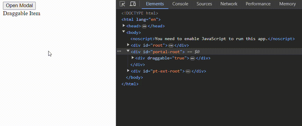
Tooltip Model
Approach 3: Draggble
In Below code snippet we discuss about how to create a Draggable component in React using React Portals. This component allows its children to be dragged around the screen.
When you use the Draggable component in your application, you wrap the element or component that you want to make draggable with the Draggable component. The Draggable component then uses the Portal component to render its content into a DOM node that exists outside the React tree hierarchy, allowing the draggable element to overlay other content. The handleDragStart function ensures that the drag operation is properly initiated, and the draggable=”true” attribute enables the native drag-and-drop functionality of the browser.
Let’s break down the code to understand its functionality:
JavaScript
import React, { useRef } from 'react';
import Portal from './Portal';

const Draggable = ({ children }) => {
    const ref = useRef(null);

    const handleDragStart = (e) => {
        e.dataTransfer.setData('text/plain', ref.current.id);
    };

    return (
        <Portal>
            <div ref={ref} draggable="true"
                onDragStart={handleDragStart}>
                {children}
            </div>
        </Portal>
    );
};

export default Draggable;
import React, { useState } from 'react';
import Modal from './Modal';
import Tooltip from './Tooltip';
import Draggable from './Draggable';

function App() {
    const [isModalOpen, setIsModalOpen] = useState(false);

    return (
        <div className="App">
            <button onClick={() =>
                setIsModalOpen(true)}>Open Modal</button>
            <Tooltip text="Drag me!">
                <Draggable>
                    <div>Draggable Item</div>
                </Draggable>
            </Tooltip>
            {isModalOpen && (
                <Modal isOpen={isModalOpen}
                    onClose={() => setIsModalOpen(false)}>
                    <h2>Modal Title</h2>
                    <p>Modal content...</p>
                </Modal>
            )}
        </div>
    );
}

export default App;
Output:
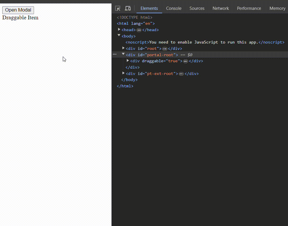
Draggable Portal
Share your thoughts in the comments
Please Login to comment...