How to set Input Fields with Black Border on Focus using CSS ?
Last Updated :
10 Apr, 2024
The visual cues play a crucial role in guiding user interaction in web design. One common interaction is when users focus on input fields, such as text boxes or text areas, during form filling. To enhance the user experience, it’s essential to provide clear feedback when an input field is in focus.
Using focus pseudo-class selector
CSS allows developers to customize the appearance of HTML elements, including input fields. To style input fields with a black border when they receive focus, we can use the “: focus pseudo-class selector ” along with the border property.
Syntax:
input:focus {
    border: 2px solid black;
}
Example: To demonstrate setting the input field with black border on focus using CSS.
HTML
<!DOCTYPE html>
<html lang="en">

<head>
    <meta charset="UTF-8" />
    <meta name="viewport"
          content="width=device-width, initial-scale=1.0" />
    <title>Input Field Focus Styling Example</title>
    <style>
        body {
            display: flex;
            justify-content: center;
            align-items: center;
            height: 90vh;
        }

        input:focus {
            border: 2px solid black;
        }
    </style>
</head>

<body>
    <form>
        <label for="username">
              Username:
          </label><br />
        <input type="text" id="username"
               name="username" /><br /><br />
        <label for="password">
              Password:
          </label><br />
        <input type="password" id="password"
               name="password" /><br /><br />
        <input type="submit" value="Submit" />
    </form>
</body>

</html>
Output:
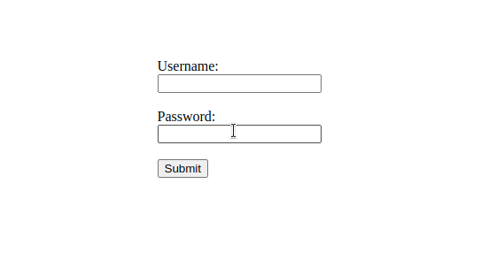
Input fields with black border on focus using CSS
Conclusion
By using CSS, developers can easily customize the appearance of input fields to provide visual feedback when users interact with them. Setting input fields to have a black border on focus enhances usability by clearly indicating which input field is currently active. This simple yet effective styling technique can contribute to a more intuitive and user-friendly form filling experience on websites.
Share your thoughts in the comments
Please Login to comment...