How to manage responsive text size and margin in Bootstrap 5?
Last Updated :
26 Dec, 2023
In this article, we will see how to manage responsive text size and margin using Bootstrap 5. Bootstrap enables to create the responsive websites. It contains a collection of built-in classes for styling the website. Managing the responsive text size can be done with the help of the utility classes like ‘text-sm’, ‘text-md’, etc, which adjust the font size based on the screen size. To manage the margins, the classes, such as ‘ms-sm’, ‘mt-md’, etc, which help to set the responsive margin values. These classes ensure a visually appealing layout across different device sizes without the need for custom CSS.
There are several techniques that help to create and manage the responsive text size and margin, which are listed below.
We will explore the above topics with the help of examples.
Breakpoint Classes
Bootstrap 5 provides a predefined set of different available breakpoints to build the responsive utilities which help in quickly creating responsive layouts, along with defining the range of screen size or viewport size. 6 default breakpoints are facilitated by Bootstrap, which are known as grid tiers.
| xs |
Extra Small |
576px and below |
| sm |
Small |
576px and above |
| md |
Medium |
768px and above |
| lg |
Large |
992px and above |
| xl |
Extra large |
1200px and above |
| xxl |
Extra Extra large |
1400px and above |
Margin
Margin is declared using the ‘m’ class and its values start from 0 (no margin ) to 5 ( large margin ), and it contains another value auto which automatically calculates and sets the margin based on the context and layout requirements.
Syntax
m*
Here, the star(*) represents the below margin classes.
| m |
It defines the margin for all sides. |
| mx |
It defines the margin for the right and left sides. |
| my |
It defines the margin for the top and bottom sides. |
| ml |
It depicts the margin-left |
| mb |
It depicts margin-bottom |
| mr |
It depicts margin-right |
| mt |
It depicts margin-top |
Text Size
In Bootstrap 5, the text size is managed through classes that provide a consistent and responsive typography system.
Syntax
text-*
Here, the star(*) represents the below Text Size classes.
| text-sm |
It is defined for small screens. |
| text-md |
It is defined for medium-sized screens. |
| text-lg |
It is defined for large screens. |
| text-xl |
It is defined for extra-large screens. |
| text-xxl |
It is defined for the even larger. |
Approach
- We have to use fs-4, fs-md-3, fs-lg-2, fs-xl-1 for responsive text.
- Now, ensure horizontal centering by using mx-auto class.
- Now, implement my-xl-5, my-lg-4, my-md-3, my-sm-2, my-xs-1 for vertical margins.
- Now, maintain Bootstrap styling with text-light, w-50, bg-success, p-4, and text-center.
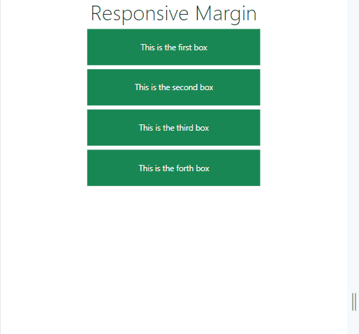
Example: In this example, we will create a html page containing 4 boxes containing responsive text and having a responsive margin between them.
HTML
<!DOCTYPE html>
<html lang="en">
<head>
<meta charset="UTF-8">
<meta name="viewport"
content="width=device-width,
initial-scale=1.0">
<link rel="stylesheet" href=
integrity=
"sha512-b2QcS5SsA8tZodcDtGRELiGv5SaKSk1vDHDaQRda0htPYWZ6046lr3kJ5bAAQdpV2mmA/4v0wQF9MyU6/pDIAg=="
crossorigin="anonymous"
referrerpolicy="no-referrer" />
<link rel="stylesheet"
href="style.css">
<title>Responsive Margin</title>
</head>
<body>
<h1 class="text-center display-4">
Responsive Margin
</h1>
<div class="text-light w-50 bg-success p-4
text-center mx-auto my-xl-5 my-lg-4 my-md-3 my-sm-2 my-xs-1">
This is the
first box
</div>
<div class="text-light w-50 bg-success p-4
text-center mx-auto my-xl-5 my-lg-4 my-md-3 my-sm-2 my-xs-1">
This is the
second box
</div>
<div class="text-light w-50 bg-success p-4
text-center mx-auto my-xl-5 my-lg-4 my-md-3 my-sm-2 my-xs-1">
This is the
third box
</div>
<div class="text-light w-50 bg-success p-4
text-center mx-auto my-xl-5 my-lg-4 my-md-3 my-sm-2 my-xs-1">
This is the
forth box
</div>
</body>
</html>
|
CSS
@media (min-width: 576px) {
div {
font-size: 2vw;
}
}
@media (max-width: 576px) {
div {
font-size: 3.5vw;
}
}
|
Output:
Share your thoughts in the comments
Please Login to comment...